lumnio; HPCC (Components); PRC 2025 Top Picks
Tis a feast for the eyes, today, as we look at two semi-related projects that make it easier to tell stories and gain insights from data. We round out this edition with a 2025 lookback by the Pew Research design team.
TL;DR
(This is an LLM/GPT-generated summary of today’s Drop. Ollama and MiniMax M2.1.)
- Lumino is a high-performance JavaScript framework forked from PhosphorJS that achieves sub-millisecond layout times by radically minimizing reflows, making it ideal for building complex, desktop-like web applications such as workbenches or IDEs with draggable, tabbed layouts (https://lumino.readthedocs.io/en/latest/)
- HPCC Systems offers a framework-agnostic visualization library built on D3.js with a unified API across diverse chart types, along with Web Components for embedding complex editors like CodeMirror and ObservableHQ’s engine (https://hpcc-systems.github.io/Visualization/)
- The Pew Research Center’s 2025 visualization highlights showcase effective chart selections including alluvial diagrams for tracking transitions over time, annotated bar charts for benchmark comparisons, and beeswarms for displaying distribution densities, all designed with a mobile-first approach (https://www.pewresearch.org/short-reads/2025/12/15/our-favorite-data-visualizations-of-2025/)
lumino
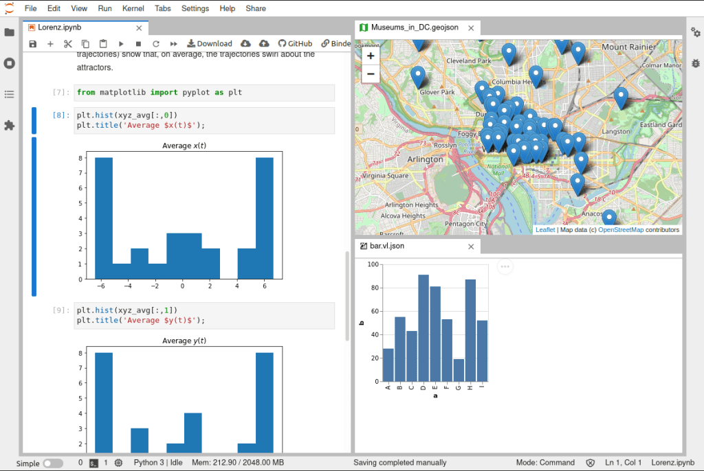
Sixteen milliseconds. That’s all you have. At 60fps, a web application gets ~16ms to handle user interaction—logic, DOM manipulation, reflows, repaints, everything. For complex, multi-tab, single-page applications, hitting that threshold consistently borders on impossible. Lumino (GH) achieves sub-millisecond layout times by radically minimizing reflows.
I typically ignore Jupyter ecosystem work (the browser is no place for data science, save for communicating results). But Lumino isn’t really a Jupyter project. It’s more a general-purpose framework for building high-performance, desktop-like web applications that happens to power JupyterLab’s GUI.
The code started life as PhosphorJS, an independent project. When the original author stepped away after some community friction, JupyterLab forked it under the Lumino name in early 2020. So, the software stayed the same, but the governance of it changed hands.
The framework ships 17 packages across five layers, which include foundation, communication, interaction, widgets, and application. They are all separately installable via NPM. Here are a few standouts:
@lumino/datagrid— High-performance virtual grid for large datasets@lumino/messaging— Message passing that replaces React/Vue-style props/state for widget communication@lumino/signaling— Type-safe publish-subscribe for application-level events@lumino/widgets— Base widget class with draggable, tabbed layouts
The message system is where Lumino diverges most from modern frameworks. Widgets communicate via messages (before-attach, after-attach, show/hide) rather than reactive state. Signals handle application-level events separately.
When to use it? If you are just building a simple website, it is serious overkill. But, if you are crafting a workbench or IDE with complex, draggable, tabbed layouts, Lumino is arguably the best tool on the planet for that job.
Thanks to some work we’ll see in the next section, you also don’t have to use it directly.
Open-source drama aside, I’m glad the Jupyter ecosystem preserved and expanded a genuinely useful project.
HPCC (Components)
HPCC Systems (GH) (High‑Performance Computing Cluster) is an open‑source, data‑intensive über‑computing platform that provides an end‑to‑end solution for building, managing, and analyzing large‑scale “data lakes.” It combines a lightweight core architecture with two complementary processing engines: Thor for batch data workflows and Roxie for high‑speed queries—plus a distributed file system, a modular Enterprise Control Language (ECL), and a suite of tools for data enrichment, security, and cloud‑native deployment. The result is a fast, scalable, and cost‑effective platform for high‑speed data engineering and analytics without the need for massive development teams or proprietary hardware.
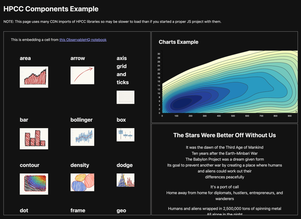
In 2022 and 2023 we talked about their GraphViz and base90 components. While they provide other WASM components/packages, we’re here, in this section, today, to discuss their Visualization Library and Web Components (GH), neither of which require us to use the HPCC platform itself.
The framework-agnostic visualization library is built on D3.js with a consistent API across all widget types. The key differentiator for the charts (vs. typical charting libraries) is the unified approach to data ingestion and property management across diverse visualization types. The Web Components aim to simplify embedding two (for now) specific and fairly complex “widgets”: CodeMirror (the bits that “power” the VS Code editor) and ObservableHQ’s engine.
The project is a Lerna monorepo with packages published under the @hpcc-js/ npm scope. All packages can be used independently. The build system uses Vite for compilation and bundling, outputting ESM, UMD, and IIFE formats.
Core packages: – @hpcc-js/common – Base widgets, utilities, D3 re-exports – @hpcc-js/api – TypeScript interfaces – @hpcc-js/util – Utility functions
Visualization packages: – @hpcc-js/chart – Bar, Line, Pie, Scatter, Area, Bubble, Radar, Word Cloud, Gantt, Gauge, Heat maps, Hex bins, Contour – @hpcc-js/graph – Network diagrams, Sankey, Vertex/Edge graphs – @hpcc-js/map – Leaflet-based geospatial – @hpcc-js/tree – Hierarchies, treemaps – @hpcc-js/timeline – Temporal visualizations
Layout/UI packages: – @hpcc-js/layout – Dashboard containers (Grid, Border, Tabbed, Overlay) – @hpcc-js/form – Form controls – @hpcc-js/html – HTML components, React integration
Integration packages: – @hpcc-js/comms – HPCC Platform communication (Roxie queries, Workunits, ESP) – @hpcc-js/marshaller – Data marshalling and dashboard orchestration – @hpcc-js/codemirror – Code editors – @hpcc-js/observablehq-compiler – Unofficial Observable notebook compiler/interpreter
The charts all have the same basic idiom:
import { Bar } from "@hpcc-js/chart";

new Bar()
  .target("placeholder")
  .columns(["Subject", "Year 1", "Year 2"])
  .data([
    ["Geography", 75, 68],
    ["Math", 98, 92]
  ])
  .render();
and, the documentation for how to use them is pretty decent.
Since this project is more of a “show” thing than a “tell” thing, I threw together a small example of using the ObservableHQ component, one chart component, and plain HTML <div> inside the HPCC-wrapped Lumnio component, all in a single-source, vanilla HTML/JS/CSS page with using ES6 ESM imports from JSDelivr.
PRC 2025 Top Picks
No, it is most certainly not that PRC.
The Pew Research Center designers know a thing or three about communicating visually with data.
Alissa Scheller (senior information graphics designer at Pew) shared her team’s 2025 visualization highlights, focusing on a few chart types they found particularly effective.
Alluvial diagrams received prominent treatment. They used them to show voter flows between the 2020 and 2024 elections and religious switching among Israeli Jews. The strength here is showing not just that changes happened, but the specific pathways of those changes. Panel surveys like their American Trends Panel make this possible since they can track the same respondents over time.
Contextual annotations on bar charts came up as a way to add comparison benchmarks. They showed audience education levels across news outlets with dots indicating the overall U.S. population baseline and Catholic cardinal regional representation with annotations showing actual Catholic population distribution. The bullet chart variant packed multiple comparisons into a compact space for their religious majority analysis.
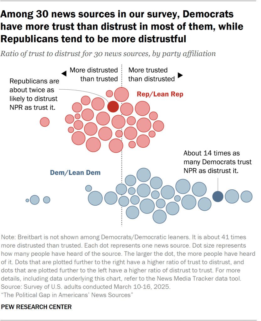
Rose plots and beeswarms rounded out the discussion. The rose plot appeared in an interactive about public behavior norms, showing response distributions with directional emphasis. The beeswarm displayed news source trust/distrust ratios by party affiliation, with dot size encoding awareness levels.
The underlying theme is matching chart type to the story structure. Alluvials for flow and transition narratives. Annotated bars for benchmark comparisons. Beeswarms for distribution density across a single dimension with grouping. They’re also clearly designing mobile-first, given smartphone prevalence.
It’s a great read with equally great visuals and links to some equally great Pew content from 2025.
FIN
Remember, you can follow and interact with the full text of The Daily Drop’s free posts on:
- Mastodon via
@dailydrop.hrbrmstr.dev@dailydrop.hrbrmstr.dev - Bluesky via
<https://bsky.app/profile/dailydrop.hrbrmstr.dev.web.brid.gy>

Leave a comment