Gribouille; a real chart from real data; a Claude Code skill that knows it cold
Gribouille by Mickaël Canouil is a full Grammar of Graphics implementation for Typst. Unlike a fair number of “chart libraries”, this is not just a hacked-together scatter function and a bar function bolted together. Mickaël built and entire framework that includes geom layering, aesthetic mapping, scale training, faceting, composition, annotations, themes. It’s literally everything you’d expect if ggplot2 were a native citizen of the compiled Typst typesetting system.
Code and data for the sample plot, below, along with a Claude Skill for Gribouille can be found at https://git.sr.ht/~hrbrmstr/gists/tree/main/item/2026/2026-05-17-gribouille
What It Is
Gribouille is a full Grammar of Graphics implementation for Typst, with the same mental model as ggplot2, same layered composition philosophy, same aesthetic-mapping system, and same scale + theme machinery. It brings Wilkinson’s full framework to the Typst compilation pipeline.
That’s not a small claim. It means you’re not getting a chart library with a “scatter plot” function and a “bar chart” function and some cursory theme knobs. You’re getting the full stack: ~35 geoms, a complete scale system (continuous, log, discrete, date, viridis, ColorBrewer, diverging gradients, stepped palettes), faceting via facet-wrap and facet-grid, multi-panel composition via compose(), annotation layers, guide customization, and a theme system built on element-text/element-line/element-rect primitives that touches every visual element in the chart.
Just clone the repo, add one import line to any Typst document, and you can start #plotting with no external compilation steps and no further system dependencies.
Why This Matters for Typst
Typst already has a compelling story of being a modern typesetting system with a real programming language embedded in it, blazingly fast compilation, a robust package ecosystem, and output quality that makes LaTeX folks quietly impressed. The gap has been data visualization. Until now the answer was “embed an image” or “use CeTZ directly”, which is a reasonable workaround but not a solution.
Gribouille closes that gap in a meaningful way. You can now write a cybersecurity monitoring report, an epidemiology summary, a financial brief, or a technical specification — all in Typst — and have publication-quality charts compiled into it with no external dependencies, no figure export step, no version drift between your data and your chart. CSV data loads natively; inline data arrays work for smaller datasets; built-in datasets (penguins, mpg, economics) are included for quick testing.
The ggplot2 readers in the crowd will feel at home immediately. The mental model is identical: map data columns to aesthetics, layer geoms, adjust scales, theme. If you’ve ever written ggplot(data, aes(x = col, y = col)) + geom_point() + scale_x_log10(), reading a Gribouille plot block requires no translation.
A Real Chart: Network Telemetry Monitoring
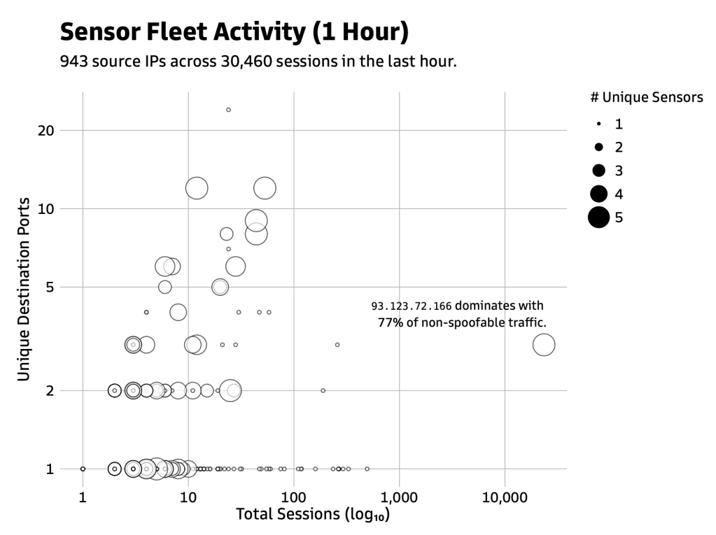
Here’s a chart I built while looking at one hour of my janky, five-node honeypot sensor fleet data: 943 source IPs hitting my monitoring infrastructure across 30,460 sessions. Three questions at once: how many sessions? How many unique destination ports? How many distinct sensors saw this IP? A bubble chart handles all three simultaneously.
#import "./gribouille/lib.typ": *#set text(font: "Goldman Sans")#let results = csv("src_ip_last1h.csv", row-type: dictionary)#let p = plot( data: results, mapping: aes( x: "total_sessions", y: "unique_dst_ports", size: "unique_sensors", ), layers: ( geom-point(alpha: 0.65), annotate( "text", x: 23424, y: 3, label: typst(align(right)[`93.123.72.166` dominates with\ ~77% of non-spoofable traffic.]), anchor: "south-east", dx: 0.0, dy: 0.3, size: 7pt, ), ), scales: ( scale-x-log10(labels: format-comma()), scale-y-log10(), scale-size-area(), ), labs: labs( title: typst([#h(1.5cm)Sensor Fleet Activity (1 Hour)]), subtitle: typst(pad(left: 1.5cm)[943 source IPs across 30,460 sessions in the last hour.]), x: "Total Sessions (log₁₀)", y: "Unique Destination Ports", size: "# Unique Sensors", ), theme: theme-minimal( text: element-text(), plot-title: element-text(size: 14pt, weight: "bold"), plot-subtitle: element-text(margin: margin(left: 3in)), ), width: 14cm, height: 9cm, )#p
Walking through it:
Data loading. csv("src_ip_last1h.csv", row-type: dictionary) pulls the CSV in as a list of dictionaries where each key is a column header. That’s the only wiring you need to connect a file to a plot. The row-type: dictionary argument is required — Typst’s csv() defaults to returning arrays of arrays, not dictionaries, so this is the flag that makes column names work.
Aesthetic mapping. aes(x: "total_sessions", y: "unique_dst_ports", size: "unique_sensors") maps three data columns to visual channels. Column names go in quotes — they’re dictionary key lookups at render time. The size aesthetic feeds the bubble size. Gribouille trains the size scale against the actual data range and maps proportionally.
Geom layer. geom-point(alpha: 0.65) renders one point per row. The slight transparency handles overplotting in denser regions without hiding anything.
Annotation. annotate("text", x: 23424, y: 3, ...) places a text annotation at raw data coordinates — Gribouille handles the log-transform internally. anchor: "south-east" places the SE corner of the text block at that coordinate, so the label extends left and upward, staying inside the panel even though the annotated point sits at the rightmost edge of the chart. The typst() wrapper inside label: lets you use real Typst markup — here, align(right) and a \ line break.
Scales. scale-x-log10(labels: format-comma()) applies a log₁₀ transform to the x axis and formats tick labels with thousands separators. scale-y-log10() does the same for y. scale-size-area() maps the unique_sensors column to point area (not radius — area encoding is perceptually correct for magnitude comparisons; radius encoding systematically understates differences).
Labs. labs() sets axis titles, legend title, plot title, and subtitle. The typst() wrapper on the title and subtitle lets you use Typst markup directly — #h(1.5cm) for horizontal indent on the title, pad(left: 1.5cm) to indent the subtitle to match.
Theme. theme-minimal() gets a clean output with no panel background. element-text(size: 14pt, weight: "bold") on plot-title overrides the title styling. The theme system uses the same element primitive pattern throughout — element-text, element-line, element-rect — each targeting a named component of the chart.
I tried to exercise a decent chunk of Gribouille, but the official examples provide many more looks at the idioms.
Oh, and it compiles in 1.1 seconds. That’s “slow” in Typst land, but the majority of the time is the data loading and conversion to a dictionary.
The Claude Code Skill
While building this chart I put together a Claude Code skill for Gribouille: a prompt-engineering layer that bakes in the library’s full parameter surface so you can describe a chart in plain language and get correct, idiomatic Gribouille code back without having to look anything up.
The skill lives at ~/.claude/skills/gribouille/ and consists of a main SKILL.md and two reference tables — references/geom-table.md and references/scale-table.md — that enumerate every geom, every scale, and every verified parameter with accurate types and defaults. That last part matters: the tables were built by reading the actual Gribouille source code, not the docs or training data. Parameter names that look like they should exist but don’t — linewidth instead of thickness, n.breaks instead of n-breaks, font instead of family, scale-size-radius instead of scale-radius — are all noted explicitly so the model doesn’t hallucinate plausible-but-wrong API calls.
The skill handles:
- Embedding context: standalone
.typwith#set page(width: auto, height: auto, margin: 0.5cm)versus embedded in atypst-authordocument without that preamble - Scale auto-selection: silently applies the right scale based on the data type (log when asked, comma-formatted labels for large numbers, viridis/ColorBrewer/Okabe-Ito for color)
- Faceting patterns:
facet-wrapfor one variable,facet-gridfor two, with correct named parameter syntax - Multi-panel composition:
compose()withdefer: trueon each plot, not the incorrectgrid()approach - Anti-pattern enforcement: a table of confirmed wrong patterns and their correct alternatives, drawn from real mistakes caught during development
The skill is designed to bridge the gap between “I know what chart I want” and “I know the exact Gribouille API call to produce it” without requiring you to keep the full library reference in your head.
Gribouille is very usable right now. There are some “gotchas” (such as no way I can find to right justify the X-axis titles), but from the included plot and the myriad of example plots on the Gribouille site, it is very clear you can start ditching ggplot2 or plotnine right away if you’re in the Typst ecosystem.
FIN
Remember, you can follow and interact with the full text of The Daily Drop’s free posts on:
- 🐘 Mastodon via
@dailydrop.hrbrmstr.dev@dailydrop.hrbrmstr.dev - 🦋 Bluesky via
https://bsky.app/profile/dailydrop.hrbrmstr.dev.web.brid.gy
☮️

Leave a comment