Flexoki; The Definitive Ranking Of Every Pantone Color Of The Year; Colorify Rocks
Today’s midweek Drop gives us a bit of color to offset the dull browns, grays, and whites of these drab Winter days (at least up in this hemisphere).
TL;DR
(This is an AI-generated summary of today’s Drop using Ollama + llama 3.2 and a custom prompt.)
- The Flexoki color scheme mimics analog inks and paper aesthetics, achieving high contrast while maintaining legibility (https://raw.githubusercontent.com/oddship/zed-flexoki-theme/refs/heads/main/themes/zed-flexoki.json)
- The Definitive Ranking Of Every Pantone Color Of The Year ranks all Colors of the Year from 26 to 1, with Rob Alderson’s list featuring Living Coral as the top color (https://www.pantone.com/color-of-the-year/2025)
- Colorify Rocks is a partly-AI-driven platform that helps discover harmonious color combinations through its suite of free tools, including a color generator and WCAG contrast checker (https://colorify.rocks/)
Flexoki

Flexoki is a carefully crafted color scheme designed for both prose and code that mimics the aesthetics of analog inks and paper. The color palette achieves high contrast while maintaining legibility across light and dark modes. Version 2.0 was released last week, which was the catalyst for including it in today’s Drop.
The system uses a sophisticated base color structure with 8 core values that blend from black (#100F0F) to paper (#FFFCF0). These values create a warm monochromatic foundation split into text values (normal, muted, faint) and interface values (normal, hover, active), plus two background values.
The palette is centered in the Oklab color space to maintain perceptual relationships across the spectrum. The colors increase in intensity exponentially to recreate the vibrancy of real pigments. This solves a very real challenge in computer-based colors: the difference between subtractive (physical ink) and additive (our glowing rectangles) color mixing.
The system provides 8 accent colors with specific semantic meanings associated with syntax highlighting:
- Errors/Imports — Red — Invalid code, import statements
- Functions — Orange — Function definitions and calls
- Constants — Yellow — Constant values
- Keywords — Green — Language keywords
- Strings — Cyan — String literals
- Variables — Blue — Variable names and attributes
- Numbers — Purple — Numeric values
- Language Features — Magenta — Special language constructs
Flexoki has been ported to numerous development environments and tools including:
- Terminal emulators (Wezterm, Alacritty, iTerm2, Warp)
- Text editors (Zed, Sublime Text VSCodium, Neovim)
- Note-taking apps (Obsidian, Standard Notes)
- Development tools (IntelliJ, tmux)
The light themes in the set use 600-series colors for syntax highlighting while dark themes use 400-series colors. In case you’ve skipped a “design” Drop or two, the numbers in color palettes like this represent the relative lightness or weight of each color variant. The numbering system follows a standardized scale from 50 to 950, where:
- Lower numbers (50-200) indicate lighter tints of the base color, often used for backgrounds and subtle accents
- Middle numbers (300-600) represent the primary, most commonly used versions of the color
- Higher numbers (700-950) denote darker shades, typically used for text or high-contrast elements The system includes an extended palette with values from 50 to 950 for more complex applications. The color values are exponentially scaled to maintain vibrancy, similar to how watercolors behave when diluted
The aforementioned version 2.0 added 88 new values to the accent color range. This expansion provides more granular control for complex interface designs while maintaining the core aesthetic principles of the system.
I reset my Sublime Text, Zed (get that one here) and Wezterm themes to Flexoki and haven’t changed them back, though I am as much of a theme gadfly as I am a coding font gadfly.
The Definitive Ranking Of Every Pantone Color Of The Year
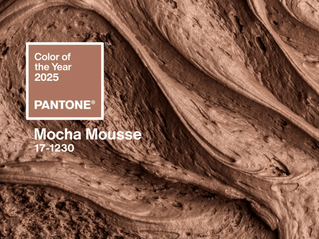
We’ve occasionally talked about Pantone’s “Color of the Year”, and it sometimes makes the news-news, but for those blissfully unaware we’ll do a quick intro. Pantone has been selecting a “Color of the Year” annually since 1999. This tradition began with Cerulean, a serene blue symbolizing the optimism of a new millennium. This year’s color is Mocha Mousse.
Each year’s color is chosen through — what I would describe as a pretty casual process. NOTE: the rumors of the colors being chosen by an elite cabal over two days in a secret meeting in a European city are fun, but not true. Ultimately, this is just an annual marketing stunt. However, it does influence design, fashion, and consumer products.
Rob Alderson of Design Week undertook the task of ranking all the Colors of the Year from 26 to 1. This, too, is — ultimately — a marketing stunt. But, I appreciate the fact that Rob took the time to make it both light-hearted and a tad snarky. After all, color preferences are fairly subjective. Rob relegated Tangerine Tango (2012’s color) to the bottom of the list, with the critique that it resembles the color of a theme-park slushy, evoking a queasy feeling. In contrast, Living Coral (2019’s color) topped the list. Rob praised it for being “humanizing and heartening,” and noted for its relevance in both natural and digital realms.
I found it to be a quaint distraction from the tidal wave of terrible news that seems to come our collective ways every day.
Colorify Rocks
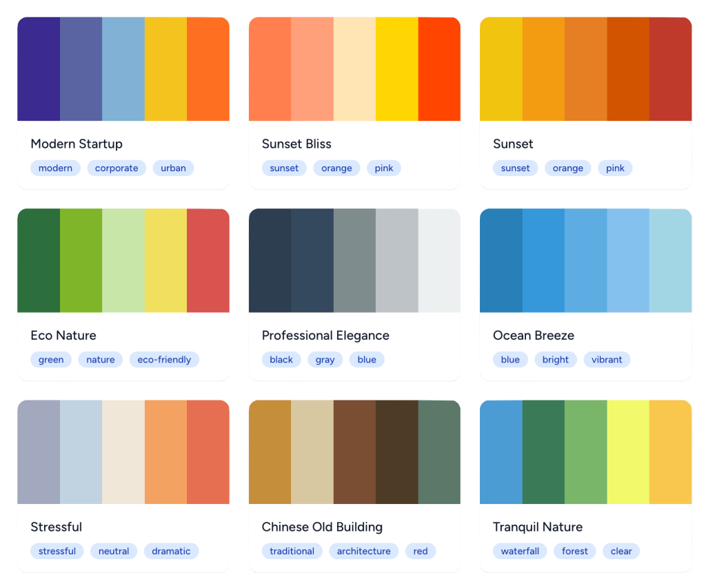
Colorify Rocks is a partly-AI-driven platform built to help us discover harmonious color combinations. If you go there, it’s fairly self-explanatory, so we’ll just provide a quick overview and direct links to variou sections.
The Colorify Rocks suite of free! tools consists of:
- Color Generator: Automatically creates (oddly consistently) spiffy color combinations via a color theory trained AI model that turns text descriptions into colors.
- WCAG Contrast Checker: Evaluates color contrast ratios to ensure accessibility compliance.
- Color Wheel: Allows you to explore color relationships and find harmonious combinations.
- Image Color Picker: Enables extraction of colors from any image directly in your browser.
- Color Mixer: Facilitates mixing multiple colors to create new ones.
- Color Toner: Generates shades, tints, and tones from any color.
- HEX to RGB Converter: Converts HEX color codes to RGB values and vice versa.
It also has a few color lists to explore:
- Hex Colors: An extensive collection of hexadecimal color codes and their names.
- Pantone Colors: Explores the Pantone color matching system widely used in printing and design industries.
- Web Safe Colors: Showcases the classic 216 web-safe colors that were standard in early web design.
- X11 Colors: Presents standard color names from the X Window System used in computing.
FIN
Remember, you can follow and interact with the full text of The Daily Drop’s free posts on:
- 🐘 Mastodon via
@dailydrop.hrbrmstr.dev@dailydrop.hrbrmstr.dev - 🦋 Bluesky via
https://bsky.app/profile/dailydrop.hrbrmstr.dev.web.brid.gy
Also, refer to:
to see how to access a regularly updated database of all the Drops with extracted links, and full-text search capability. ☮️

Leave a comment