Kinetic Typography; Fast Font; Balancing Text In CSS
Back to the daily work grind and, as expected, podcast day really ate away at Drop creation time. The real issue was fiddling with the code example in the first section to get it to do what I wanted (I mostly succeeded).
TL;DR
(This is an AI-generated summary of today’s Drop using Ollama + llama 3.2 and a custom prompt.)
- Kinetic typography combines animated text with motion to express ideas, from classic film titles to modern web animations (https://rud.is/ex/kinetic.html)
- Fast Font enhances reading speed by emphasizing word beginnings through bold initial letters in three variations (https://born2root.github.io/Fast-Font/)
- CSS’s text-wrap: balance property automatically distributes text evenly across multiple lines for improved visual layout (https://ishadeed.com/article/balancing-text-css/)
Kinetic Typography
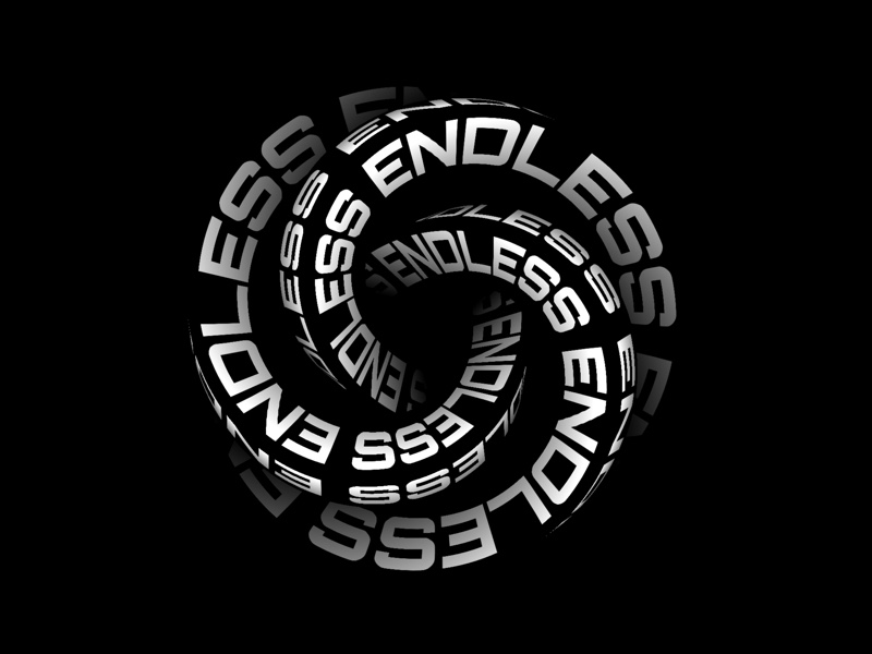
Kinetic typography is the art of animating text in motion, combining movement with typography to express ideas and emotions through video animation. This technique emerged in the late 1800s but gained prominence in the 1960s when Saul Bass revolutionized film title sequences with his work on Alfred Hitchcock’s “North by Northwest”.
While it’s a tad disingenuous to lump all of kinetic typography into a couple categories, there are two that do a fair job encompassing The majority of the field. In “motion typography” text elements move in relation to each other, either in 2D or 3D space. This includes scrolling text (like the iconic Star Wars opening crawl) and dynamic layouts where letters and words interact with each other.
Conversely, in “fluid typography”, letters and words transform and evolve while staying in place. A prime example is the “Night Watch” film’s subtitles, where text dissolves like blood in water during underwater scenes.
You likely see kinetic typography almost every day, especially if you engage in/with entertainment sources on your glowing rectangles. You can now smugly note the presence of it whenever you’re around friends/colleagues when video introductions and title sequences pop up, or you’re confronted with marketing and promotional content (etc.).
Modern kinetic typography is typically created using professional animation software, but, you don’t need to “go commercial” or be a professional animator to have some fun with it. There are free tools and techniques available that let us all join in the fun. In fact, we can take advantage of the crazy cool features of variable fonts and modern web CSS/JS to dip our toes into the kinetic waters (I have no idea if this embed will work for email readers):
Just view the source of this page to see the three functions that manipulate different features of Inter’s variable nature.
If you don’t feel like coding, there are some fun tools like the Kinetic Typography Playground (GH) where you just get to play.
Of course, our AI overlords have joined in the kinetic fray. One example is “KineTy: Kinetic Typography Diffusion Model” (GH). It uses three key components to create kinetic type animations. First, it employs static captions to control the visual style, including colors, textures, and letter shapes; then, it uses dynamic captions to manage how letters and backgrounds move throughout the animation. Lastly, it implements a specialized “zero convolution” technique to ensure the desired text remains visible.
Anything that moves on our glowing rectangles captures viewer attention, which is why kinetic typography — when implemented properly — works so well at captivating an audience. The technique can emphasize key messages, convey emotions, and transform simple text into engaging visual narratives. The most effective kinetic typography designs maintain readability while adding meaningful motion (so, not just an add-on to “look cool”). As with any adornment, the key is ensuring the animation serves the content’s purpose rather than overshadowing it.
Fast Font

Fast Font (GH) is a typeface designed to enhance reading speed by emphasizing the beginnings of words. It bolds the initial letters, creating “artificial fixation points” that guide our eyes through the text. This method lets our noggins recognize and process words more quickly, as it fills in the rest of the word after identifying the highlighted start.
The font offers three variations:
- Fast Font with Serifs: This version includes small lines or strokes attached to the ends of letters, which can aid readability in printed text.
- Fast Font Sans (without Serifs): This version lacks the additional strokes, offering a cleaner appearance that some readers prefer for on-screen text.
- Fast Font Sans with Dots as Spaces: Inspired by the “Space Reading” technique discussed in Kam Knight’s book “Speed Reading: Learn to Read a 200+ Page Book in 1 Hour,” this variation replaces spaces between words with dots. This design encourages readers to focus on the spaces, preventing the eyes from narrowing their focus and enabling the pickup of more peripheral information.
I gave it a go, and it does seem to do what it says on the tin, though it is not the prettiest font in the world to look at.
Balancing Text In CSS

When designing for the web, achieving visually balanced text — especially in headings — can be challenging due to varying content lengths and screen sizes. Traditionally, folks use manual line breaks (e.g., <br/>) or adjusted the maximum width of text containers to control text wrapping. However, these methods can be inflexible and may not adapt well to dynamic content changes.
To address this, CSS introduces the text-wrap property with the balance value. This property enables the browser to automatically distribute text evenly across multiple lines, enhancing readability and aesthetic appeal without manual adjustments. By applying text-wrap: balance; to a text element, the browser calculates the optimal line breaks to ensure a more uniform appearance.
For example, consider a headline that, without balancing, might display a single word on a new line, creating a visually unappealing “orphan” word. By adding text-wrap: balance; to the headline’s CSS, the text is redistributed to minimize such issues, resulting in a more balanced layout.
This feature is particularly useful for elements like page titles, card titles, tooltips, modals, and FAQ sections, where balanced text can significantly enhance the user interface. It’s important to note that text-wrap: balance; affects only the distribution of text within its container and does not alter the container’s width. Currently, the feature is limited to balancing text across up to four lines.
Note that this is a pretty bleeding-edge feature, but seems to have fairly broad browser support. I’m going to start adding this CSS to the styles I use in Observable Plots to help make titles, subtitles, and captions a tad nicer.
FIN
Remember, you can follow and interact with the full text of The Daily Drop’s free posts on:
- 🐘 Mastodon via
@dailydrop.hrbrmstr.dev@dailydrop.hrbrmstr.dev - 🦋 Bluesky via
https://bsky.app/profile/dailydrop.hrbrmstr.dev.web.brid.gy
Also, refer to:
to see how to access a regularly updated database of all the Drops with extracted links, and full-text search capability. ☮️

Leave a comment