Oxidize; Fontations; Type Revival for Film & TV
We’re getting technical in today’s typography-centric edition of the Drop, looking at the software underpinnings that help make the glyphs we all 💙 to collect and admire.
TL;DR
(This is an AI-generated summary of today’s Drop using Ollama + llama 3.2 and a custom Modelfile.)
- Oxidize initiative aims to migrate Google Fonts’ font manipulation stack from Python and C++ to Rust, targeting better performance and memory safety guarantees (https://github.com/googlefonts/oxidize)
- Fontations is a Rust-based font tooling framework that provides fundamental font parsing capabilities, with a focus on memory safety and performance (https://github.com/googlefonts/fontations)
- Type revival for film & TV involves recreating vintage typography and lettering as digital typefaces to maintain period authenticity while meeting modern production demands (https://www.alphabettes.org/type-revival-for-film-tv/)
Oxidize

Oxidize is Google Fonts’ initiative to migrate their font manipulation stack from Python and C++ to Rust. The project’s goal is to address performance and safety issues in the current tech stack while maintaining developer productivity.
The current architecture uses Python for general manipulation (via tools like fonttools and fontmake) which provides good development velocity but poor runtime performance. Their C++ code (primarily HarfBuzz) delivers excellent performance but is development-intensive and prone to memory safety issues, with fuzzer bugs regularly appearing after seemingly safe changes. This is especially “not great” since font rendering is still done at the kernel-level in most operating systems.
The migration to Rust targets a middle ground: better performance than Python while providing memory safety guarantees that C++ lacks. This is particularly relevant since both Chrome and Microsoft report that 70% of their high-severity security bugs stem from memory safety issues (😔).
Key active projects include Skrifa (replacing FreeType in Chrome), fontc (replacing fontmake), klippa (replacing subsetting functionality), and harfruzz (replacing HarfBuzz shaping). These components build upon core font manipulation libraries in the fontations repository (ref. next section).
The project emphasizes incremental delivery with continuous production validation rather than engaging the “Iron Man Clean Slate Protocol” replacement approach. Each component is tested against existing implementations for correctness and performance before deployment.
The engineering approach strongly favors minimal unsafe code usage while maintaining high performance and memory efficiency. The team is willing to accept unsafe code blocks when they can be proven safe and provide substantial performance benefits.
Even if you’re “not into” the technical underpinnings of font creation, this project is a fun one to track to see what it takes to migrate from memory-unsafe tooling to memory-safe tooling.
Fontations
Fontations is Google’s Rust-based font tooling framework designed to handle OpenType font parsing, manipulation, and validation. It’s comprised of multiple crates that each serve distinct purposes in font processing workflows.
The core functionality lives in the read-fonts crate which provides fundamental font parsing capabilities. This is complemented by write-fonts which handles font serialization. Both work together to enable complete font file manipulation.
The framework includes specialized components like font-types for basic font data structures and skrifa for text shaping and font rendering. For developers needing to validate fonts, the font-validator crate implements the OpenType specification checks.
Memory safety is front-and-center, with performance being a high secondary goal. Both are achieved via Rust’s ownership model, making it more robust than equivalent C/C++ implementations. The codebase demonstrates careful attention to error handling and validation.
The project maintains WASM compatibility, enabling web-based font tools. This makes it particularly useful for browser-based font development workflows and testing tools.
The WASM bit is primarily why I carved out a full section to highlight this project. We’re close to being able to do all sorts of fancy/wonderful operations on fonts in a very performant way right in-browser. This is going to open up whole new avenues for not only graphics/design folks, but also those of us who like to experiment with data visualization. We will be able to bend glyphs to our collective wills and come up with new ways to annotate even the most complex of charts.
Keep an eye on these projects and the datavis community. Exciting things are on the horizon!
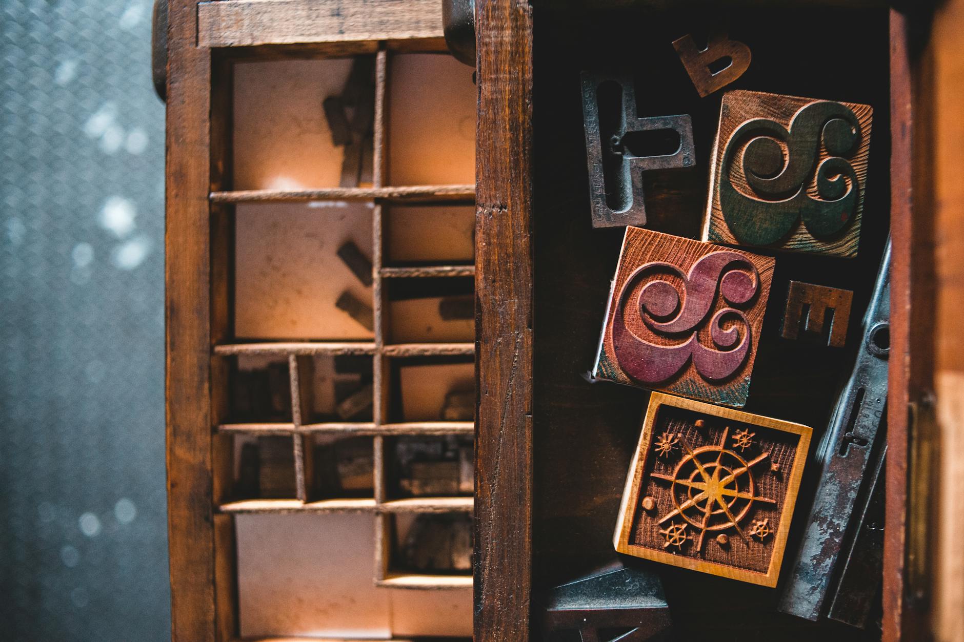
Type Revival for Film & TV
Type revival for period film and television productions represents a captivating intersection of historical preservation, graphic design, and practical problem-solving. The process involves recreating vintage typography and lettering as digital typefaces to maintain period authenticity while meeting modern production demands. Leah Spencer goes into some serious detail on the process in her essay “Type Revival for Film & TV” on ALPHABETTES.
Film and TV graphic designers face unique constraints when creating period-accurate visuals. Many historical typefaces were never digitized, and traditional production methods like letterpress, Letraset, and mimeograph are typically unavailable. Legal restrictions often limit font choices to specific foundries, while tight production schedules demand rapid turnaround — sometimes just hours to design what would normally take weeks.
Type revival offers an elegant solution by digitizing period lettering styles. While requiring upfront investment, it enables quick production of authentic-looking graphics that can be easily replicated for multiple takes. The process involves collecting historical specimens, cleaning up reference images in Photoshop, vectorizing in Illustrator, and creating fonts using tools like Fontself Maker.
The post uses an example from “Marvelous Mrs. Maisel”. The subway sequence in that film demonstrates this approach in action. The production team created six custom typefaces based on New York Transit Museum references to recreate historically accurate subway signage. Similarly, for the show’s Automat scene, they developed a modified version of Peignot Bold to match period art deco styling.
This work requires thinking like a “recreator” rather than a creator. The goal is capturing the imperfect human qualities of historical typography — the subtle variations and organic characteristics that tell stories about who made them and how. While modern digital tools enable precise reproduction, maintaining these imperfections helps preserve authenticity.
The process represents a practical fusion of historical research, design craft, and production efficiency — granting modern shows the superpower to maintain period accuracy while meeting demanding production schedules.
Leah’s post is a joy to read, especially with the graphics she chose to “show the work”. Definitely carve out time to read the whole thing.
FIN
Remember, you can follow and interact with the full text of The Daily Drop’s free posts on Mastodon via @dailydrop.hrbrmstr.dev@dailydrop.hrbrmstr.dev ☮️

Leave a comment