The Web Could Use Some GLP-1; Bottom’s Up!; Bar Crawl
Programming note: The DOCTYPE magazine I ordered came over the weekend! So, there will be at least one section of one Drop this week that does a review of it. And, I may even record (then time-lapse speed-up) an old-school typing session from one of the projects in it.
I will say now, that it was so cool seeing printed code again. But, I will leave more sentimental thoughts for said later edition.
Today, we look at a two nifty, non-heavyweight web development resources that show being clever does count quite a bit, especially when it comes to putting the web on a weight-reduction program.
TL;DR
(This is an LLM/GPT-generated summary of today’s Drop. This week, I continue to play with Ollama’s “cloud” models for fun and for $WORK (free tier, so far), and gave gpt-oss:120b-cloud a go with the Zed task. Even with shunting context to the cloud and back, the response was almost instantaneous. They claim not to keep logs, context, or answers, but I need to dig into that a bit more.)
- The HTTP Archive Page Weight report shows the web’s median page size has ballooned to 2.6 MB, causing slower load times and accessibility gaps (https://httparchive.org/reports/page-weight)
- Pure Web Bottom Sheet demonstrates how to build a lightweight, framework‑free bottom sheet using native scroll‑snap and CSS animations, drastically reducing JavaScript footprint (https://viliket.github.io/pure-web-bottom-sheet/)
- PicoStitch’s guide explains how to turn a plain HTML table into a responsive, accessible bar chart using only a few lines of CSS, eliminating the need for heavy charting libraries (https://picostitch.com/blog/2025/11/css-bar-chart/)
The Web Could Use Some GLP-1
The web has a weight problem, and the HTTP Archive Page Weight report is one of the clearest ways to see it. Think of it as a long-running health check for the internet: it measures how much data a page sends over the network and how many separate files a browser has to fetch before anything useful appears. That includes HTML, images, fonts, CSS, JavaScript, videos, and all the miscellaneous odds and ends sites tend to accumulate. When you look at these measurements over years instead of weeks, you get a blunt picture of how the modern web has steadily grown heavier.
Right now that weight is climbing fast. The median page sends about 2.6 megabytes of compressed data, and some pages push much, much higher once everything is loaded. That’s the equivalent of downloading a couple of high-quality photos just to view a single page. Images remain the biggest contributor, followed closely by (ofc) JavaScript. On desktop, the typical site ships more than 600 KB of scripts; on mobile, it’s just a bit lower. Those numbers might not seem catastrophic on fiber, but the story changes instantly on a phone, on a congested network, or on inexpensive hardware where every byte and every millisecond matters.
The effect is visible in performance metrics. At the midpoint of the web, desktop visitors wait roughly 53 milliseconds of blocking time before a page becomes usable. Mobile visitors, by contrast, wait about 1.2 seconds. That gap represents more than slow loading. It’s an inequality built into the way we ship sites. Heavier pages mean slower experiences, reduced accessibility, and a growing divide between people with fast, modern devices and those using whatever hardware and connectivity they can afford.
These metrics impact search rankings, conversion rates, visitor trust, energy consumption, and global accessibility. In the most basic terms, every web page has a “download size,” and that size has ballooned more than 350 percent in the past decade. That extra weight makes folks wait, and waiting makes people leave. For a business, that can translate directly into lost revenue and wasted marketing spend. For developers, it’s a sign that budgets for JavaScript, images, and CSS are often ignored. For researchers, it’s a longitudinal dataset showing exactly where complexity accumulates across the web.
From a security and infrastructure perspective, page weight also reflects attack surface. Each request is a dependency, each dependency a potential risk. The median page makes around seventy requests, and many of them involve third-party code that organizations don’t control. Watching how these patterns change helps identify where vulnerabilities will appear and what modern web stacks actually look like in the wild.
The Page Weight report is grounded in real crawls of real sites over long spans of time. It tells a story the industry frequently tries to forget: the web keeps getting heavier, but it doesn’t have to. Techniques like responsive images, modern compression, pruning unused code, and reducing third-party dependencies can slim pages down dramatically. The report makes the problem visible. Acting on it is the part that’s up to us.
To that end, the next two resources can help thin out the web by reducing dependence on massive frameworks for some common techniques. I’ve combined the two into one example, and laid bare how heavy or light the results are.
Bottom’s Up!
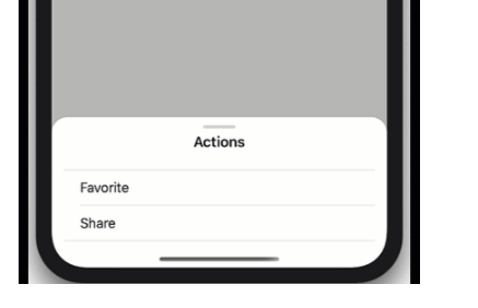
Folks know my Vue (heh) of React and other useless, gigantic framwworks. In their approach to development for the “modern” (it is increasingly feeling like the web is devolving, hence the scare quotes) often feels like they need a small city of JavaScript just to recreate behaviors our phones pull off with barely a shrug. Bottom sheets are a perfect example. Nearly every major framework ships its own version, each packed with helpers, state managers, animation controllers, gesture recognizers, and enough abstraction to make you forget that browsers actually know how to scroll things on their own. That’s what makes feel like a breath of fresh air.
Rather than building yet another (heavyweight) imitation of mobile UI mechanics, Pure Web Bottom Sheet (PWBS) (GH) leans into what is already provided by the core foundations of HTML/CSS/JS, and is pretty clever (hence why we’re covering it). It uses scroll snap and scroll-driven animations as the sheet’s engine. This lets the browser handle physics, timing, and the tactile feel of moving panels on a touchscreen. Most UI libraries tie these interactions to animation loops or gesture-handling JavaScript, but here the heavy work is outsourced to the CSS features the user agent already optimizes. On “modern” (scare q’s again b/c browsers are also devolving) browsers the JS footprint of the component becomes almost negligible because there’s very little animating to do. The browser already knows how to fling, settle, and snap content, and PWBS simply harnesses that ability.
That whole thing is implemented as a lovely Web Component 💙. You drop it into HTML and it behaves the same whether the surrounding app is React, Vue, Astro, or a completely framework-free page. It’s friendly to Server-side Rendering (SSR), supports declarative Shadow DOM, and avoids the telltale flash of unstyled content that plagues many custom elements. Slots organize the layout intuitively: one for the main content, optional ones for header or footer, and separate elements that declare the snap points using a straightforward CSS variable. A snap point at half the screen height is just a div with a style saying this should be fifty percent. Zero magic framework incantations required.
The component supports multiple snap points, proper nested scrolling, swipe-to-dismiss interactions, modal or non-modal configurations, and even an expand-before-scroll behavior for the sheet’s content. It adjusts gracefully when the content changes, which is harder than it sounds when the sheet’s resting position is tied to scroll geometry. It also handles tricky mobile scenarios like keyboards rising on screen. On the accessibility front, it uses 100% real browser primitives such as the dialog element or the Popover API to handle focus management and input patterns correctly. This alone distances it from many JavaScript-heavy UI kits that only approximate native behavior.
Of course, the web is not hurting for bottom sheet widgets. There are dozens across the major frameworks, many with sophisticated sets of options. But those solutions often come with a cost: more code to ship, more runtime work, more state to synchronize, more platform assumptions to fight. Pure Web Bottom Sheet earns its place by doing less. It asks the browser to be the browser and trusts the platform’s built-in capabilities rather than rebuilding them in JavaScript. That makes it lighter, faster, and typically more reliable across devices. For people building progressive web apps or mobile-first experiences, this can bring UI behavior closer to native without depending on heavy client-side frameworks.
The project is also super helpful if you want to see how to work with core web technologies since the code is well-organized, has well-crafted comments, and has plenty of examples. I also encourage folks to look at Web Awesome’s “Drawer” component implementation, because you’ll find they, too, lean into taking advantage of modern built-in standards-base capabilities.
Bar Crawl
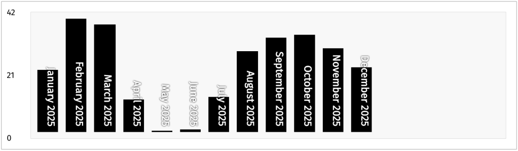
I do love me some bars (charts, that is 📊). In R it’s usually {ggplot2}’s geom_col(), and on the web it’s usually Observable Plot’s barX()/barY(). I tend to always resort to those somewhat heavyweight (they both have a ton of dependencies) solutions for such a data visualization, but this PicoStitch post might change-up when — or at least how often — I lean on import * as Plot from "@observablehq/plot";.
In the post (and, at a recent talk) Wolfram Kriesing demonstrates how we can turn a plain HTML table into a fully functioning bar chart using nothing but HTML and a few (~40) lines of CSS.
It starts with a semantically structured table — with <thead> for column headers and <tbody> for data rows. Each data cell (<td>) is decorated with a custom property (e.g., --percent), representing that value as a percentage of the table’s maximum value. With a single rule in CSS, applying a linear-gradient background based on that percentage immediately makes each row resemble a bar, giving a quick, intuitive visual impression of relative values.
But it doesn’t stop there. By switching the layout so rows align horizontally (using flexbox on the <tbody>), and flipping the gradient to grow from bottom to top instead of left to right, the table becomes a horizontal bar chart in vertical orientation — effectively a vertical bar chart. Hiding the table header and rotating the row labels inside <th> elements (via CSS writing-mode and positioning) cleans up the presentation so the bars stand alone.
For even more polish, the technique adds a pseudo y-axis by using the table’s <tfoot> as a scale marker (min, mid, max rows), flex layout to position it, and spacing rules to distribute those axis labels evenly. The result: a readable, responsive bar chart, grounded in semantic markup and styled entirely with CSS.
With almost no code, you get a lightweight, accessible, responsive bar chart without loading a library, managing data binding, or wrestling with DOM complexity. It’s another spiffy example of leveraging native web platform capabilities to produce clean, maintainable UI with minimal overhead.
FIN
Remember, you can follow and interact with the full text of The Daily Drop’s free posts on:
- 🐘 Mastodon via
@dailydrop.hrbrmstr.dev@dailydrop.hrbrmstr.dev - 🦋 Bluesky via
https://bsky.app/profile/dailydrop.hrbrmstr.dev.web.brid.gy
☮️
 hrbrmstr's Daily Drop
Leave a comment