Sound Typography; Sound-Responsive Typography; Wavefont
Glowing rectangle experiences are increasingly immersive and multi-sensory, and the intersection of typography and sound is opening up spiffy new frontiers. Today’s Drop explores how typography can go way beyond mere visual design. We can use it to create full sensory experiences that connect with our emotions, memories, and even our sense of hearing. From the subtle ways fonts can evoke sound to the bold, dynamic world of sound-responsive typography and specialized typefaces like Wavefont, we’ll uncover how text can move, change, and respond to music (or noise), transforming the way we interact with language and design.
TL;DR
(This is an LLM/GPT-generated summary of today’s Drop using Ollama + Qwen 3 and a custom prompt.)
- Typography and sound share a deep connection, influencing perception and memory through visual and auditory experiences (https://www.bloomsbury.com/us/giving-type-meaning-9781350256415/)
- Sound-responsive typography transforms text into a dynamic, visual representation of audio, creating immersive and interactive experiences (https://player.vimeo.com/video/158764860?title=0&byline=0&portrait=0)
- Wavefont is a specialized typeface for data visualization, using Unicode characters to represent waveform data with customizable axes and CSS integration (https://fonts.google.com/specimen/Wavefont/tester)
Sound Typography: When Letters Meet The Beat
(This can take a bit to load.)
Typography and sound might seem like distant cousins, but they share a surprisingly close relationship. When we look at a bold, angular font, we might hear sharpness or intensity. When we see flowing script, our minds conjure gentle melodies. This isn’t just imagination. Our brains naturally connect visual and auditory experiences together, often forming powerful memories.
Think about how you read different fonts. A newspaper headline in heavy sans-serif feels urgent and loud, while elegant script on a wedding invitation whispers sophistication. Designers have begun to recognize and harness this invisible bridge between what we see and what we hear, creating experiences that speak to multiple senses at once.
The rhythm of text itself mirrors musical composition. Just as a song has tempo and beat, typography has spacing, weight, and flow. A designer might arrange words on a page to echo the cadence of speech or the structure of a musical phrase. The white space between letters becomes the silence between notes, equally important to the overall composition.
This connection goes beyond metaphor into practical application. Digital interfaces now respond to voice commands by adjusting font sizes, creating a direct dialogue between sound and text. Some designers embed subtle audio cues into their works: the gentle click of a typewriter key or the soft rustle of turning pages—that make digital reading feel more tangible and engaging.
We’re all familiar with how a font can crystalize the identity of a blog or brand. But, what about a “sound” identity? Think of it as an “audio signature”, even if that’s just an artifact of the choice of typeface. It can go beyond just letterforms, though. A technical identify might use a perfectly pointed sans-serif that can be paired with crisp, digital tones. A gentler one mighe be combining flowing script with warm, resonant sounds.
The frontier where typography meets sound represents more than just aesthetic innovation—it’s about creating communication that feels more human and complete. As we move toward increasingly digital experiences, understanding how letters can carry the weight of music, and how sounds can give voice to silent text, opens new possibilities for connection and expression, as we’ll see in the middle section.
Sound-Responsive Typography: When Text Dances to Music
Imagine walking into an art gallery where the words on the wall aren’t just sitting there quietly. They move, stretch, and change shape as music plays around you. The letters grow bold and dramatic when the bass drops, then become delicate and wispy during a gentle piano melody. This is sound-responsive typography, and it’s transforming how we think about text as a living, breathing medium.
Sound-responsive typography takes the invisible qualities of audio — the deep rumble of bass, the sparkle of high notes, the rhythm of a drumbeat — and translates them into visual changes in letterforms. Think of it like a visual translator that speaks both the language of sound waves and the language of typography.
Designer Ran Zheng, who created groundbreaking work in this field, puts it beautifully: “I call architecture frozen music and I like to call type forms frozen sound.” Her approach involves creating a grid system where each point on a letter responds to different aspects of the audio input, making the text literally dance in three-dimensional space as sounds play.
You might be familiar with responsive typography from websites. In some contexts, text grows bigger or smaller depending on whether you’re viewing it on a phone or desktop. Sound-responsive typography is entirely different. Instead of responding to your screen size, it responds to what your ears are hearing. It’s like the difference between adjusting your outfit for the weather versus dancing to your favorite song.
The technical process is surprisingly elegant. Audio gets analyzed in real-time, breaking down into components like frequency ranges and volume levels. These audio characteristics then get mapped to visual properties of the text. For example, bass frequencies might control how thick or thin letters appear, while higher frequencies could affect their color or transparency.
What makes this particularly fascinating is how it taps into synesthesia (a neurological phenomenon where experiencing one sense automatically triggers another). Sound-responsive typography creates artificial synesthesia, letting us “see” music through the movement and transformation of letterforms.
The most obvious use of sound-responsive typography is in a performance context. Unlike traditional text that says the same thing every time you read it, sound-responsive typography creates unique experiences that can never be exactly repeated. Each piece of music, each sound, each moment creates its own visual interpretation through the text.
This opens up entirely new possibilities for storytelling and artistic expression. Imagine poetry that literally moves with the rhythm of spoken word, or brand logos that pulse with the energy of their company’s mission. Sound-responsive typography suggests a future where text doesn’t just communicate meaning through words, but through movement, rhythm, and visual transformation that connects directly to our emotional and sensory experiences.
Well, you don’t have to imagine this thanks to our brave new world of variable fonts, as there are numerous “starter projects” for sound typography, including this Code Sandbox by Edoardo Guido: https://codesandbox.io/p/sandbox/sound-reactive-variable-font-6k72c. Just clap your hands then start hacking.
Wavefont: Very Sound Glyphs
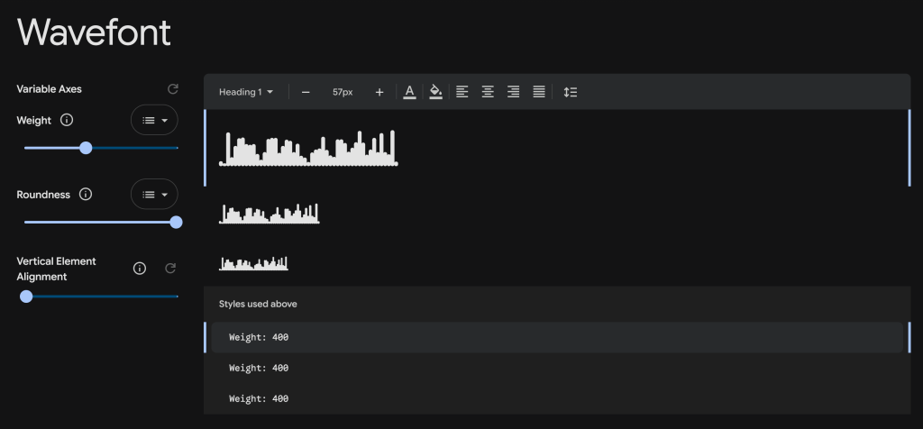
Wavefont (GH | Playground) introduces a specialized typeface designed for rendering vertical bar data such as waveforms, spectrums, diagrams, histograms, and columns. The font uses Unicode characters to represent data values, with different character ranges assigned to specific value steps: 0-9 for simplified input (step 10), a-zA-Z for manual input with step 2, and U+0100-017F for precise input (step 1, covering values 0–127).
Key Features and Usage (from the GH README):
- Variable Axes: The font supports variable axes for customization:
wght(1–1000): Controls bar width/boldness (default 400).ROND(0–100): Adjusts border radius/roundness (default 100).YELA(-100–100): Sets bar alignment (bottom, center, or top; default -100).
- CSS Integration: Easily included via
@font-faceand controlled with CSS variables for dynamic styling. - Character Mapping: Special characters and accents adjust bar height and position, and certain punctuation maps to specific values (e.g.,
|for max value). - JavaScript Package: Optional npm package for generating bar strings from value arrays.
- Compatibility: Designed to be visually coherent with similar fonts like
linefont, allowing seamless switching between fonts for data visualization.
Notable Details:
- Unicode Handling: Characters outside the defined ranges are clipped to zero, and marking characters are word-selectable.
- Accents for Adjustment: Accent characters (acute, circumflex, grave, caron) can shift bar values up or down in steps.
- Building: The project can be built using
make build.
The concept is super clever and the execution is solid.
FIN
Remember, you can follow and interact with the full text of The Daily Drop’s free posts on:
- 🐘 Mastodon via
@dailydrop.hrbrmstr.dev@dailydrop.hrbrmstr.dev - 🦋 Bluesky via
https://bsky.app/profile/dailydrop.hrbrmstr.dev.web.brid.gy
☮️

Leave a comment