A Timeline Of Unix Shells; rDNS Map; The Natural System of Colours
It was a pretty hectic 47 Watch and $WORK day, yesterday, hence no Drop. To make up for it, you get three cool things to distract you from gestures wildly.
TL;DR
(This is an AI-generated summary of today’s Drop using Ollama + llama 3.2 and a custom prompt.)
- Juno Takano created a shell history timeline visualization showing Unix shell evolution from the 1960s RUNCOM through modern shells like fish (2005) and Nushell (2019) (https://blog.jutty.dev/notes/shells-timeline/)
- The rDNS Map project by Alexey Milovidov visualizes the entire IPv4 address space using ClickHouse to process 3.69 billion DNS records, allowing interactive exploration of domain distributions across the internet (https://reversedns.space)
- Nicholas Rougeux digitally recreated Moses Harris’ 1766 “The Natural System of Colours” with faithful reproductions of the Prismatic and Compound color wheels using modern watercolor techniques, offering both light and dark versions (https://www.c82.net/natural-colors/)
A Timeline Of Unix Shells

The Unix shell has evolved significantly since its inception, with tons of variations developed over the decades, each with their own take on functionality and UX.
This history began in the 1960s with RUNCOM, which influenced the Multics shell created by Glenda Schroeder in 1965. The first true Unix shell was the Thompson shell, developed by Ken Thompson at Bell Labs and introduced in the first version of Unix in 1971. This pioneering shell introduced several innovative features to command-line interfaces, including a compact syntax for input/output redirection using > and < symbols.
The Thompson shell was followed by the PWB (Programmer’s Workbench) shell in 1977, developed by John Mashey. The PWB shell enhanced shell programming capabilities by adding shell variables, user-executable shell scripts, and interrupt handling. It also extended control structures from simple if/goto to more sophisticated constructs like if/then/else/endif and while/end/break/continue.
The most influential early Unix shell was the Bourne shell (sh), created by Stephen Bourne at Bell Labs and distributed with UNIX Version 7 in 1979. The Bourne shell introduced fundamental features that became standard in all later Unix shells, including here documents, command substitution, more generic variables, and extensive built-in control structures. Its language design was influenced by ALGOL 68, notably using reversed keywords to mark the end of blocks.
The 1980s saw the emergence of several important shells:
- C shell (csh) was developed at UC Berkeley in the late 1970s by Bill Joy, offering features not available in the Bourne shell.
- TENEX C Shell (tcsh) appeared in October 1983 as an enhancement to csh.
- KornShell (ksh) was created by David Korn at Bell Labs in June 1983, based on the Bourne shell sources.
The late 1980s and early 1990s brought more innovation:
- Almquist shell (ash) emerged in May 1989 as a BSD-licensed replacement for the Bourne Shell.
- Bourne-Again Shell (bash) was created by Brian Fox for the GNU Project in June 1989, becoming the most widely used shell on Linux systems.
- Z shell (zsh) appeared in May 1990, eventually becoming the default shell in macOS Catalina and Kali Linux.
Shell development has continued into the 21st century with shells focused on user-friendliness and modern features:
- The friendly interactive shell (fish) was introduced in 2005, emphasizing user-friendly features.
- Nushell (nu) emerged in August 2019 as a modern approach to command-line interfaces.
Each shell has contributed unique features and philosophies to the Unix/Linux ecosystem, from the minimalist approach of early shells to the feature-rich environments of modern alternatives like zsh and fish.
Why the his[h]tory lesson?
Juno Takano used Markwhen (which the Drop covered back in 2022!) to make a neat shell history timeline datavis (GH), and I figured some additional explanations may be just enough information inspiration for some folks to build upon Juno’s work.
Hit up their post for the both a static and interactive shell timeline.
This conveniently shows up to the Drop as the fish shell gets a bump to 4.0.0.
rDNS Map

I 💙 ClickHouse almost as much as I 💙 DuckDB and RStats. A big reason for the 💙 is some of the wacky-yet-incredibly-powerful data wrangling you can do with their query language.
A couple years back, Alexey Milovidov (ClickHouse co-founder and CTO) did a FOSSDEM presentation showcasing some of thewe wrangling features — the “rDNS Map project”. This work is a creative exploration of Internet-scale data visualization using ClickHouse. It demonstrates how to collect, process, and visualize reverse DNS (rDNS) records for the entire IPv4 address space.
The project began with the ambitious goal of performing reverse DNS lookups on all IPv4 addresses. With approximately 4 billion addresses in the IPv4 space, this required a careful approach to avoid being blocked by DNS providers. Instead of using traditional DNS scanning tools like MassDNS (which could lead to being blocked), the creator opted to use DNS over HTTPS (DoH) services provided by Cloudflare (1.1.1.1).
The scanning process involved:
- Generating all possible IPv4 addresses (excluding private ranges)
- Sending DoH requests to Cloudflare’s DNS service
- Storing the JSON responses in ClickHouse
The scan took about ten days to complete, resulting in a dataset of 3.69 billion DNS records stored in a 13.69 GiB table. The raw JSON data was highly compressible, with a 65.6x compression ratio in ClickHouse.
After collecting the raw data, the creator parsed the JSON responses into a more structured format:
CREATE TABLE dns_parsed ENGINE = MergeTree ORDER BY ip
AS
WITH JSONExtract(json,
'Tuple(Status UInt8, TC Bool, RD Bool, RA Bool, AD Bool, CD Bool,
    Question Array(Tuple(name String)),
    Answer Array(Tuple(name String, type UInt8, TTL UInt32, data String)),
    Authority Array(Tuple(name String, type UInt8, TTL UInt32, data String)),
    Comment Array(String))') AS t
SELECT time, t.Status, t.TC, t.RD, t.RA, t.AD, t.CD,
toIPv4(byteSwap(IPv4StringToNum(extract(
  tupleElement(t.Question[1], 'name'), '^(\d+\.\d+\.\d+\.\d+)\.')))) AS ip,
replaceRegexpOne(tupleElement(t.Answer[1], 'data'), '\.$', '') AS domain
FROM dns WHERE t.Answer != ''
SETTINGS allow_experimental_analyzer = 1;
This parsed table was much more efficient, taking only 4.88 GiB of storage. The domain names field had a particularly high compression ratio of 27.41x.
The processed data allowed for interesting analyses:
- Top-level domains (TLDs): The most common TLDs were .net (407M domains), .com (282M domains), and .jp (78M domains)
- Organizations: The most common domain owners included amazonaws.com (57M domains), comcast.net (41M domains), and bbtec.net (40M domains)
- ClickHouse instances: The dataset revealed hundreds of servers with “clickhouse” in their domain names, showing the widespread adoption of ClickHouse
The most impressive part of the project is the visualization. Alexey mapped the entire IPv4 space onto a 2D plane using Morton encoding (Z-order curve), assigning colors based on the domain name:
(echo 'P3 4096 4096 255';
clickhouse client --query "
  WITH 4096 AS w, 4096 AS h, w * h AS pixels,
    cutToFirstSignificantSubdomain(domain) AS tld,
    sipHash64(tld) AS hash,
    hash MOD 256 AS r,
    hash DIV 256 MOD 256 AS g,
    hash DIV 65536 MOD 256 AS b,
    toUInt32(ip) AS num,
    num DIV (0x100000000 DIV pixels) AS idx,
    mortonDecode(2, idx) AS coord
  SELECT avg(r)::UInt8, avg(g)::UInt8, avg(b)::UInt8
  FROM dns_parsed GROUP BY coord
  ORDER BY coord.2 * w + coord.1
    WITH FILL FROM 0 TO 4096*4096
") | pnmtopng > image.png
To handle the massive scale (a full 65536×65536 image would be 4 gigapixels), Alexey implemented a tiled approach similar to Google Maps, generating tiles at different zoom levels that could be loaded on demand in a web browser.
The final result is the https://reversedns.space website, which lets us explore the entire IPv4 space visually. When you click on a point, it sends a query to ClickHouse to retrieve the domain name for that IP address:
const response = fetch(
    `https://driel7jwie.eu-west-1.aws.clickhouse-staging.com/?user=website`,
    {
        method: 'POST',
        body: `SELECT domain FROM dns_parsed WHERE ip = '${ip_str}' FORMAT JSON`
    }).then(response => response.json().then(o => {
        let host = o.rows ? o.data[0].domain : 'no response';
        if (ip_str == current_requested_ip) {
            popup.setContent(`${ip_str}${host}`);
        }
    }));
The rDNS Map project is a superb and fun example that showcases ClickHouse’s capabilities for handling large-scale data processing and visualization. It demonstrates creative use of DNS over HTTPS for data collection, efficient storage and processing of JSON data, and integration with web technologies for interactive visualization. The source code is available on GitHub under a Creative Commons license, allowing others to learn from and build upon this work.
The Natural System of Colours
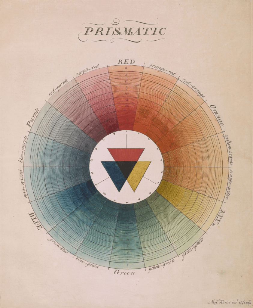
Moses Harris’ “The Natural System of Colours,” published in 1766, was a foundational contribution to color theory. Harris proposed that all colors derive from three primary colors: red, blue, and yellow. His work featured two groundbreaking color wheels: the “Prismatic” wheel based on rainbow colors, and the “Compound” wheel demonstrating relationships between secondary and tertiary colors.
Despite being only nine pages long (including title and dedication), Harris’ treatise became renowned for its beautiful color wheels. Each wheel showcased color combinations using three principal colors each: the Prismatic wheel focused on red, yellow, and blue while the Compound wheel focused on orange, green, and purple. The work was republished in a second edition in 1811 after Harris’ death, and again in 1963. Each edition featured colors that varied from the original publication due to differences in mixing techniques and aging of materials.
The digital recreation project used modern methods to faithfully reproduce Harris’ color wheels. Primary colors were sampled from Daniel Smith artist materials: organic vermillion, cadmium yellow, and ultramarine blue. Realistic watercolor behavior was mimicked using Rebelle 7 Pro to paint swatches and mix colors on realistic paper backgrounds. Color mixing followed Harris’ system: primary colors created secondary colors (orange, green, purple), which were then mixed to create tertiary colors.
Harris arranged each wheel with 18 numbered sectors, with the primary colors positioned equidistant from one another. The wheels feature concentric circles representing decreasing saturation levels from center outward. Saturation was mimicked digitally by decreasing color opacity from 100% at center to 10% at edge. Additional black concentric circles were overlaid to vary the tone of each color. The center was filled with textured overlapping triangles representing the base colors, and color names were written along the outer edge with distinct typography for primary, secondary, and other colors.
The project expanded on Harris’ original concept by creating dark versions of the wheels. Black lines and labels were changed to white, creating a different interplay with the colors’ varying saturation. Colors appear brighter in the center against the dark background, offering a new perspective on Harris’ historical system.
The recreation resulted in several resources: wall posters in both light and dark versions for both wheels, combined posters featuring both color wheels alongside color-restored scans of first and second editions, and data for 627 total colors generated for the project, freely available under CC0 1.0 Universal license.
FIN
Remember, you can follow and interact with the full text of The Daily Drop’s free posts on:
- 🐘 Mastodon via
@dailydrop.hrbrmstr.dev@dailydrop.hrbrmstr.dev - 🦋 Bluesky via
https://bsky.app/profile/dailydrop.hrbrmstr.dev.web.brid.gy
Also, refer to:
to see how to access a regularly updated database of all the Drops with extracted links, and full-text search capability. ☮️

Leave a comment