BIFF! BAM! POW!; New Heterodox Mono Gone And Didone It (Featured Free Font); Relationship Advice
The long weekend made it possible to have a lot of fun making this week’s typographic-centric edition.
TL;DR
I “broke” several LLMs with the usual prompt I use since the last section did not have an external resource. The thinking ones (almost all of them) tied themselves in knots trying to do what was asked of them. So, I ended up writing the bullets myself. Go. Humans.
- Comic Book Grammar, Decoded: Lettering isn’t just about putting words in bubbles—it’s a visual language with its own rules for rhythm, tone, and emotion. Nate Piekos’s Blambot guide reveals the grammar behind the “invisible glue” that makes comic dialogue feel right. (https://blambot.com/pages/comic-book-grammar-tradition))
- A Monospaced Rebellion: New Heterodox Mono is a Didone-style serif programming font that brings Bodoni-esque elegance into your code editor—a deliberate break from the utilitarian sans-serif norms of developer typography. (https://github.com/hckiang/font-new-heterodox-mono)
- Relative Thinking in CSS: Ditch pt and px for scalable, accessible units like em, rem, and clamp()—turning responsive typography into a kind of rhythm where local units dance, and root units keep the beat.
BIFF! BAM! POW!
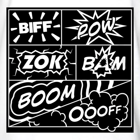
If you picked up some comics at New York Comic Con, you probably spent most of your time admiring the artwork or getting lost in the story. But there’s a whole other layer of communication happening on every page that you might’ve never noticed. Once you do, you can’t stop seeing it.
Comic book lettering isn’t just putting words in bubbles. It’s a language with its own grammar, etiquette, and quirks that’s evolved over decades. Letterer Nate Piekos has built what’s basically the Rosetta Stone of this world over at Blambot, and it’s a rabbit hole worth falling into, if only to not think about … gestures wildly.
Here are a few gems (the site has visual examples for each of these and far more).
The crossbar “I”? It’s not decoration. That version—where the “I” has little horizontal lines on top and bottom—is only for the pronoun “I” and acronyms like F.B.I. Use it anywhere else, and you’re outing yourself as a rookie.
Double dashes? Comics don’t mess with em dashes or en dashes. It’s always exactly two hyphens, used for interrupted speech or semicolon-type pauses. Ellipses—three dots, never more—are for trailing off. They each carry a different rhythm, and pros never mix them up.
And shouting? It’s not just bold letters in a bubble. A real yell gets a jagged, explosive balloon shape. Radio chatter gets a wavy balloon. Whispering gets gray text or dashed outlines. Every shape and texture signals tone and emotion—like punctuation for volume.
These conventions might sound fussy, but they’re invisible glue. Done right, you don’t even notice. Done wrong, and the page just feels off. Piekos’s guide covers it all! TIL that balloon tails should actually point to mouths (not general head areas)! There are also rules for when to connect balloons, how to handle foreign languages, and even whether sound effects deserve punctuation (most letterers say no).
Lettering traditions have shifted too. Thought balloons with bubbly tails have mostly vanished, replaced by square inner-monologue boxes. Hollow sound effects (outlined letters without fills) are a newer stylistic trend that divides old-school letterers. Even spacing rules have changed; we’re (rightfully) down to one space after a period now.
If you’re considering creating comics, Piekos’s guide is absolutely required reading. But even if you’re just a fan, learning this secret language adds another dimension to reading. Once you know the cues, you start catching them everywhere—the way panels guide your eye, how ellipses make you linger, how balloon shapes change the mood.
Next time you flip through your NYCC or weekly haul, slow down and look at how the letters themselves tell the story.
New Heterodox Mono Gone And Didone It (Featured Free Font)

Didone fonts are the ones that look super elegant and high-contrast — like Bodoni or Didot. They have very thin horizontal lines, thick vertical strokes, and sharp, straight serifs (those little feet on letters). Think of them as the fashion models of typography: tall, polished, and dramatic.
They became popular in the late 1700s when printing got precise enough to handle those fine details. Back then, they looked “modern” — clean, rational, and a little bit fancy compared to older, softer Renaissance-style fonts.
Today, you’ll mostly see Didone fonts in luxury branding, magazine titles (like Vogue), and high-end print work. Basically, anywhere that wants to feel refined and “European”.
So, why the history lesson?
Well, I came across a monospaced Didone font, and I know we all 💙 monospaced font Drops in these Tuesday editions. And, truth be told, I kind of felt the need to make y’all as uncomfortable as I felt when working with this font.
New Heterodox Mono is a serifed, Didone-style programming font, inspired by the aforementioned Bodoni and Didot typefaces. It’s been re-engineered to fit the strict grid of a monospace environment (since every letter has to take up the exact same width). It’s based on the open-source Old Standard TT, reshaped and tuned by H.C. Kiang for actual daily coding.
The creator’s philosophy is quite contrarian: most programming fonts today are sans-serif, flat, and purely “functional.” New Heterodox Mono argues that a little beauty and history in your code editor is more of a feature than a bug.
So, this font is a small rebellion against sterile developer aesthetics, and unapologetically weird in a world of uniform monos. The name “Heterodox” says it all: it’s not the mainstream way, but it’s the interesting way.
The section header shows this section set in the font in Zed. (It was changed right back to Maple Mono after the screen capture.)
Relationship Advice
As someone who is increasingly hitting ⌘ + on web pages, I made it a mission to try to stop solely using pt and px in my own CSS work. They are also a bane to sizing accessibility. px is somewhat necessary as a unit on top-level HTML elements (e.g., html { font-size: 16px; }) and can be fine for microscopic details like borders, icons, or a one-off tweak inside a layout that doesn’t need to scale.
pt is mostly a fossil from print design. It’s technically supported in browsers, but it doesn’t map cleanly to screen pixels, and its physical size varies by display density. It’s only useful if you’re generating something destined for print (like a PDF) or working in a hybrid media CSS context.
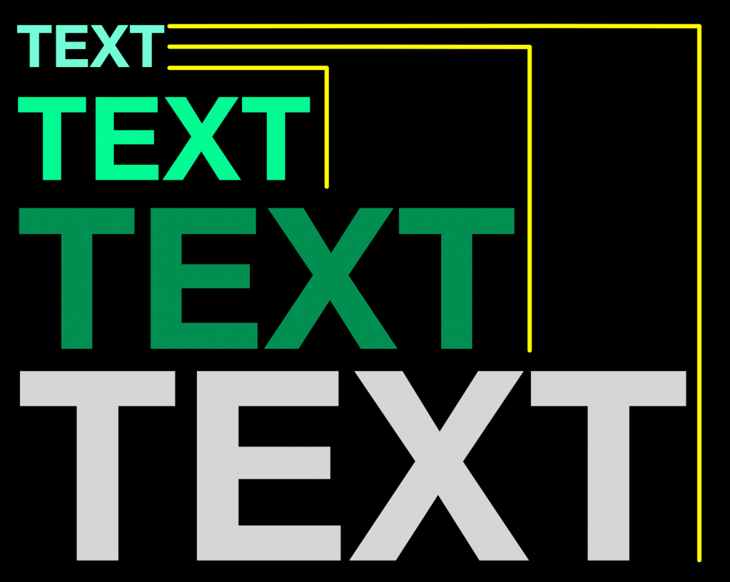
To make a web page fully visually accessible, one has to dig into more advanced relative CSS unit specifications to ensure folks who visit our creations can do so without content getting jumbled. These relative specs can be grouped into two categories: local and root.
At the “local” level, these units take their cues from the element they’re attached to. em is the most common: it’s the element’s font size. If your paragraph is 12px, then 1em equals 12px, and 2em doubles it. ex is tied to the height of the lowercase “x” (a good proxy for midline height), and ch measures the width of the “0” character, which is super helpful when sizing monospace text boxes. There are also cap and ic, which align with the height of capital letters and the width of the ideographic “水” character, respectively.
Then there are “root-relative” units—versions that look outward, not inward. Instead of basing their scale on the element’s font, they reference the root element’s font metrics. rem is the one you’ll see most often: it’s relative to the root element (<html> in most cases). That makes it predictable and ideal for global sizing. If you change one root font size, your whole design rhythm can scale up or down elegantly. The others, like rcap, rch, rex, ric, and rlh, behave like their local counterparts but with a global anchor. They’re newer, more specialized tools for fine-tuned typographic balance—ideal when you want consistent optical proportions across components.
Most Drop readers have primary work to do, and keeping these technical CSS unit details in one’s head is a challenge if they aren’t used regularly. A friendly way to think about them is that the local units dance to their own beat, and root units follow the site’s master tempo. Combine them smartly, and you’ll get text that feels cohesive, responsive, and friendly to everyone’s zoom settings. Once you stop thinking in pixels and start thinking in relationships, CSS typography stops being math and starts being music.
I added this section mostly to help solidify the definitions in my own noggin with a narrative but figured it might help others who may (like me) end up a bit befuddled when reading complex CSS stylesheets.
I should note that we probably should not hard code that html { font-size: 16px; } example from above (though it is fine to do so provided you stick to relative units in the rest of the styles).
html { font-size: 100%; } tells the browser to use the defaults your visitors have set up in their browsers, but I’m not sure most folks take the time to customize that anymore (FWIW, most modern browsers default to 16px).
For radical accessibility, html { font-size: clamp(14px, 1.5vw + 1rem, 20px); } is likely the way to go to set up the initial sizing. It makes the base font size adapt to viewport width, which is great for fluid typography that grows or shrinks with screen size. We’ve covered clamp before but TL;DR, it’s a CSS function that constrains a value between a minimum and maximum bound, using a preferred value that can scale responsively.
I’ll close with a quick reference:
cap: Relative to the height of capital letters in the current fontch: Relative to the height of the “0”em: Font size of the element. If you have a font size of12px, then1emis12pxex: Relative to the height of the lowercase “x” in the current fontic: Relative to the full width represented by the “水”pt:Represents a length in pointsrcap: Cap height (the nominal height of capital letters) of the root element’s font.rch: Average character advance of a narrow glyph in the root element’s font, as represented by the “0”rem: Relative to the font size of the root elementrex: Relative to the root element’sexunitric: Average character advance of a full-width glyph in the root element’s font, as represented by the “水”rlh: Line height of the root element
FIN
Remember, you can follow and interact with the full text of The Daily Drop’s free posts on:
- 🐘 Mastodon via
@dailydrop.hrbrmstr.dev@dailydrop.hrbrmstr.dev - 🦋 Bluesky via
https://bsky.app/profile/dailydrop.hrbrmstr.dev.web.brid.gy
☮️
 hrbrmstr's Daily Drop
Leave a comment