Drafting Mono; No Tears; Semi-Justified Text
The jabs went well! (tho my left shoulder is telling me to say “hi” to y’all right now…it’s so needy)
Two fonts (the first one is “pay-what-you-want”, the second is gratis) and a nigh-forgotten typographical layout technique are on tap for today.
TL;DR
(This is an LLM/GPT-generated summary of today’s Drop using SmolLM3-3B-8bit via MLX and a custom prompt.)
- Owen Earl’s Drafting Mono captures the imperfect feel of typewriters and early print by embracing inconsistency, blending serif and sans-serif forms to create a natural rhythm. https://indestructibletype.com/Drafting/
- No Tears is a free font inspired by Handwriting Without Tears, offering a nostalgic alternative to Comic Sans and evoking memories of elementary school handwriting. https://www.lwtears.com/solutions/writing/handwriting-without-tears
- Semi-justified text uses word-spacing limits to justify lines while allowing ragged alignment in narrow columns, balancing clean edges and readability. https://blog.glyphdrawing.club/semi-justified-text/
Drafting Mono
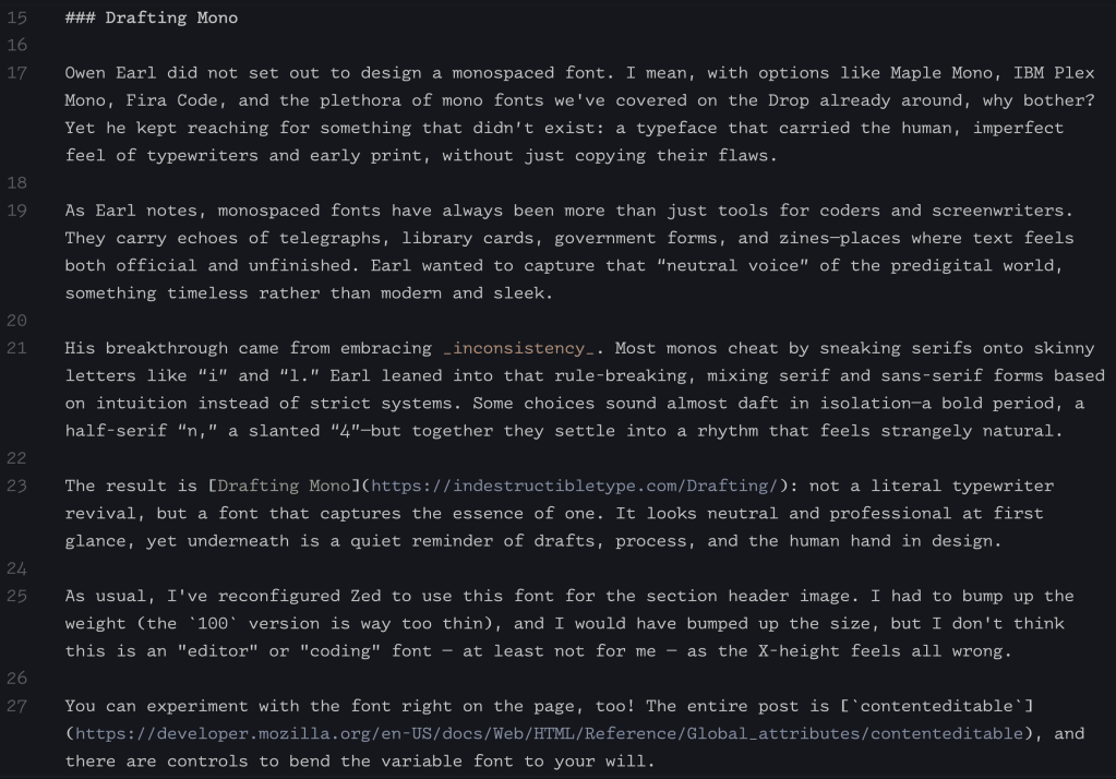
Owen Earl did not set out to design a monospaced font. I mean, with options like Maple Mono, IBM Plex Mono, Fira Code, and the plethora of mono fonts we’ve covered on the Drop already around, why bother? Yet he kept reaching for something that didn’t exist: a typeface that carried the human, imperfect feel of typewriters and early print, without just copying their flaws.
As Earl notes, monospaced fonts have always been more than just tools for coders and screenwriters. They carry echoes of telegraphs, library cards, government forms, and zines—places where text feels both official and unfinished. Earl wanted to capture that “neutral voice” of the predigital world, something timeless rather than modern and sleek.
His breakthrough came from embracing inconsistency. Most monos cheat by sneaking serifs onto skinny letters like “i” and “l.” Earl leaned into that rule-breaking, mixing serif and sans-serif forms based on intuition instead of strict systems. Some choices sound almost daft in isolation—a bold period, a half-serif “n,” a slanted “4”—but together they settle into a rhythm that feels strangely natural.
The result is Drafting Mono: not a literal typewriter revival, but a font that captures the essence of one. It looks neutral and professional at first glance, yet underneath is a quiet reminder of drafts, process, and the human hand in design.
As usual, I’ve reconfigured Zed to use this font for the section header image. I had to bump up the weight (the 100 version is way too thin), and I would have bumped up the size, but I don’t think this is an “editor” or “coding” font — at least not for me — as the X-height feels all wrong.
You can experiment with the font right on the page, too! The entire post is contenteditable, and there are controls to bend the variable font to your will.
No Tears
We’re sticking with another one of Owen’s fonts for this mid-section, since it is back-to-school time, and he’s made a free font inspired by the Handwriting Without Tears handwriting program.
It’s a great alternative to (ugh) Comic Sans, and boy howdy did it bring back some bad elementary school memories (I, literally, “failed” handwriting in Kindergarten).
Semi-Justified Text
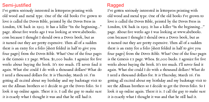
Semi-justified text is an almost-forgotten middle ground between ragged and fully justified alignment. The idea surfaced in the 1980s when an ad agency, Cogent Elliott (provided the content is not randomized, it’s 100% worth hitting that URL), asked for type that was “semi-justified”: mostly left-aligned, but with near-full lines stretched to the margin. The result was a cleaner right edge without the awkward gaps full justification often creates.
In print, justification works well with wide columns. On our glowing rectangles, though, narrow columns turn it into a mess of rivers and uneven spacing. That’s why most online typography defaults to ragged left. Semi-justification offers a neat compromise: justify lines that can fit gracefully, and leave the rest ragged.
The technical trick is elementary. Instead of guessing which lines to stretch, you define word-spacing limits (say 25% tighter or looser than normal). If a line reaches the margin within those bounds, it’s justified. If not, it stays ragged. This means narrow columns naturally fall back to ragged, while wider ones look more polished, without ever producing the “loose tooth” spacing that makes justified web text difficult to read.
Unlike heavyweight algorithms like Knuth–Plass, which juggle entire paragraphs, semi-justification can run line by line. It’s simple enough to imagine in CSS:
text-align: justify;
word-spacing: clamp(-25%, 0%, 25%);
Despite being practical, the method is barely mentioned online (and the post’s author only rediscovered it in thrifted typography books). This obscurity shows how much useful design knowledge hides in forgotten corners, just waiting for someone to dust it off.
FIN
Remember, you can follow and interact with the full text of The Daily Drop’s free posts on:
- 🐘 Mastodon via
@dailydrop.hrbrmstr.dev@dailydrop.hrbrmstr.dev - 🦋 Bluesky via
https://bsky.app/profile/dailydrop.hrbrmstr.dev.web.brid.gy
☮️

Leave a comment