Atkinson Hyperlegible Next; Hyperglot; Preserving Ukrainian Heritage Through Typography
Well, I put off talking about Atkinson Hyperlegible long enough that now I only needed to cover the latest incarnation of it. #winning?
We’ve got both “hype” and heritage on tap for today. And, if resources allow, please consider a donation to the Kyiv Type Foundry.
TL;DR
(This is an AI-generated summary of today’s Drop using Ollama + llama 3.2 and a custom prompt.)
- The Atkinson Hyperlegible Next font family enhances readability and accessibility for individuals with low vision through carefully crafted letterforms and expanded features (https://www.brailleinstitute.org/freefont/).
- Hyperglot, created by Rosetta Type Foundry, helps ensure multilingual typography by tracking character needs for various languages and checking font support via a command-line tool, Python package, or database (https://hyperglot.rosettatype.com/).
- The Kyiv Type Foundry preserves Ukrainian heritage by documenting and recreating typography from Kyiv’s metro stations, offering these fonts freely to Ukrainians and by donation to others (https://www.itsnicethat.com/features/kyiv-type-foundry-metro-fonts-graphic-design-typography-spotlight-200125).
Atkinson Hyperlegible Next
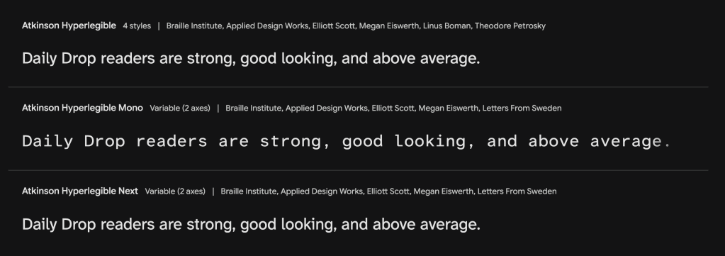
A good font can fade into the background, doing its job without calling attention to itself. But for individuals with low vision, the right font can be transformative. The Braille Institute understands this acutely, which is why they co-developed the Atkinson Hyperlegible font family with the team over at Applied Design. The latest iteration, Atkinson Hyperlegible Next, builds upon the original’s success to further enhance readability and accessibility.
This typeface was designed with the specific goal of improving legibility for people with low vision. The letterforms are carefully crafted to be unambiguous, with clear distinctions between similar characters. Open counters, angled spurs, and longer tails all contribute to the font’s enhanced readability. The newest version comes in seven weights (the original had two), each with an accompanying italic style, plus includes a variable font format as well as a monospace version, perfect for your terminal machinations. An expanded character set (4,464 per font) and language support (up to 150 languages from the original 27), give designers — which is all of us — quite a bit more flexibility and range for a variety of uses.
Traditional fonts can be difficult to read for individuals with visual impairments, leading to eye strain and reading fatigue. Atkinson Hyperlegible Next mitigates these issues, allowing for more comfortable and sustained reading. The benefits extend beyond low-vision users; its clear design can also improve readability for people with dyslexia or other learning disabilities. In fact, there are over 40 million unique website impressions via Google Fonts that feature the original Atkinson Hyperlegible font.
The designers at Applied Design emphasize that while true “universal design” might be an unattainable ideal, focusing on improving access for a particular group can lead to unexpected benefits for others. They also view their work as a means of reducing stress and improving people’s lives, and advocate for questioning established norms and continuously seeking ways to enhance accessibility in various aspects of life. And, when you think of it, we interact with/consume fonts virtually every single day of our lives. We need to keep that in mind whenever we release some new idea into the universe in “written” form. Being a bit more deliberate in the choice of something to basic as typeface could have an equally profound impact as the words/ideas we’re hoping to convey.
Hyperglot
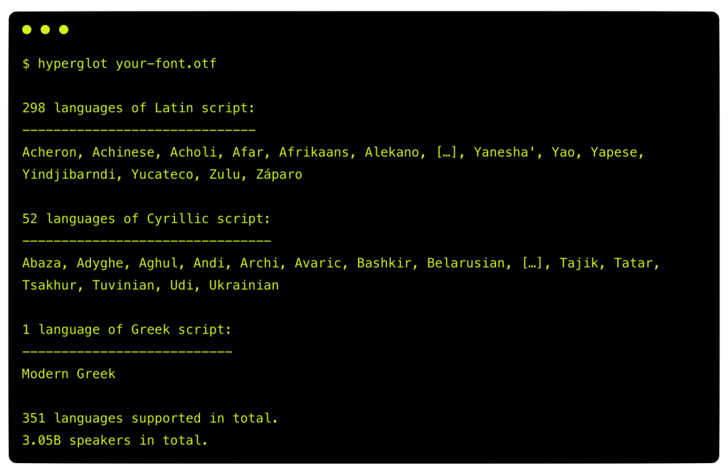
Have you ever noticed how some websites look great in English but fall apart in other languages? That’s due to a sad but understandable fact that multilingual typography is often an afterthought. Hyperglot (GH), created by Rosetta Type Foundry, is hoping to help change this status quo.
Their resource answers a straightforward question: “Can I use this font for that language?” It does this by tracking which characters each language needs and checking if a font you desire to use has them all. And, in a testament to their accessible misson, you can do so via a command-line tool, a Python package, or directly through through their database. The system currently covers over 775 languages and continues to grow.
As hinted at in the first section, most design workflows tackle language issues too late. We pick fonts, create layouts, and only discover problems when the need for translations arrive. Hyperglot flips this approach by letting you test typography across languages from the start.
When you upload a font to Hyperglot, it tells you which languages you can support. It shows how many speakers your font can reach and what you’d need to add to support more languages.
Now, solid language support isn’t just about having all the right letters. A font needs glyphs that look right for each language and work together properly. Some languages need specific combinations to form ligatures or require special spacing between characters. Hyperglot checks all these aspects to help ensure your font truly works for the languages you need.
Type designers use Hyperglot to see which languages their fonts support and what they need to add to reach more users. UI designers use it to test designs with actual writing systems before implementation. Developers use it to validate font files, and global organizations use it to ensure brand consistency across regions.
The project is deliberately unfinished. Rosetta acknowledges that mapping every language is beyond any one team. Each language entry is labeled with its verification status, and the team welcomes input from native speakers to improve the database.
Preserving Ukrainian Heritage Through Typography
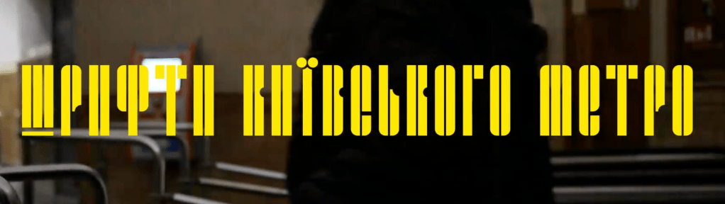
The Kyiv Type Foundry is undertaking a remarkable cultural preservation project by documenting and recreating typography from Kyiv’s metro stations. Born from the devastation of Russia’s 2022 invasion, this initiative transforms architectural lettering into functional typefaces, with the goal of creating a living archive of Ukraine’s visual cultural heritage.
The project began with workshops at Cooper Union in New York, where participants took an “imaginary walk” through Kyiv, examining both recent destruction and the city’s rich typographic history. The founders then organized online type design workshops specifically for Ukrainians, focusing on Cyrillic letterforms found throughout the metro system.
Five distinctive typefaces were ultimately developed, each representing different eras and architectural styles of Kyiv’s metro stations—from 1960s nuclear shelter-inspired serifs to mid-70s techno-style lettering. These fonts are available free to Ukrainians and by donation to others, with proceeds supporting Ukraine’s military efforts.
This innovative approach to cultural preservation captures something often overlooked during conflict: the unique visual language of a place and its people. To learn more about this super cool intersection of typography, architecture, and cultural resilience, check out the complete It’s Nice That’s interview with the founders.
FIN
Remember, you can follow and interact with the full text of The Daily Drop’s free posts on:
- 🐘 Mastodon via
@dailydrop.hrbrmstr.dev@dailydrop.hrbrmstr.dev - 🦋 Bluesky via
https://bsky.app/profile/dailydrop.hrbrmstr.dev.web.brid.gy
Also, refer to:
to see how to access a regularly updated database of all the Drops with extracted links, and full-text search capability. ☮️

Leave a comment