xit; In Defense of Text Labels; Bad Apple 🤫 🔑
While this likely goes without saying (since y’all are obviosly brilliant humans—I mean, you do subscribe to the Drop, after all), but — just because the U.S. was daft enough to do this does not mean it is either safe or ethical to dabble in cryptocurrency.
With that out of the way, we have another zero-theme Drop, but I think there’s at least one of the three sections will appeal to most readers.
TL;DR
(This is an AI-generated summary of today’s Drop using Claude 3.7 wiuth custom prompt.)
Note the change-up today…I wanted to see how the latest Claude handled the extraction/summarization.
- Xit is an experimental version control system built in Zig that combines snapshot and patch-based approaches, featuring Git compatibility, FastCDC chunking for binary files, and a clean implementation with no third-party dependencies (https://github.com/radarroark/xit)
- Text labels are essential in user interfaces as they reduce cognitive burden compared to ambiguous icons, with the most effective interfaces using icons and text as complementary tools rather than competing approaches (https://www.chrbutler.com/in-defense-of-text-labels)
- Someone created a version of the famous “Bad Apple” animation using SSH randomart images generated from key fingerprints, demonstrating another creative implementation of this popular animation (https://www.5snb.club/posts/2025/bad-apple-but-its-ssh-keys/)
xit

Xit (GH) is an experimental version control system positioned as a modern reimagining of Git, currently in early development with some fairly clever implementation choices.
Built in Zig, Xit deliberately avoids third-party dependencies to guarantee reliability — i.e., every bug is their bug (assuming Zig is infallable). This clean-slate approach firther extends to the Xit storage engine, which uses an (WIP) immutable database that enables a theoretical “universal undo” capability. Unlike Git’s purely snapshot-based model, Xit takes a hybrid approach: network operations and file restoration use snapshots like Git, while merging/cherry-picking adopts patch-based semantics from systems like Darcs. This attempts to pair Git’s performance with more intuitive conflict resolution.
The system introduces FastCDC chunking for binary/large file handling, avoiding Git’s compression pitfalls with media assets. Its included TUI interface (still super basic) is (or, will be) great if you prefer interactive workflows rather than CLI machinations. The CLI syntax consciously mirrors Git (xit commit, xit branch), easing adoption for Git veterans while introducing new primitives like reset-add for granular staging control.
At v0.x, Xit implements core workflows (commit, branch, merge) and basic Git protocol compatibility for push/fetch/clone. However, missing features include:
- Mature conflict visualization
- Full
pullimplementation (requiresfetch+mergeworkaround) - Binary diff optimizations
- The aforementioned undo subsystem
I gave it a go and it does “work,” but since I use Git quite a bit for a living, I can’t justify running it a as a daily driver (or getting used to the additional features) quite yet.
In Defense of Text Labels

Christopher Butler argues that text labels are essential in user interfaces, as relying solely on icons creates unnecessary cognitive burden. Modern interfaces are overloaded with icons that force us to expend mental energy interpreting them rather than using the tools they represent.
Icons rarely communicate a clear, singular meaning immediately. Even seemingly straightforward icons like the pencil can be ambiguous — does it mean create, edit, write, or draw? This ambiguity can often result in a pause to process the meaning, creating small but cumulative cognitive delays.
As interfaces grow more complex, the problem compounds. What might work with 5-7 core functions becomes unmanageable with 15-20 features, requiring increasingly abstract visual distinctions between icons. The communication burden increases for each icon as feature sets expand, making it particularly difficult to distinguish between similar actions like creating versus editing. I find this to be particularly true in apps like Photoshop and Omnigraffle.
Icons also function as an interface-specific language within a broader ecosystem of interfaces. Applications run within browsers that run within operating systems, creating multiple levels of complexity. Custom icons force us to learn a new visual language while maintaining awareness of established conventions, and standardized icon sets can create cross-context confusion when the same icon represents different functions across applications.
Text processing, on the other hand, is remarkably efficient. Our brains process familiar words holistically rather than letter-by-letter, making them effective information carriers. We’ve spent our lives recognizing words instantly, while app icons often require learning new visual vocabulary. Text scanning is also more efficient — a stacked list requires only top-to-bottom scanning, while icon grids demand both vertical and horizontal scanning.
Adding text labels to icons serves dual purposes: clarifying meaning and providing greater creative freedom for designers. When an icon’s meaning is reinforced by text, we can scan more quickly and confidently. Designers can focus more on creating a unified visual language when not relying solely on icons to communicate function. Whenever the option to use both icon + text, or just text, is presented to me in any app, I take full advantage of that feature.
This isn’t an argument for eliminating icons entirely. Icons serve as effective visual landmarks and anchors in text-heavy applications, helping differentiate functional areas from content areas and drawing the eye toward interactive elements. The combination of icon and text label creates clearer affordances than either element alone.
The most effective interfaces recognize that icons and text aren’t competing approaches but complementary tools that work best together. The most elegant solution isn’t always what looks simple, but what makes communication and understanding feel simple.
Bad Apple 🤫 🔑
We’ve covered Bad Apple in a previous Drop in the context of someone embedding the animation into a font. If you’re not familiar with it, this will help set some context:
What was that you were just mumbling? It sounded like “Um…hrbrmstr…what does this have to do with those two emojis?”
Brilliant. Question!
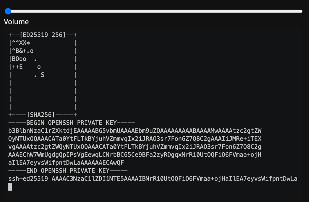
OK, so, did you know that you can make art with your SSH keys? You should, since you do that everytime you make one:
$ ssh-keygen -f what-if-i-prefer-oranges
Generating public/private ed25519 key pair.
Your identification has been saved in what-if-i-prefer-oranges
Your public key has been saved in what-if-i-prefer-oranges.pub
The key fingerprint is:
SHA256:TUwJ057s37t8knJoUjbW2zKtUk6fss59uQKORBgJZAg hrbrmstr@pears.com
The key's randomart image is:
+--[ED25519 256]--+
| E. o+. +o..     |
|   ..  o +o      |
|        ooo.     |
|       . ++      |
|        S..  .   |
|         ...= +  |
|        . o=.B *o|
|         ...B+@o*|
|           o.BO@o|
+----[SHA256]-----+
SSH randomart images use the fingerprint hash output, and interpret it as a set of instructionsm. You can read all about that here.
Some clever human decided to throw together a bit of Rust code to make yet-another Bad Apple — but it’s SSH keys. (blog lanuage warning for that link)
I won’t steal their thunder and embed it here, but you can absolutely grok that it’s using the key art frames to mmimc the OG animation.
FIN
Remember, you can follow and interact with the full text of The Daily Drop’s free posts on:
- 🐘 Mastodon via
@dailydrop.hrbrmstr.dev@dailydrop.hrbrmstr.dev - 🦋 Bluesky via
https://bsky.app/profile/dailydrop.hrbrmstr.dev.web.brid.gy
Also, refer to:
to see how to access a regularly updated database of all the Drops with extracted links, and full-text search capability. ☮️

Leave a comment