Type Scales; Hellboxes; Featured Free Font: Bricolage Grotesque
Today, we’ve got two resources that will help level up your typography game and one that will make you glad we live in modern times.
47 Watch has been updated with a menu to choose which type of executive documents collection to list/sort, and several entries have had “action” updates which track what individuals and agencies have done to implement those orders.
TL;DR
(This is an AI-generated summary of today’s Drop using Ollama + llama 3.2 and a custom prompt.)
Quick note that both my custom local llama 3.2 tldr model and custom pplx space consistently failed to provide the correct link for the first bullet, even after three tries each. I wonder what characteristics of the text caused that.
- Type scales in typography mirror musical intervals and mathematical ratios, with options ranging from the subtle Minor Second (1.067) to the naturally pleasing Golden Ratio (1.618) (https://baseline.is/tools/type-scale-generator/)
- Hellboxes were containers used in traditional metal typesetting to collect used or damaged type for recycling, managed by printer’s devils and contributing to printing shops’ reputation as dangerous workplaces (https://en.wikipedia.org/wiki/Hellbox)
- Bricolage Grotesque is a variable font by Mathieu Triay that combines French and British typographic influences, featuring 8 primary masters and sophisticated optical size adjustments (https://ateliertriay.github.io/bricolage/)
Type Scales

When we look at gorgeous typography, we’re actually experiencing mathematics and music theory at work. The type scales that designers use today have their roots in the same mathematical relationships that make music mellifluous to our ears.
In Western music, the distance between two notes is called an interval. These intervals are based on frequency ratios — mathematical relationships between sound waves. For instance, when you play middle C on a piano and then the G above it (known as a perfect fifth), the G vibrates precisely 1.5 times faster than the C. This 1.5:1 ratio creates a pleasing sound to our ears.
Designers discovered that these same ratios could create visual harmony, and developed a set of key ratios for use in various contexts.
The Minor Second (1.067) is like whispering — it creates subtle differences perfect for body text variations. Imagine reading a novel where footnotes are just slightly smaller than the main text. That’s the minor second at work.
The Perfect Fourth (1.333) provides a comfortable step up, like the distance between a paragraph and a subheading. It’s noticeable but not jarring.
The Perfect Fifth (1.500) creates dramatic contrast – think of a main headline compared to body text. It commands attention while maintaining harmony with the overall design.
At 1.618, the Golden Ratio deserves special mention. This mathematical constant appears throughout nature — in seashells, flower petals, and even galaxy spirals. When applied to typography, it creates proportions that feel naturally pleasing to the human eye.
Modern designers use these scales to create cohesive typographic systems. For example, if your body text is 16px, using the Perfect Fourth scale (1.333) would make your next size up 21px (16 × 1.333). Continue this progression, and you get a harmonious series: 16px, 21px, 28px, 37px.
Understanding these relationships helps us create designs that feel naturally balanced and pleasing. Just as a well-composed piece of music flows effortlessly, typography based on these musical ratios creates visual rhythm and harmony that guides readers through content seamlessly.
Baseline has a nice type scale generator that will let you experiment with these different scales, and we’ll talk about a completely different approach to type scales next Tuesday.
Hellboxes
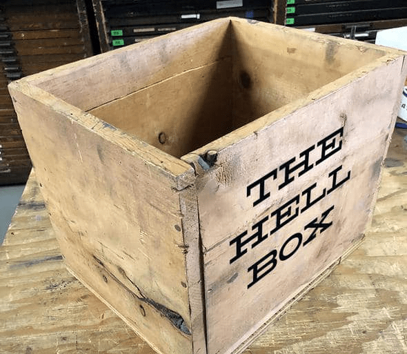
Hellboxes were essential receptacles in traditional printing operations during the era of metal typesetting, which — as all Drop readers know by now — began with Gutenberg in 1436.
The hellbox collected used, worn, or broken metal type sorts after printing jobs were completed. Printer’s devils (young apprentices) were tasked with sorting through the hellbox contents, either cleaning and returning usable type to job cases or preparing damaged pieces for recycling.
When continuous casting and hot metal typesetting machines like Linotype became prevalent, hellboxes became primarily used for collecting damaged type that would be melted down and recast into new pieces. This recycling system was crucial for maintaining printing operations, as evidenced by modern type foundries like Ed Denovan‘s (⚠️ that was a Threads link) Hellbox Letter Foundry, where the tradition continues.
The work was often hazardous — one historical account mentions a starburst splatter of lead on a printing shop ceiling, demonstrating the dangers of mishandling molten type. This dangerous aspect likely contributed to printing shops being historically viewed as somewhat diabolical places.
Featured Free Font: Bricolage Grotesque
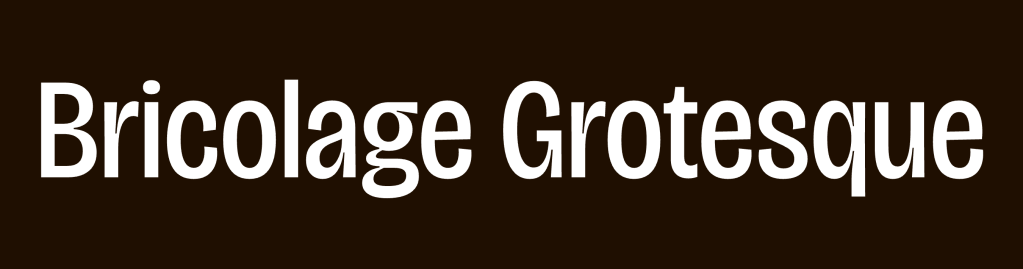
Bricolage Grotesque (GH) (GF) variable font that intertwines French and British typographic traditions. Created by Mathieu Triay, it evolved from a fork of Mayenne Sans and incorporates influences from both Antique Olive and Stephenson Blake‘s Grotesque series.
The typeface embodies a deeply personal narrative, reflecting Triay’s experience as a French designer living in England. Its design space allows for transformation from a more relaxed, French-influenced regular width to a more anxious, British-inspired compressed style.
The font is built using 8 primary masters:
- Bold and Thin
- Compressed Bold and Compressed Thin
- Matching sets for 12pt optical size
It supports multiple languages, including Vietnamese, and features sophisticated optical size adjustments that automatically optimize the typography for different display sizes.
The name “Bricolage” (French for improvising with available materials) reflects the font’s nature as a cultural hybrid. The design successfully bridges historical references with contemporary needs, creating what Triay describes as a “platypus of a typeface” — something that defies simple categorization.
FIN
Remember, you can follow and interact with the full text of The Daily Drop’s free posts on:
- 🐘 Mastodon via
@dailydrop.hrbrmstr.dev@dailydrop.hrbrmstr.dev - 🦋 Bluesky via
https://bsky.app/profile/dailydrop.hrbrmstr.dev.web.brid.gy
Also, refer to:
to see how to access a regularly updated database of all the Drops with extracted links, and full-text search capability. ☮️

Leave a comment