Mudlark Rescue; Mimetic; Monaspace 1.1.0
Historical font intrigue, better web typography, and an overhaul of a Drop fav font family await ye, intrepid readers!
TL;DR
(This is an AI-generated summary of today’s Drop.)
- Doves Type, a custom typeface created for the Doves Press publishing house in the late 1800s, was destroyed by co-founder T.J. Cobden-Sanderson out of spite. However, designer Robert Green has worked to painstakingly recreate the typeface, even recovering some of the original metal sorts from the Thames river with the help of divers and mudlarks. [https://typespec.co.uk/doves-type/]
- The
mimeticJavaScript library addresses the limitations of responsive design when it comes to font scaling on the web, allowing for predictable scaling without side effects and maintaining proper browser zoom functionality across all JS-enabled browsers. [https://github.com/julienetie/mimetic] - Monaspace, a popular variable font series released by GitHub Next, has been updated to version 1.1.0 with over 30 issues addressed, significant ligature improvements (a breaking change), and a new public roadmap. WezTerm users will need to update their configuration to take advantage of the new features. [https://github.com/githubnext/monaspace/releases/tag/v1.100]
Mudlark Rescue

Today, kerfuffles involving fonts almost always involve some legal issue around misuse or theft of font files/families. Back in the days when fonts were meatspace denizens, that was not always the case.
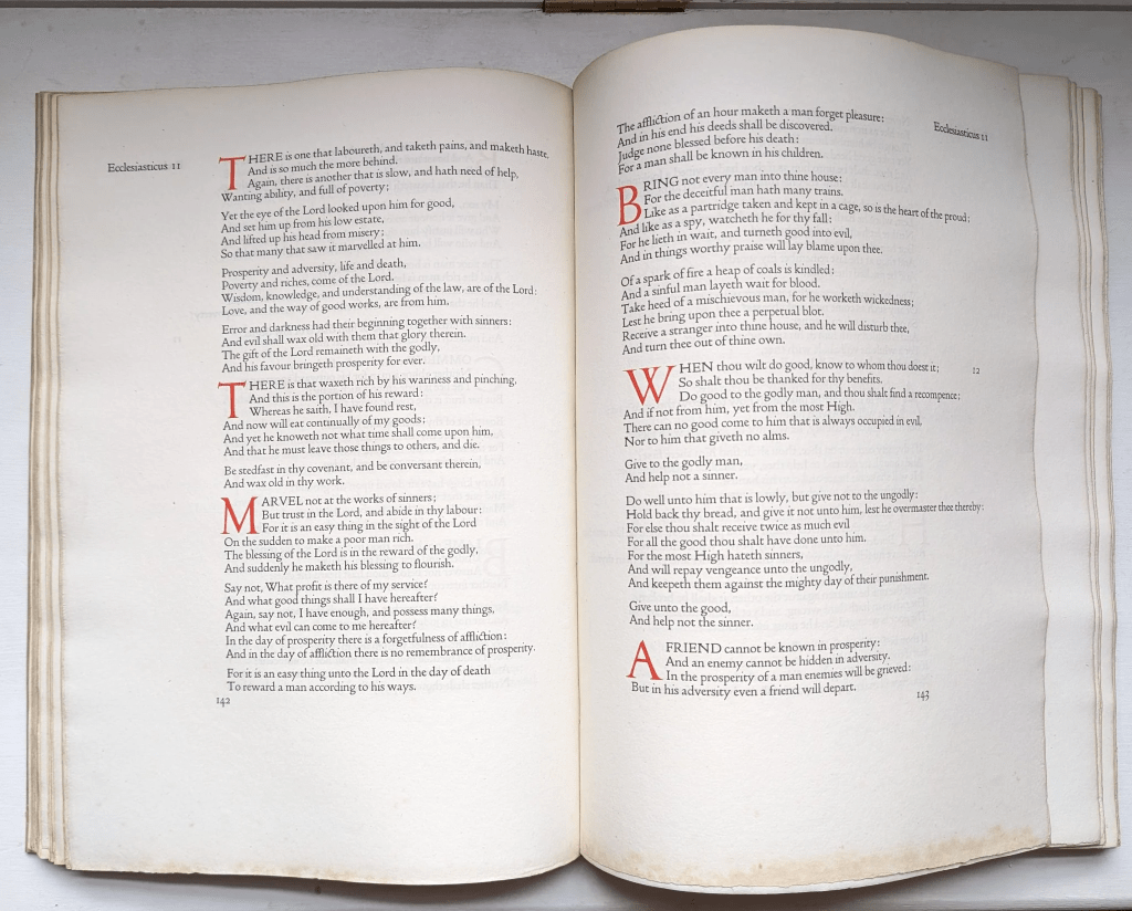
Recovering lawyer (can one ever truly recover from going down that sad occupation path?), Thomas James Cobden-Sanderson (TIL Encyclopedia Britannica is still “a thing”), had a business partner — Emery Walker. Together, in the late 1800’s, they formed Doves Press, a prestigious publishing house. Doves Press is famous for many works, including their “Doves Bible” print of the King James Bible, seen in the section header.
T.J. commissioned a custom typeface, Doves Type, that was used in all their works. It came in one size (16pt). Remember, fonts were physical metal components, and labor, plus materials, can add up.
At some point during their business machinations, the pair became embroiled in a protracted and bitter dispute involving the rights to the Doves Type. They dissolved the business, and in the final agreement, Walker was awarded the rights to the Doves Type upon the death of Cobden-Sanderson. Instead of letting this happen, Cobden-Sanderson destroyed the matrices (moulds) and punches (the stamps used to make sorts — the individual type glyphs) on Good Friday in 1913, when he threw them into the Thames river off Hammersmith Bridge in London, a short walk from the Press.
Sanderson then made 170 trips to the river from August 2016 to January 1917 to dispose of all the individual sorts, leaving them lost in time. Or, so the story might have ended.

Robert Green really liked the typeface and did his best to recreate it as a digital typeface back in 2013. This involved a meticulous process of examining each printed letter and working to reproduce the individual glyphs. It worked, but Green was never truly satisfied. He dug into the lore surrounding Doves Press, and even pored over Sanderson’s journals.
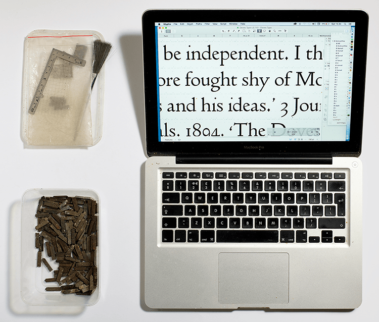
In November 2014, Green tapped the Port of London Authority’s diving team to help recover 151 metal sorts from the Thames. While that was not the complete set, it was sufficient to help level up Green’s original efforts. His quest has not ended, however! After the diving team finished their work, Green enlisted local mudlarks to keep an eye out for more sorts as they went about their scavenging ways. They found more! And, they continue to keep their eyes peeled for the sorts to this day.
I can only imagine what T.J. would do, today, to accomplish the same, spiteful goal. I think it would be nigh impossible to fully eradicate an OTF, TTF, or variable font file from existence. Perhaps this is one positive aspect of our modern, digital lives.
You can see and purchase a copy of the typeface over at typespec.
Mimetic

Responsive design has limitations when it comes to font scaling on the web. Fonts are essentially static and do not scale proportionally across different screen sizes and resolutions. This creates challenges in web design and implementation, such as content display limitations, animation issues, and the need to account for a wide variety of browsers and devices
Existing font scaling libraries and techniques like SVG, Canvas, WebGL, and viewport units all have drawbacks – they either lack browser compatibility, break accessibility features like zoom, or fail to properly scale other relative dimensions like padding and margin.
Julien Etienne felt this pain quite deeply and designed a JavaScript library called mimetic to address these issues. The library scales relative font units to the viewport without breaking the browser’s zoom functionality. It detects the browser’s zoom level and scales the design accordingly, working across literally every JS-enabled browser.
Etienne recently released a hefty update to the library.
What do you get in exchange for 2.5K web app bloat increase?
- Predictable scaling without side effects like overflows and collisions
- Reduced need for media queries, as the design scales linearly
- Improved accessibility by maintaining proper zoom functionality
- Cross-browser compatibility without browser sniffing or user agent detection
You can dig into many details at Julien’s Medium (ugh) post.
Monaspace 1.1.0

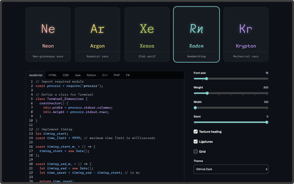
Longtime readers know I’m a yuge fan of Monaspace (Radon Variable, to be specific, as seen in the section header). This series of fonts was released at GitHub Next back in November, 2023. If there was ever a doubt about whether fonts are software, this release should erase said doubts from your mind.
What’s new/different?
- they have addressed over 30 issues, some of them pretty gnarly. Monaspace should look better and work better across operating systems, editors, and programming languages.
- they have significantly revamped the way ligatures work. This is a breaking change, and if you used Monaspace v1.0, you will almost certainly need to change your editor settings.
- there’s a new public roadmap
There are too many issues to toss here to give them a look, grab the new release, and make changes accordingly.
While you’re at it, see what’s in store for version 1.2.0.
NOTE: WezTerm users will want to update:
harfbuzz_features = {"calt=1", "ss01=1", "ss02=1", "ss03=1", "ss04=1", "ss05=1", "ss06=1", "ss07=1", "ss08=1", "liga=1", "zero=1", ""},
immediately after installing the new versions.
FIN
Remember, you can follow and interact with the full text of The Daily Drop’s free posts on Mastodon via @dailydrop.hrbrmstr.dev@dailydrop.hrbrmstr.dev ☮️
Leave a comment