Stack & Justify; BlockFace; Glyph of the Day
The “rules” say it’s bad form to shunt folks away from your own content right off the bat, but Andy Kirk’s (Visualizing Data) inaugural newsletter is out, and it’s as good as I hoped it would be. Check it out and mash the subscribe button!
- Stack & Justify: A web app by Max Esnée that automates the creation of type specimens by matching the width of different words or phrases, facilitating the design process for typographers. This tool is highlighted for its potential to save time and inspire creativity in typeface design, especially useful in responsive design contexts. Primary resource: Stack & Justify
- BlockFace: A modular typography printing kit designed by Will Mower and produced by the Open Press Project, allowing users to explore printmaking and typography by constructing letterforms and designs. The kit is based on a 10mm grid system and includes a TypeBook for guidance, aiming to blend digital and physical creative processes. Primary resource: BlockFace
- Glyph of the Day: A blog by Kate Sherwood that focused on glyphs and writing systems, offering a mix of light and deeper dives into typographic elements. Although no longer actively updated, the blog serves as a resource for those interested in the intricacies of glyphs. Primary resource: Glyph of the Day
Stack & Justify

This section’s resource is a bit niche, but the tech behind it is open-source, and the UX is smooth and fun, so it’s at the top of today’s list.
Stack & Justify (GH) is a super cool web app created by Max Esnée, that lets us build type specimens, but with a twist!
What are “type specimens”? Well, you’ve seen them every time you go to Google Fonts (et al.). They help showcase typeface designs by presenting the constituent fonts, individual characters and glyphs in a particular theme or context. Occasionally, this is on an actual product (or render). However, they can be just rows of type with some text, that help demonstrate the individual flare or feel the typographer was going for. In the case of Esnée, he came up with the clever idea of building a tool you can add any combination of fonts to, and his code does some spiffy maths to find words or phrases of the same width. Doing this by hand could be challenging (to say the least).
By automating the process of matching the width of different words or phrases, Stack & Justify enables designers to quickly generate harmonious and visually appealing type specimens. This is particularly useful in the early stages of typeface design, where visual consistency across different characters and words is paramount. The tool’s ability to streamline this aspect of type design not only saves time but also opens up new creative possibilities, letting designers experiment with different combinations of words and phrases that they might not have considered otherwise.
It’s also a great way to get a view of the results of your font hoarding collection.
In the context of responsive design, where the layout and typography must adapt seamlessly across different screen sizes and devices, the tool can be a valuable asset. By ensuring that text elements maintain a consistent width, designers, and developers can create more cohesive and adaptable web pages. This level of precision and flexibility is almost essential, especially when the quality of your audience’s experience can make or break a website’s success.
It’s all client-side, and the JavaScript that powers it is very readable/hackable.
I feel compelled to point out that type specimens have been around for ages, including outside of our glowing rectangles. It’s fun to take a look at different typographer’s takes on the physical medium of type specimens.
The section header is an example of one specimen I built from some local fonts.
If this has piqued your interest in type specimens, you’ll 💙 this site/newsletter
BlockFace

BlockFace (Kickstarter) is an _easy-to-use modular typography printing kit designed by graphic artist Will Mower. Combine the stamps to construct letterforms, design typographic posters and cards, and explore the joys of printmaking”.
If you’ve always wanted to feel what it might have been like to work back in the physical letterpress days, BlockFace seems like a decent, modern take on the practice.
It was created by graphic artist Will Mower and produced by the Open Press Project — yes, if you went there, you did see 3D printed mini-printing presses! BlockFace aims to bridge the gap between digital and physical creative processes, offering a spiffy analog alternative to screen-based design work.
In essence, this is a stamp kit that lets folks construct various letterforms and designs for a wide range of applications. Anythign from general artworks, handmade signs, T-shirts, and more. The kit is based on a 10mm grid system, allowing for precise and modular construction of letters and designs. Folks can follow the included TypeBook to recreate six typeface styles or combine elements to create their own unique designs. The project emphasizes modularity, creativity, and the tactile experience of printmaking.
I’m going to grab a set for #2 and see if I can get her and #2.1 interested in this creative process.
Glyph of the Day

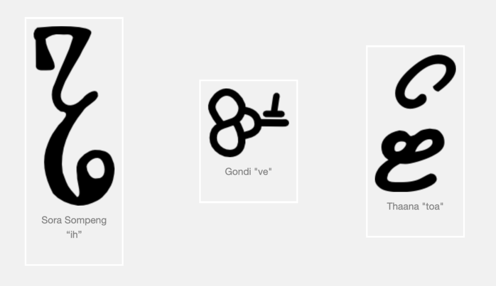
Glyph of the Day is/was (it’s no longer being actively updated) blog created by Kate Sherwood, where the focus is on all things related to glyphs/writing systems.
It was active for just over a year. And provides a nice mix of light and deeper dives into a wide array of these typographic atoms.
Start here and work your way through to the end.
FIN
Remember, you can follow and interact with the full text of The Daily Drop’s free posts on Mastodon via @dailydrop.hrbrmstr.dev@dailydrop.hrbrmstr.dev ☮️
Leave a comment