dot-font; Letraset; Featured Free Font: Glina Script
Your friendly neighborhood hrbrmstr messed up the schedule picker again in WordPress, though I think I was a day ahead mentally due to the extended weekend really messing up my sense of time.
We’re kickin’ it old-school, again, in the typography-centric edition of the Drop. I was sifting through an old set of bookmarks when I came across some saved articles from John (featured in the first section), and then got super nostalgic for the topic in the middle section after reading through the collection of John’s articles.
TL;DR
(This is an LLM/GPT-generated summary of today’s Drop. This week, I continue to play with Ollama’s “cloud” models for fun and for $WORK (free tier, so far), and gave gpt-oss:120b-cloud a go with the Zed task. Even with shunting context to the cloud and back, the response was almost instantaneous. They claim not to keep logs, context, or answers, but I need to dig into that a bit more.)
- Dot‑font showcases John D. Berry’s collected essays preserving a transitional era of typography, highlighting the human stories behind tools and typefaces (https://dot-font.com/)
- Letraset recounts the tactile history of dry‑transfer sheets that let designers create crisp layouts by hand before desktop publishing rendered the process obsolete (https://imagetransfers.com/blog/history-letraset-instant-transfers/)
- Glina Script, a free handwritten typeface by Liese Mars, offers soft, organic Latin and Cyrillic characters for friendly, expressive designs under an open license (https://www.behance.net/gallery/221558065/Glina-Script-Free-handwritten-typeface)
dot-font
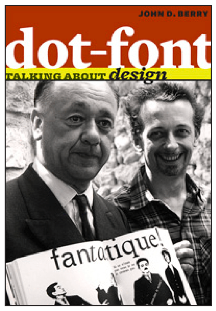
Dot-font feels like a snapshot from a brief, in-between era: desktop publishing was no longer new, but digital typography still hadn’t become the invisible infrastructure it is now. Things worked, mostly. But, you could still “see the seams”.
John D. Berry was a steadfast sherpa for that moment. Before these essays, he was one of the editors and publishers of U&lc (“Upper and lower case: the international journal of graphic design and digital media”), a famous typography magazine that introduced a lot of designers to new typefaces and new ideas. In his CreativePro column (2000–2003), he brought the same talent: he notices what’s interesting “this week” and explains why it matters, without turning it into a lecture. Those essays/articles were collected into a (free) book, and have preserved a bit of typography history that might otherwise have been lost. The pieces in it aren’t meant to be comprehensive. They jump from a vintage Nebiolo specimen book to Microsoft font work, from Letraset stencil history to Sumner Stone at Adobe—whatever grabbed his attention and had a story behind it.
This collection captures how typography felt at that moment in time. Metal type wasn’t ancient history yet. Phototype already had a whiff of nostalgia. PostScript fonts (yes, those were/are “a thing”) were just “how computers did fonts.” Berry writes with true excitement about multiple master fonts — technology that would let a designer smoothly vary a typeface’s weight and width — before the industry effectively set that idea aside for years. And he keeps returning to the people in the work: type designers building careers from spare rooms, Zapf telling the origin story of Optima, and a conference talk happening in the stunned days after September 11. It’s less “fonts as objects” and more “fonts as the product of human effort under changing tools.”
Berry’s best trick is making the technical bits feel grounded. He points out small, vivid observations, such as folks watching Letraset stencil cutters (more on that in the mid-section) and unconsciously mimicking the hand motions. He enjoys Robert Norton’s dry humor in Microsoft documentation. Likewise, he explains how some “design choices” were actually forced by machines, like why Sabon’s italic had to match the roman’s width on Linotype equipment—and how those constraints can echo for decades.
Reading it now, Berry’s big point comes through clearly: writing about type isn’t really about obsessing over shapes. Such commentary is more valuable when it leans into the messy collaboration between craft, technology, and everyday reading. These short essays will hopefully make you notice the built world of letters a little more and further appreciate the folks who sweat the details most of us never think about.
Letraset
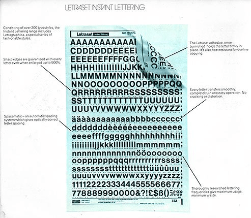
(I vividly remember coming across sheets of Letraset transfers when I was a wee lad, which likely started me down the typography obsession path.)
Letraset (WP) is another instance of something so profoundly useful that we (for a time) noun-ified it (like the way folks used to say “Xerox” when they meant “make a copy”). For a couple of decades, if you were making anything that needed to look clean and finished (e.g., architectural boards, record covers, ad comps, school posters that were trying very hard to not look like school posters), there was a decent chance Letraset was involved somewhere along the line.
The original magic was the dry transfer sheets. They were such a simple idea: a clear carrier sheet, perfectly drawn letters, and a backing that would let each character let go when you rubbed it with a burnisher or a pen. But in practice it felt like cheating. You could get sharp, professional type on paper or illustration board without access to typesetting, without a darkroom, without a printer, and without steady hands. The sheets were meticulously organized by face, size, and color, and you learned the little rituals fast: keep your hands clean, tape the sheet down so it doesn’t drift, rub from the center outward, lift a corner to check adhesion, curse softly when an “e” half-transfers and you have to decide whether you’re going to live with it or start over.
And it wasn’t just alphabets. Letraset was a whole ecosystem. Symbols, rules, borders, halftone-ish textures, pattern fills, sheet after sheet of visual shortcuts for people building layouts by hand. There’s a particular kind of nostalgia to it because it’s tactile and slightly stressful. You didn’t “undo.” You committed. You planned spacing with a pencil and a ruler, because once you started laying letters, kerning was whatever your patience and your eyesight could pull off. If you ever had to make something look centered and balanced using individual transfers, you understand why designers got very, very opinionated about type.
These transfer sheets were the last perfected version of an older workflow: hand-built layouts that could still look crisp and “typeset” if you had the right tools and enough care. The advent of desktop publishing didn’t just compete with Letraset; it made the entire problem disappear. Why rub down a headline letter by letter when you can set it, print it, revise it, and print it again in an afternoon?
Still, it’s hard not to miss what got lost. Letraset forced you to slow down and think spatially. It made typography physical: sheets you could hold, letters you could ruin, and layouts you could smudge with your sleeve if you weren’t careful. And if you ever opened a flat file or drawer and found a half-used Helvetica sheet with the most common letters (E, A, S, T, R) gone, there’s a very specific feeling that comes with it. It’s the same feeling as finding a nearly empty roll of tape right when you need to mount a board: annoyance, sure, but also a reminder that real work happened here, by hand, one character at a time.
Featured Free Font: Glina Script

Created by Liese Mars, Glina Script is a free handwritten typeface with a soft, pliable character designed for Latin and Cyrillic in two styles. The typeface features smooth, organic strokes that contribute to a natural and friendly aesthetic, and it’s available under an open license for desktop and commercial use.
It was designed to bring warmth and expressiveness to text and would be particularly effective for use in comic books, speech bubbles, and less formal design projects.
The ‘thin’ variant is featured in the section header.
FIN
Remember, you can follow and interact with the full text of The Daily Drop’s free posts on:
- 🐘 Mastodon via
@dailydrop.hrbrmstr.dev@dailydrop.hrbrmstr.dev - 🦋 Bluesky via
https://bsky.app/profile/dailydrop.hrbrmstr.dev.web.brid.gy
☮️

Leave a comment