Zalgo Text; Hellvetica; Seven Deadly Sins Of Typography
Since it’s an ominously numbered Drop, today, we’ll use that to take a look at some “darker” sides of typography.
TL;DR
(This is an LLM/GPT-generated summary of today’s Drop using Ollama + Qwen 3 and a custom prompt.)
- Zalgo text uses Unicode to create chaotic, visually disturbing typography by layering diacritical marks onto letters (https://zalgo.org/)
- Hellvetica is a deliberately broken version of Helvetica that causes visual discomfort and became a viral design experiment (https://web.archive.org/web/20191031230922/https://hellveticafont.com/)
- The Seven Deadly Sins of Typography list common typographic mistakes using sin-themed names and examples (https://screenrant.com/fullmetal-alchemist-brotherhood-sins-ranked/)
Zalgo Text: When Typography Breaks Bad
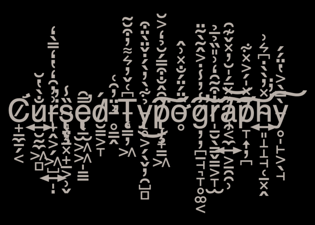
Unicode, as we’ve noted in more than a few Drops,. is a remarkable achievement in computing. This standardized system lets us represent virtually every writing system on Earth. But like most powerful tools, it can be “weaponized” in creative and occasionally horrifying ways. One such way is “Zalgo text”, the digital embodiment of typographical chaos.
Zalgo text transforms ordinary words into something that looks like it crawled out of a glitched horror movie. Normal text becomes overlaid with a chaotic swarm of diacritical marks (i.e., those accent-like symbols that hover above, below, and through letters). Take the word “hello” and run it through a Zalgo generator, and you might get something like: ḧ̷̰ë̸́l̴̀l̵̽ö̴́. Your perfectly innocent text now looks like it’s having an existential crisis.
This effect is possibe due to Unicode’s special characters that are designed to modify the appearance of the character they follow. Languages like Vietnamese and Arabic rely heavily on combining characters for proper rendering. Zalgo text exploits this system by layering dozens of these modifiers onto single characters, creating the characteristic “corrupted” appearance. It’s essentially typographical vandalism using legitimate Unicode features.
The name “Zalgo” comes from a creepypasta character representing chaos and corruption. The aesthetic perfectly captures that digital horror vibe, which explains its popularity in memes and internet culture. From a design perspective, Zalgo text violates every principle of readable typography, as it’s intentionally difficult to parse, visually aggressive, and serves no functional purpose.
As we gaze upon the distorted landscape of Zalgo text, we’re reminded that even the most seemingly innocuous technologies can be co-opted for “sinister” purposes. The beauty of Unicode lies in its ability to facilitate global communication, but also in its capacity to unleash creative mayhem. By indulging in the absurdity of Zalgo text, we’re not both preserving a peculiar aspect of internet culture, and also celebrating the boundless potential of language and design to surprise (and disturb) us.
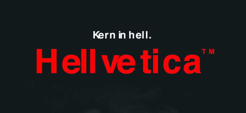
Hellvetica: The Most Cursed Font?
🚨 DO NOT GO TO
hellveticafont[.]com! The domain is now owned by a spammer and it full of AI slop. The link in the first ❡ goes to the Wayback Machine entry for the site.
What happens when you take perhaps the most beloved typeface in design history and systematically destroy everything that makes it work? You get Hellvetica. This is a typographic horror story that became one of the most brilliantly subversive design experiments of our time.
In 2019, Zack Roif and Matthew Woodward, associate creative directors at R/GA New York, decided to weaponize perfection against itself. Their Halloween project took Helvetica’s meticulously balanced letter spacing and turned it into a kerning nightmare that makes nearly every viewer of it physically uncomfortable. Seriously: it’s not just aesthetically unpleasant. It is genuinely distressing to look at.
Creating consistently terrible typography isn’t trivial. You can’t just randomize letter spacing and call it done. The creators had to apply genuine typographic expertise to systematically break every convention that makes text readable. They crafted chaos with the precision of a Swiss watchmaker.
The cultural impact surprised everyone. Within weeks, Hellvetica racked up 7,000+ downloads, “ruined” over 76,000 designs (by the creators’ count), and generated 210 million impressions across social platforms. All with a $0 marketing budget. Brands started incorporating it into Halloween campaigns. Developers used it for April Fools’ pranks. It became a shared reference point for an entire community.
If you, too, would like to drive yourself (and others) insane, you can grab a copy of the TTF and disturb away. Plus, you can side-load a Chrome extension that will swap in Hellvetica on any site using good ol’ Helvetica.
Seven Deadly Sins Of Typography
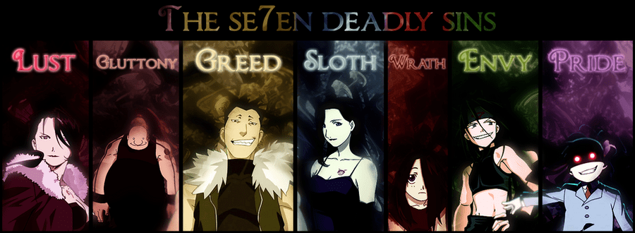
There’s an inordinate number of design blog posts on this subject (go ahead and Kagi that term), so let me channel on of my fav anime shows and add some sinful names to the shames:
- Wrath: Aggressive kerning that makes letters fight each other, or conversely, letterspacing so tight it creates visual violence. Also applies to ALL CAPS ABUSE that screams at readers.
- Greed: Font hoarding (e.g., using 12 different typefaces in one design) or stealing/pirating premium fonts instead of paying licensing fees. The typographic glutton who can never have enough fonts.
- Sloth: Defaulting to system fonts without consideration, never adjusting tracking or leading, and generally being lazy about typographic refinement. The designer who uses Times New Roman for everything because it’s “good enough.”
- Envy: Copying trendy typography without understanding why it works, or trying to make every project look like the latest design award winner. Font FOMO.
- Gluttony: Overindulgence in decorative fonts, effects, and treatments. The designer who adds drop shadows, gradients, and three different script fonts to a single headline because more = better.
- Pride: Choosing style over legibility, making text so “artistic” that it becomes unreadable. The designer who prioritizes their creative vision over the user’s ability to actually consume the content.
- Lust – Being seduced by a beautiful font without considering if it serves the content. Falling in love with a typeface and forcing it into inappropriate contexts just because it looks “sexy”.
Each sin comes with its own special circle of designer hell, naturally.
FIN
Remember, you can follow and interact with the full text of The Daily Drop’s free posts on:
- 🐘 Mastodon via
@dailydrop.hrbrmstr.dev@dailydrop.hrbrmstr.dev - 🦋 Bluesky via
https://bsky.app/profile/dailydrop.hrbrmstr.dev.web.brid.gy
☮️

Leave a comment