Tendrills; Make Serifs Great Again; Featured Free Font: Instrument
We’ve got a fun and hopefully very distracting typography-centric edition of the Drop today.
Bonus points for whomever “decodes” the message in the first section.
TL;DR
(This is an AI-generated summary of today’s Drop using Ollama + llama 3.2 and a custom prompt.)
- Tendrilis is a constructed script designed to replace the Latin alphabet with organic, vine-like characters that transform ordinary text into visually distinctive writing resembling plant tendrils (https://anomalis.gumroad.com/l/tendrilis-guide)
- Designers are experiencing a “sans-serif backlash” as brands move away from homogenized typography toward more distinctive serif fonts that restore elegance and heritage, signaling a shift from conformity to uniqueness in brand identity (https://www.designandpaper.com/they-are-calling-it-a-sans-serif-backlash-designers-grow-tired-of-the-homogenisation-of-fonts-in-branding/)
- Instrument Sans and Instrument Serif are free typeface families offering exceptional flexibility through variable font technology, with Instrument Sans balancing precision and playfulness while Instrument Serif provides a contemporary interpretation of traditional old-style serifs (https://github.com/Instrument/instrument-sans)
Tendrills
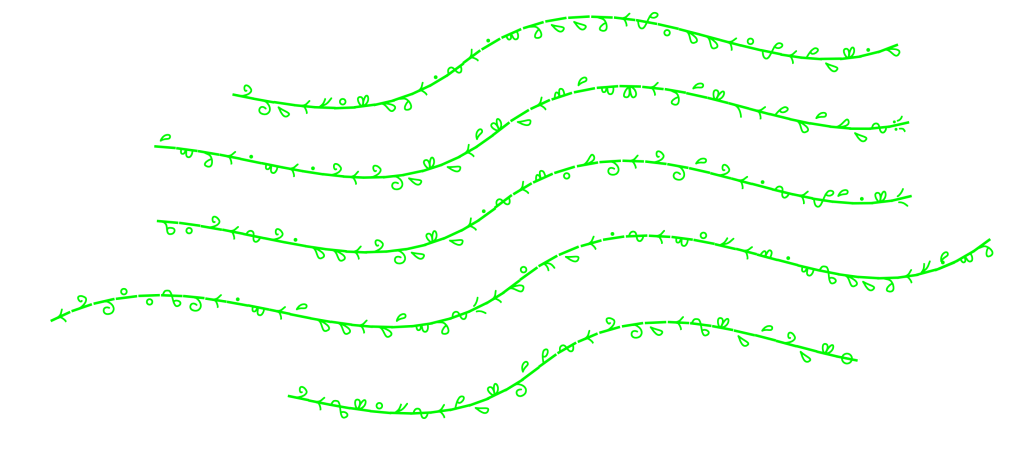
Tendrilis is a constructed script or writing system designed to replace the Latin alphabet, created by Anomalis. It’s not a language itself but rather a way to write existing languages that primarily use the Latin alphabet, such as English. Its approach to writing lets us transform ordinary text into something visually distinctive and organic, reminiscent of plant tendrils growing along a vine.
It consists of characters that represent each letter of the Latin alphabet, arranged along a “vine” that serves as the baseline for writing. The characters are designed to look like leaves growing from this vine, creating an organic, flowing aesthetic.
The alphabet includes unique symbols for each letter:
- Letters like ‘a’, ‘b’, ‘c’, etc. have specific corresponding symbols
- Some letters have distinctive features (e.g., ‘m’ and ‘n’ have flat bases, while ‘r’ and ‘y’ have pointy bases)
Writing in Tendrilis begins with drawing a vine that should be thicker than the leaf-like characters. The characters follow the vine’s direction, generally flowing from top to bottom and left to right.
There are two main modes of writing. “Basic mode” uses separate vines, ideal for journaling and everyday writing, while “creative mode” employs complex vine shapes, better suited for aesthetic purposes
Words are separated by specific markers in Tendrilis. The system also includes various punctuation marks:
- Periods can appear inside the vine or at the end
- Commas replace word separators
- Apostrophes, dashes, quotation marks, parentheses, and other punctuation have specific representations
- Proper names are enclosed in special markers
Tendrilis includes symbols for numbers 0-9 and mathematical operations such as addition, subtraction, multiplication, division, and equals signs. This allows for writing numerical expressions and equations within the script.
Anomalis encourages creative use of Tendrilis in various projects including art, music, books, games, and even tattoos. Fols are welcome and encouraged to modify the system for their personal use, though Anomalis maintains the original version to keep it consistent for new learners.
While Anomalis won’t be adding more characters to the official system, folks are further encouraged to create their own additional characters if needed for languages with special characters or diacritics.
The message in the section header was made with Omnigraffle, wrapping the Tendrills TTF glyphs to a Bézier curve.
Make Serifs Great Again

In more than a few Drops, we’ve talked about how contentious fonts can be, and also how designers and creative types tend to pile-onto new trends, which usually ends up overwhelming the appeal of original creation.
“They Are Calling It a Sans-Serif Backlash: Designers Grow Tired Of The Homogenisation Of Fonts In Branding”, chronicles what is describd as a “sans-serif backlash” in branding. It notes that there is a a major shift happening in the typography landscape as designers grow increasingly frustrated with the homogenization of brand identities. Over the last decade, there has been a mass migration toward sans-serif typography in branding, with companies across industries adopting clean, minimal sans-serif fonts to project a modern and tech-savvy image. This trend was initially driven by digital-first companies seeking fonts that would work well across various devices, but soon legacy brands like Burberry, Balmain, and Yves Saint Laurent also abandoned their iconic serif logos in favor of sleek sans-serif alternatives.
While sans-serif fonts offered practical advantages—scaling better for mobile screens, the widespread adoption led to what designers call “blanding,” where brands across different industries began to look eerily similar and characterless. This homogenization has prompted a reconsideration of typography’s role in brand identity.
In response to this “crisis of sameness”, we’re witnessing a resurgence of more distinctive typography choices. High-end fashion brands like Burberry, Valentino, and Chloé have recently reintroduced serifs into their branding, restoring elements of elegance and heritage that had been sacrificed for modernity. This return to serifs and more expressive typography represents more than just an aesthetic choice—it signals a fundamental shift in design philosophy.
The backlash against sans-serif domination reflects a growing understanding that in a saturated market, standing out has become more valuable than simply looking modern. Typography is reclaiming its role as a storytelling tool rather than just a functional design element, with brands prioritizing uniqueness over conformity.
This movement doesn’t mean sans-serif fonts are becoming obsolete. It’s more of a return to typographical balance, with designers seeking to create more diverse, expressive, and human brand identities. The future of typography in branding appears to be moving toward greater diversity, with companies recognizing that their font choices should reflect their unique brand DNA rather than following universal trends.
While the complete demise of sans-serif branding is unlikely, the era of generic, cookie-cutter typography seems to be waning as brands rediscover the power of distinctive, character-driven fonts to communicate their identity and connect with consumers seeking authenticity and personality.
It’s a great read with some solid visuals, and I definitely welcome the forthcoming greater diversity across the web. Now if we could only just get rid of “startup purple”.
Featured Free Font: Instrument
Instrument Sans and Instrument Serif are two typeface families designed for the Instrument brand. I’ve been staring at both of them quite a bit, of late, since the White House website uses both of them extensively. Despite their use in the spread of lies and propaganda (which I doubt the creators are happy about), they’re prett spiffy fonts, so I felt compelled to share them.
Instrument Sans is a variable sans-serif typeface that achieves a balance between precision and playfulness. Drawing inspiration from neo-grotesques, it features a comprehensive family of weights, widths, and italics that represent a carefully orchestrated collection of sans-serif qualities while incorporating contemporary characteristics that make it distinctive.
The typeface offers exceptional flexibility through its variable font technology with three axes:
- Width (
wdth): Ranges from 75 to 100 - Weight (
wdth): Ranges from 400 to 700 - Italic Slant (
ital): Ranges from 0 to 100
Instrument Sans includes of 12 unique stylistic sets, allowing commonly-used characters to be replaced with alternate glyphs. This lets u tailor the appearance and legibility of text to suit various expressive styles.
The font also supports several OpenType features including:
- Access to all alternatives (
aalt) - Case-sensitive punctuation (
case) - Standard ligatures (
liga) - Proportional figures (
pnum) - Tabular figures (
tnum)
With support for 389 languages, Instrument Sans also offers extensive linguistic versatility.
Instrument Serif takes a different approach as a condensed, display serif designed specifically for large sizes. It presents a contemporary interpretation of traditional old-style serifs.
While more focused in its application than its sans-serif counterpart, Instrument Serif still offers substantial language support with 374 Latin glyphs covering 86 languages including Afrikaans, English, French, German, Italian, Polish, Spanish, and many others.
Both typefaces were designed by Rodrigo Fuenzalida with direction from Jordan Egstad. Instrument Serif additionally credits JD Hooge and Jack De Caluwé for direction.
Both fonts are licensed under the SIL Open Font License.
FIN
Remember, you can follow and interact with the full text of The Daily Drop’s free posts on:
- 🐘 Mastodon via
@dailydrop.hrbrmstr.dev@dailydrop.hrbrmstr.dev - 🦋 Bluesky via
https://bsky.app/profile/dailydrop.hrbrmstr.dev.web.brid.gy
Also, refer to:
to see how to access a regularly updated database of all the Drops with extracted links, and full-text search capability. ☮️

Leave a comment