Letterpression; Fonts For Freedom; Featured Free Font: Inclusive Sans
Typography and power dynamics play out in three different stories in today’s typography-centric edition of the Drop.
The first section is about how authoritarian governments controlled fonts in the past. The middle is about a bold move to bring back banned newspaper typefaces as symbols of resistance. And, the closer is about a modern typeface that’s designed to be inclusive. Each story shows how letters can be used to oppress or liberate us in our fight for open communication.
TL;DR
(This is an AI-generated summary of today’s Drop using Ollama + llama 3.2 and a custom prompt.)
- Typography has historically been weaponized by authoritarian regimes while also serving as a tool for resistance, with examples ranging from Nazi Germany’s manipulation of Fraktur to modern digital surveillance.
- The Fonts for Freedom initiative reconstructed typefaces from 9 banned newspapers across multiple countries, reaching 132 countries and generating 830 million contacts in a powerful stand against press censorship
- Inclusive Sans is an accessibility-focused typeface designed by Olivia King that features clear character distinctions and open counter forms to enhance readability for visually impaired and neurodiverse individuals.
Letterpression
Typography has served as both a tool of authoritarian control and a vehicle for resistance, with regimes manipulating typefaces to reinforce power structures while dissidents subvert them through design. Historical and modern examples reveal how letterforms shape political narratives and public perception under autocratic rule.
The Nazi regime weaponized typography to promote racial ideology. Initially, they mandated Fraktur as the “true German script,” framing it as an Aryan heritage symbol. However, in 1941, they abruptly banned Fraktur, falsely claiming it had Jewish origins, and adopted Roman-style Antiqua for practical communication in occupied territories. Modernist fonts like Futura — despite being labeled “degenerate” early on — were later co-opted for propaganda materials due to their legibility.
This historical revisionism was implemented through systematic typeface bans, retroactively altering the typography used around us to align with the regime’s preferred aesthetic and erase traces of previous design traditions. There were other tactics employed as well, such as projecting an image of regime strength and authority via public signage by making heavy use of stark, authoritative sans-serif typefaces.
Stalinist-era USSR replaced revolutionary Constructivist fonts with state-approved Literaturnaya, a serif typeface designed for mass-produced propaganda. The regime shuttered independent foundries, centralizing production at Polygraphmash, executed or exiled designers who deviated from Socialist Realism, and standardized Cyrillic letterforms to erase pre-revolutionary cultural markers. So much for typography being a risk-free profession.
Post-Stalin reforms saw limited typographic experimentation, but state control remained through approved fonts like Zhurnalnaya Roublennaya (a.k.a., Journal Sans).
Believe it or not, we even have some recent-ish domestic examples, one being in the early 2000s where easier-to-read fonts were found to increase support for FBI surveillance programs by 14% in controlled experiments.
Autocratic regimes systematically use specific text layouts and fonts strategically to influence how information is perceived and remembered. However, as we’ll see in the middle section, the same design principles become weapons for resistance when reclaimed by dissidents, proving typefaces remain frontline tools in information warfare.
I realize there’s a torrent of very direct and kinetic oppression happening right now, but we would do well to watch for these more subtle means of shaping opinion and shuttering creative, public expression.
Also: 99% Invisible has a great episode on Fraktur.
Fonts For Freedom
👉 BEFORE READING! — I have to potentially spoil the resource reveal since the
fonts-for-freedom.comTLS certificate expired and the domain no longer goes to the resources (yay link rot). It’s mentioned in the first link, so I must emplore you to NOT click on it as I have not been able to verify whether the site that shows up is malicious or not. The proper/archive link is near the end of the section.
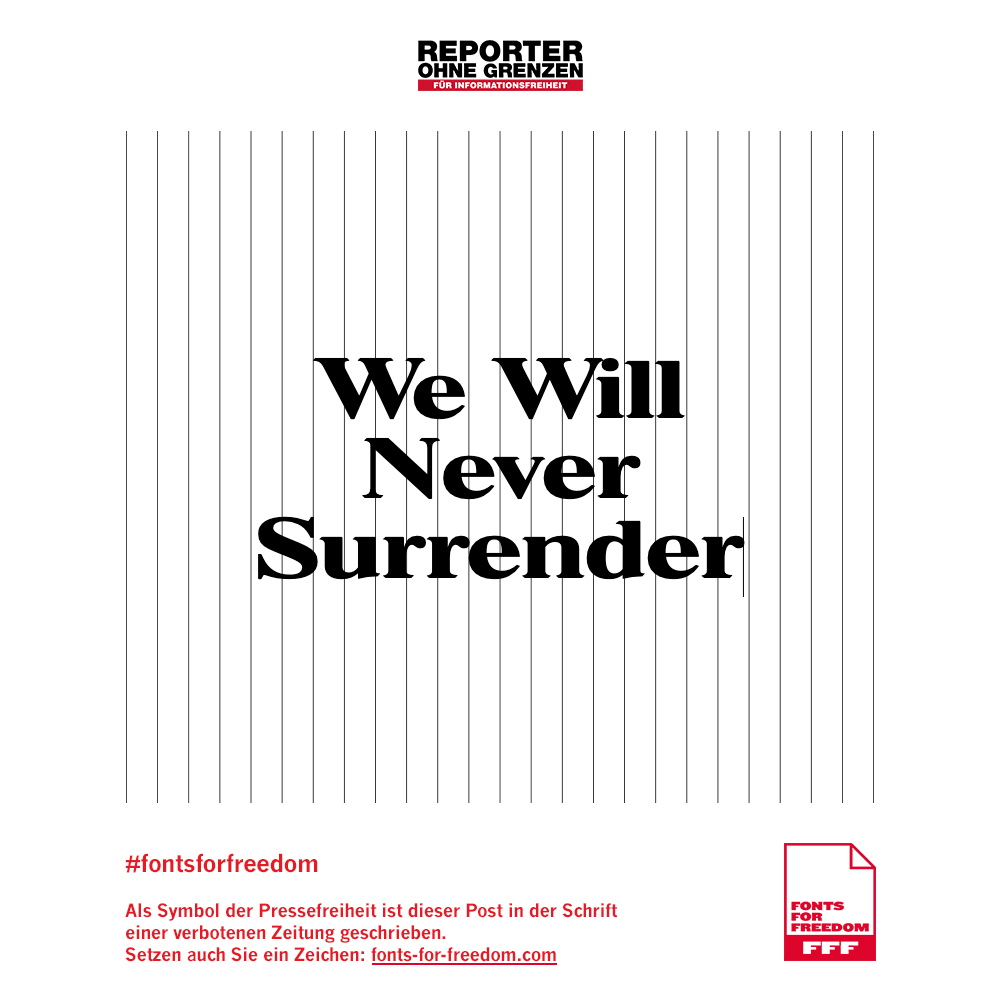
The Fonts for Freedom (FFF) initiative represents a clever convergence of typography and press freedom advocacy. In 2018, amid a concerning wave of media suppression that saw over 140 media organizations censored or closed worldwide, Serviceplan Campaign Hamburg and Reporters without Borders Germany launched this artistic and practical response.

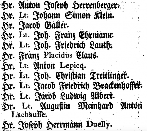
The project reconstructed the typefaces of nine banned newspapers from various countries including Turkey, Azerbaijan, Vietnam, Cambodia, Tanzania, Hungary, and Russia. These fonts were transformed into powerful symbols of resistance against censorship, effectively turning typography into a tool for advocating press freedom.
The campaign managed to reach across 132 countries, generating 830 million contacts and 2.7 million interactions. A particularly notable moment occurred during Turkish President Erdoğan’s visit to Germany in 2018, where he was confronted with billboards featuring headlines set in the very fonts of newspapers his government had banned.
The German National Library in Leipzig recognized the project’s significance by awarding it the 2019 Gutenberg Prize. The library hosted an exhibition that contextualized FFF within the broader history of censorship, featuring campaign materials and poster displays, documentation of banned newspapers, special newspaper editions explaining the FFF initiatives, and historical censorship cases from the 16th century to present.
This initiative shows how we can repurpose traditional elements of publishing, such as typefaces, into instruments of resistance against oppression. A government may be able to shut down publications or control them via intimidation (ref: NY Times, ABC, and CBS capitulation to Trump after taking office), but they cannot easily erase the visual identity and cultural significance these publications [used to] represent.
As noted in the spoiler, the original domain is dead, but you can interact with the online exhibit via the Wayback Machine — https://web.archive.org/web/20190923211141/https://fonts-for-freedom.com/en/#FFF_Oezguer-Guendem-Bold.
It’s still early days in our current fight, so I’m keeping an eye out for what fonts will be dominating our collective movement to contain this coup. And, I’ll game that a bit in the final section.
Featured Free Font: Inclusive Sans
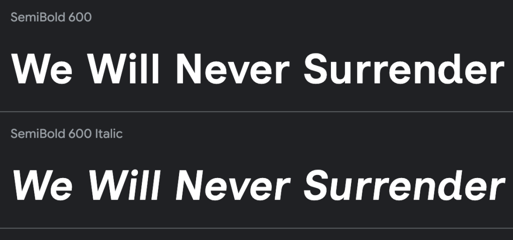
Inclusive Sans (GH) is a text font designed with a focus on accessibility and readability. It was created by Olivia King, and draws inspiration from contemporary neo-grotesque typefaces, “blending a friendly aesthetic with functional clarity”. The design incorporates features such as clear distinctions between similar characters (like ‘I’, ‘l’, and ‘1’), non-mirroring of letters (‘d’, ‘b’, ‘q’, ‘p’), and wider, open counter forms in characters like ‘c’, ‘o’, ‘a’, and ‘e’. These elements enhance legibility, particularly benefiting individuals who are visually impaired or neurodiverse. The design also ensures that text is easily readable at various distances and under different conditions, reducing the risk of misinterpretation.
This could be a great choice for signs/flyers/etc.
FIN
Remember, you can follow and interact with the full text of The Daily Drop’s free posts on:
- 🐘 Mastodon via
@dailydrop.hrbrmstr.dev@dailydrop.hrbrmstr.dev - 🦋 Bluesky via
https://bsky.app/profile/dailydrop.hrbrmstr.dev.web.brid.gy
Also, refer to:
to see how to access a regularly updated database of all the Drops with extracted links, and full-text search capability. ☮️

Leave a comment