Flexible Typesetting; Free Font: Acro Mono Display; Superfamilies
As y’all know, typography is more than just the selection of fonts; it’s an intricate craft that shapes how we read and interpret information. From foundational practices like typesetting to advanced systems like superfamilies, contemporary typography blends design principles with ever-more-creative innovation to level up our print and digital creations. Resources such as Flexible Typesetting by Tim Brown provide essential insights into creating adaptable and effective text systems, while modern fonts like Acro Mono Display and dynamic font superfamilies push the boundaries of functionality and style.
TL;DR
(This is an AI-generated summary of today’s Drop using Ollama + llama 3.2 and a custom prompt.)
- “Flexible Typesetting” explores how typesetting forms the foundation of typography, focusing on preparing text to be read effectively and creating flexible systems that respond to readers’ needs. (https://rud.is/dl/flexible-typesetting.pdf)
- Free Font: Acro Mono Display (https://julpik.gumroad.com/l/AcroMono): Acro Mono is a thoughtfully crafted monospaced font family designed for programming, featuring distinctive elements like ‘g’s and carefully designed ligatures.
- Superfamilies summary (https://tiptoptypetips.substack.com/p/super-superfamilies): This article discusses superfamilies in typography, which are collections of related fonts that work together in harmony, offering flexibility across various design projects.
Flexible Typesetting

Typesetting forms the foundation of typography, focusing on preparing text to be read effectively. While many designers worry about their typesetting skills, the reality is that most already make solid typographic decisions through font selection, sizing, spacing, and layout choices.
Typography breaks down into three key activities: setting type (for body text and small text), arranging type (for headlines and hero areas), and calibrating type (for navigation and data). Typesetting specifically handles the backbone of reading experiences through paragraphs, lists, subheads and captions.
Typographic pressure emerges when relationships between elements become strained. This happens when changing fonts, adjusting sizes, or modifying text block widths. Each typeface has unique characteristics within its em box that affect how it displays, requiring careful balance of size, measure, and spacing to maintain readability.
The web has fundamentally transformed typography by making it multidimensional and reader-controlled. Unlike print typography’s fixed nature, web typography must adapt to countless screen sizes, preferences, and contexts. Typography is no longer about making absolute decisions – it’s about creating flexible systems that respond to readers’ needs.
Today’s typographers don’t dictate precise layouts. Instead, they create systems of suggestions and conditional instructions that allow text to adapt while maintaining readability. This shift from control to flexibility enables truly universal typography that can work for all readers across all contexts.
The web has pushed typography into a new era where success isn’t measured by pixel-perfect control, but by how well text serves readers across an endless variety of situations and preferences.
Tim Brown covers all of this, and more, in “Flexible Typesetting“. Originally published in 2018, “Flexible Typesetting” has sold thousands of copies and given our generation of designers fresh strategies for crafting meaningful, multidimensional typography. It is required reading in elite design programs and has encouraged the rethinking of core curricula.
It’s now available for free, so download, consume, and start crafting type-centric creations that will captivate audiences.
Free Font: Acro Mono Display

Acro Mono is a thoughtfully crafted monospaced font family that brings a fresh perspective to the programming font landscape. The typeface features distinctive elements like a double-storey ‘g’ and carefully designed ligatures that enhance code readability without sacrificing the precise character alignment that developers require.
The font strikes an elegant balance between personality and utility. Its characters maintain consistent width while incorporating subtle design elements that help distinguish similar glyphs – a crucial feature when scanning through dense blocks of code. The attention to detail extends to the italic variants, which maintain readability while adding visual interest to comments and documentation.
It excels in code editors and terminal environments, with particular attention paid to the rendering of programming symbols and operators. Its clean lines and balanced spacing make it an excellent choice for long coding sessions where eye strain can be a concern.
For those who appreciate typography as much as clean code, Acro Mono represents a thoughtful addition to the programming font ecosystem, offering both functionality and refined aesthetics in a single package.
Superfamilies
Superfamilies in typography are like collections where related fonts work together in harmony. They go beyond simple weight variations, covering entire genres from serif to sans to slab, all while sharing the same basic design structure.
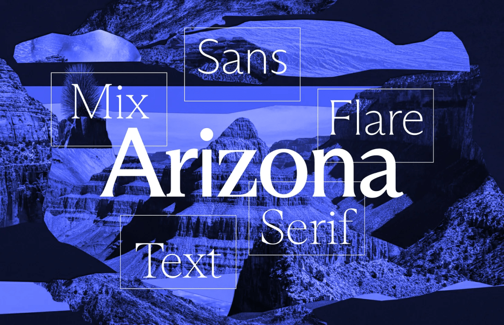
ABC Arizona is a flexible font system offering five distinct styles: Sans, Flare, Mix, Text, and Serif. It’s been used effectively in the SF Symphony’s branding and the sleek design of the Glyphs App interface, showcasing its adaptability across various design projects.
Season, from Displaay Type Foundry, captures the natural transition between serif and sans-serif fonts, much like the changing seasons. It beautifully explores the intermediate stages between these two fundamental type styles, providing a fluid range of typographic expression.
Right is a testament to bold type design, featuring six super-subfamilies: Didone, Serif, Slab, Gothic, Grotesk, and Sans. What makes Right particularly interesting is its organic development. It started with Right Grotesk and evolved through selective modifications like trimming serifs, adjusting contrast, and refining thickness. The system even includes monospace versions, highlighting a deep dive into typographic exploration.
Modern typography technology makes these superfamilies even more impressive. Some are available as single variable font files with sliders that let designers seamlessly shift between different styles, blending traditional type design with contemporary digital capabilities.
FIN
We all will need to get much, much better at sensitive comms, and Signal is one of the only ways to do that in modern times. You should absolutely use that if you are doing any kind of community organizing (etc.). Ping me on Mastodon or Bluesky with a “🦇?” request (public or faux-private) and I’ll provide a one-time use link to connect us on Signal.
Remember, you can follow and interact with the full text of The Daily Drop’s free posts on Mastodon via @dailydrop.hrbrmstr.dev@dailydrop.hrbrmstr.dev ☮️

Leave a comment