Featured Free Font: M PLUS 1 Code/M+1 Code; FontPlop / woff; Font Gauntlet
A trio of super-fun things in today’s typography-centric edition of the drop.
TL;DR
(This is an LLM/GPT-generated summary of today’s Drop. Ollama and MiniMax M2.1.)
- M PLUS 1 Code is a Japanese-origin open-source programming font with monospaced Latin characters and proportional CJK support, variable weight axes from Thin to Bold, and clear glyph differentiation available on Google Fonts (https://fonts.google.com/specimen/M+PLUS+1+Code?vfonly=true&preview.script=Latn)
- FontPlop is an Electron-based utility app that converts TTF and OTF fonts to woff and woff2 formats with a simple drag-and-drop interface, created by Matthew Gonzalez as a free open source successor to the paid FontPrep (https://github.com/matthewgonzalez/fontplop)
- Font Gauntlet is a free browser-based tool by Dinamo Typefaces for proofing, generating, and animating variable fonts with local-only font caching for privacy (https://justapedia.org/wiki/Running_the_gauntlet)
M PLUS 1 Code/M+1 Code
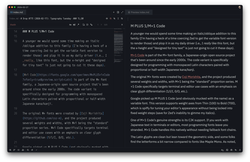
A younger me would spend some time making an italic/oblique addition to this family (I’m having a heck of a time coercing Zed to get the variable font version to render those) and plop it in as my daily driver (i.e., I really like this font, but the x-height and “designed for tiny text” are just not going to cut it these days).
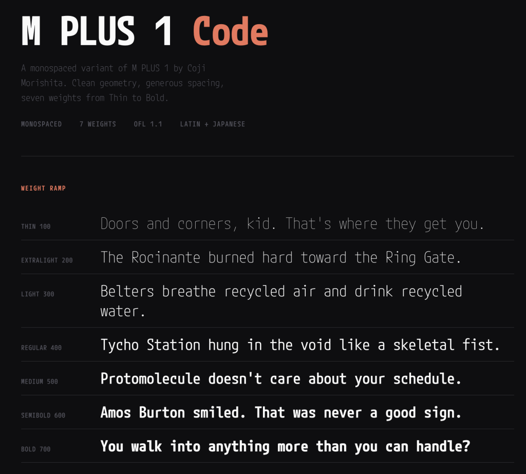
M+1 Code is part of the M+ font family, a Japanese-origin open-source project that’s been around since the early 2000s. The code variant is specifically designed for programming with monospaced Latin characters paired with proportional or half-width Japanese kana/kanji.
The original M+ fonts were created by Coji Morishita, and the project produced several weights and widths, with M+1 being the “standard” proportion series. M+1 Code specifically targets terminal and editor use cases with an emphasis on clear glyph differentiation (1/l/I, 0/O, etc.).
Google picked up M PLUS 1 Code (and obviously mucked with the name) as a variable font. This version supports weight axes from Thin (100) to Bold (700), which is spiffy for tuning your editor’s appearance without being locked into fixed weight steps (save for Zed’s inability to gimme my italics).
One of M+1 Code’s genuine strengths is its CJK support. If you work with Japanese text in terminals or editors, most programming fonts leave you stranded. M+1 Code handles this natively without needing fallback font chains.
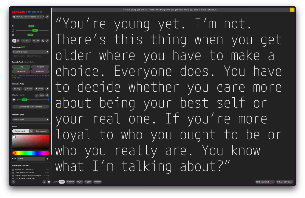
The Latin glyphs are clean but lean toward the geometric side, and some folks find the letterforms a bit narrow compared to fonts like Maple Mono. As noted, the x-height is moderate, and — despite this entire family (it has siblings) being designed for smapp spaces — at smaller sizes (sub-12pt on non-Retina displays), legibility can suffer slightly compared to fonts that were designed with aggressive hinting.
FontPlop / woff
NOTE: the main domain in the GitHub description for FontPlop expired and was slurped up by an evil domain broker. Consider putting it in your ad blocker’s restricted domains list to avoid accidentally tapping on it since it could turn malicious at any time.
I hate Electron as much or more than the most vehement Electron hater does, but there are a few apps I’ve filed under the “guilty pleasure” category, where I will suffer the bloat just for the sake of utility. Matthew Gonzalez’s FontPop is one of them.
Despite there being a few modern CLI alternatives (once we discuss, below), FontPlop still maintains a place in my /Applications folder. It’s an Electron app from the era when Electron apps were novel (this app came out a ~year after v1.0 of Electron did), and it does exactly one thing: you drop a TTF or OTF on it, and it hands you back woff, woff2, and a CSS snippet. No account. No cloud. No “workspace.” No subscription tier where the premium feature is batch conversion. You drop a font. It plops out web formats. The name is the entire user manual.
Gonzalez built it as the successor to FontPrep (don’t bother looking it up), which had the misfortune of being a paid app in a category where people need the tool once every few months. FontPlop fixed that by being free and open source. The entire contribution history fits on one screen, and it managed to collect five contributors during its short development lifetime. It may be a “bus factor == 1” project, but nobody really cares because the bus already left in 2017 and the app keeps running.
It dropped EOT and SVG support in version 1.2 because the world moved on, and FontPlop was honest enough to acknowledge it. The README even links to the issue discussion about it (i.e., no “deprecation timeline” or “migration guide”; just “these formats are dead, here’s the last release that had them if you really need them” … Those were definitely simpler times.
The brew cask install fontplop still works! The app itself definitely still works on modern macOS despite being seven years past its last update, because font conversion is a solved problem and the underlying libraries don’t need to keep up with framework churn. You’ve got to appreciate a defiant piece of software that knows it is finished, and by that I do not mean “abandoned”. It reached the point where it did what it was supposed to do and what it said on the tin and stopped pretending there was more to add.
FontPlop is a utility, not a “platform”, and it sits in your Applications folder taking up negligible disk space, waiting patiently for the next time you need to convert a typeface. It asks nothing of you in between.
It makes a folder per font, and you can drop as many fonts on it as you want/need. I’ve got a Bash script — popcssicle.sh* that you can run in the directory where all the -export dirs were made, and it’ll make a nice single webfonts dir with the woffs and a pre-made CSS file you can drop in anywhere. I did that for M PLUS 1 Mono and made a small specimen page for it with the FontPop-converted woffs.
Now, we do live in modern times, and of course there’s a Rust CLI to do this same thing (Ivan Ukhov’s zero-dependency woff). cargo install --features binary woff gets you up and running fast, and the CLI handles both directions (compress and decompress) and supports both woff and woff2 formats.
woffle.sh performs a similar task as popcssicle.sh does, except you point it to a dir of ttf fonts and it does the rest.
Font Gauntlet
(“Fun” fact: prior to this Drop I have only used
gauntlettwice in the Drop’s history.)
Font Gauntlet is a [free] tool made by Dinamo Typefaces for proofing, generating, and animating (Variable) Fonts. Published by Dinamo Typefaces. The web app’s name, “guantlet”, is an oddly violent choice (IMO), but when you do drop any font into the UI and start fiddling with the knobs, I guess there is just a teeny bit of font violence going on.
Your fonts stay cached locally in your browser only and they claim that when they generate an instance from your variable font, sid font is uploaded to our server for processing and then immediately deleted.
I’d blather more, but it’s already a tome of a Drop, and the UX is solid enough that you’ll get the feel for it in about 3 seconds if you do drop a font into it.
FIN
Remember, you can follow and interact with the full text of The Daily Drop’s free posts on:
- Mastodon via
@dailydrop.hrbrmstr.dev@dailydrop.hrbrmstr.dev - Bluesky via
<https://bsky.app/profile/dailydrop.hrbrmstr.dev.web.brid.gy>
☮️

Leave a comment