Times New American; How Typography Can Save Your Life; Final Free Font Of The Year!: Fantasque Sans Mono
We quickly step into and then out of the politics of fonts, then cover a post which has been on my TODO to include in one of these Tuesday editions for most of the year. And, we close with our final featured free font of 2025!
TL;DR
(This is an LLM/GPT-generated summary of today’s Drop. It’s Ollama and MiniMax M2.1 since it just got released.)
- The State Department’s decision to revert from Calibri to Times New Roman reflects political signaling rather than tradition, intersecting with anti-DEIA policies and challenging the notion that font choices can be neutral (https://hsu.cy/2025/12/times-new-american/)
- Typography directly impacts public safety, from the National Weather Service’s ALL CAPS legacy dulling warning impacts to Clearview font improvements for highway legibility and MIT research showing humanist dashboard typefaces cut driver glance time by half a second (https://www.propublica.org/article/how-typography-can-save-your-life)
- Fantasque Sans Mono is a monospaced programming font featuring organic, handwriting-like qualities while maintaining clear character distinction and comprehensive language support, balancing personality with practical functionality (https://github.com/belluzj/fantasque-sans/releases/tag/v1.8.0)
Times New American
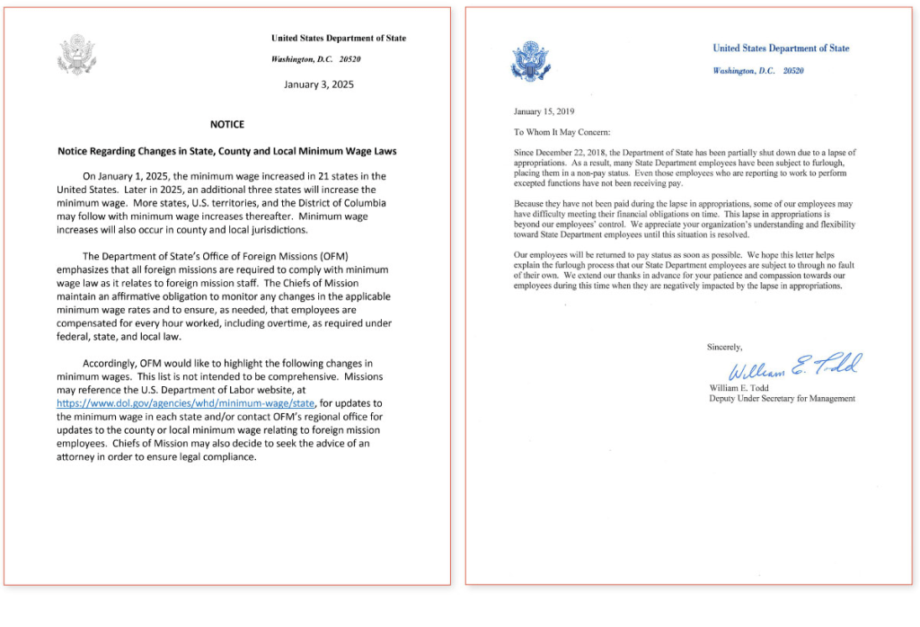
I tried super hard to not step into the stupid that is the State Department’s decision to switch [back] to Times New Roman but the resource I’m sharing did such a great job that I had no choice but to acquiesce to fate.
_“Times New American: A Tale of Two Fonts” by Chenyang “Platy” Hsu explores the seemingly trivial and unsurprisingly political decision by the U.S. State Department to revert its official document font from Calibri back to Times New Roman. The post examines the memo behind the change, the historical and design arguments for serif versus sans‑serif typefaces, and how these aesthetic choices intersect with broader anti‑DEIA (diversity, equity, inclusion, accessibility) policies in the current administration.
By contrasting the practical origins of Times New Roman and Calibri with higher‑quality alternatives, the author argues that the typography switch is less about tradition or readability and more about signaling political loyalty.
The piece blends typographic history, accessibility considerations, and contemporary politics to ask whether font choices can ever be truly neutral.
It is well-crafted and absolutely worth your time.
How Typography Can Save Your Life
ProPublica’s “How Typography Can Save Your Life” examines the surprisingly powerful role that type‑choice plays in public safety.
They open with the National Weather Service’s long‑standing habit of issuing all forecasts in ALL CAPS, which turns out to be a legacy of antiquated equipment. In theory, the CAPS signal urgency but, in practice, they dull the impact of true warnings. By finally allowing mixed‑case text, the agency hopes to reserve caps for genuine emergencies, making critical alerts stand out and encouraging the public to take swift protective action.
The post then turns to the world of transportation, recounting how the highway‑sign typeface Highway Gothic, once standard, proved hard to read in rain, fog, or at night, prompting the development of the Clearview font to improve legibility and reaction times. The story continues inside vehicles, where MIT researchers showed that a humanist typeface on dashboard displays cuts drivers’ glance time by half a second (roughly 50 feet (0.02 km) at highway speed), potentially saving lives.
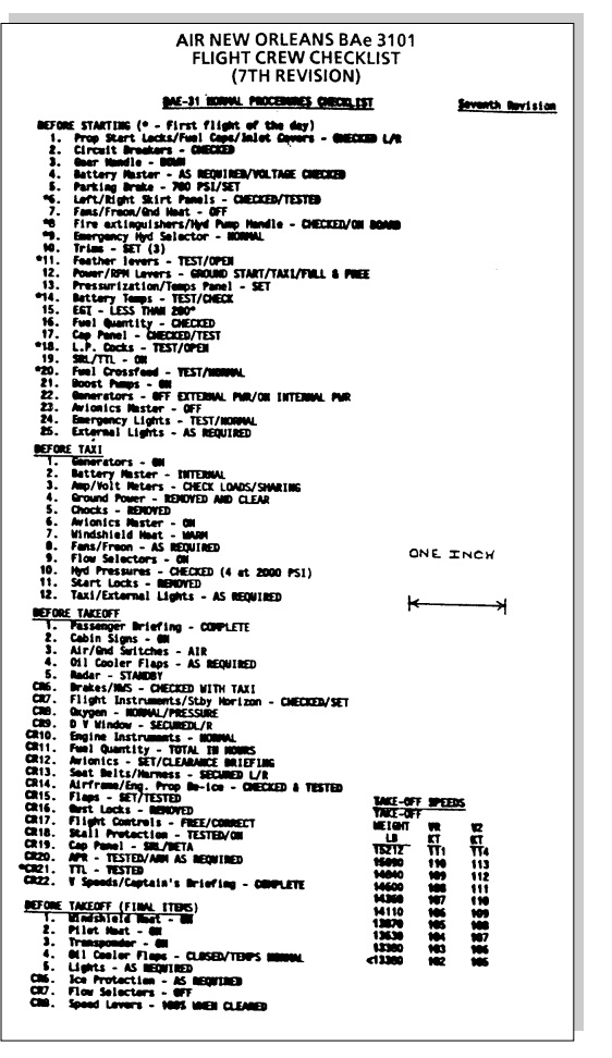
Finally, the piece highlights how typography affects safety beyond weather alerts and road signs, citing NASA’s warning that tiny, poorly chosen fonts on flight‑deck checklists can jeopardize pilots during emergencies.
Across each of these domains, the author argues that thoughtful type design (i.e., considering case, spacing, contrast, and font family) is not merely an aesthetic choice but a vital component of clear, life‑preserving communication.
Final Free Font of the Year!: Fantasque Sans Mono
We’re ending 2025 with yet another monospaced font, but this one has a slight twist.
Jany Belluz (the font’s creator) describes Fantasque Sans Mono as having “wibbly-wobbly handwriting-like fuzziness” and that is probably the most accurate description of a font I have ever read. It is not trying to look like handwriting exactly. It is more like what would happen if a handwritten font and a traditional monospace font had a conversation over drinks and decided to collaborate on something. The letters have a slight organic quality to them, little curves and quirks that make the whole thing feel less mechanical without sacrificing any of the practical requirements of a coding font.
What I appreciate most is that it does not sacrifice functionality for personality. Every character is still clearly distinguishable from every other character. You are not going to confuse a one with a lowercase L or a zero with an uppercase O. The font does all the boring important stuff right while still managing to have some charm, which is often a difficult balance to strike.
Belluz originally called it Cosmic Sans Neue Mono, which is a delightfully self-aware name that references the (rightfully) much maligned Comic Sans. He changed the name after realizing that people were reflexively dismissing it based on that association alone, which says something about how we think about fonts and professionalism (as touched on in the first section). The font itself takes inspiration from Inconsolata and Monaco, both respected members of the programming font canon, so it has solid bones underneath a pretty playful exterior.
It comes with a bold variant that shares the same metrics as the regular weight, which means you can use both in the same document without things getting misaligned. There are also ligatures (which I know not everyone is a fan of, but I appreciate them being included).
Language support is pretty comprehensive. It covers Latin characters for Western European languages, basic Cyrillic, basic Greek, and a bunch of other character sets that you might need depending on what you are working on. If you are writing code that includes comments or strings in multiple languages, you are probably covered.
The section header, as usual, is one section of this post in Zed using Fantasque Sans Mono.
FIN
Remember, you can follow and interact with the full text of The Daily Drop’s free posts on:
- 🐘 Mastodon via
@dailydrop.hrbrmstr.dev@dailydrop.hrbrmstr.dev - 🦋 Bluesky via
https://bsky.app/profile/dailydrop.hrbrmstr.dev.web.brid.gy
☮️

Leave a comment