Refreshing Refresher; Codepoints; No Tofu
Some typographical technical underpinnings adorn the sections in today’s typographic-centric edition of the Drop.
TL;DR
(This is an LLM/GPT-generated summary of today’s Drop. This week, I’m (still) playing with Ollama’s “cloud” models for fun and for $WORK (free tier, so far), and gave gpt-oss:120b-cloud a go with the Zed task. Even with shunting context to the cloud and back, the response was almost instantaneous. They claim to now keep logs, context, or answers, but I need to dig into that a bit more.)
- 1984.design’s Typography Basics provides an accessible, visual guide to type anatomy, spacing, alignment, and readability, treating type as communication rather than decoration (https://1984.design/blog/typography-basics/)
- Codepoints.net functions as a comprehensive, searchable atlas of Unicode characters, detailing each codepoint’s origin, behavior, and typographic role (https://codepoints.net/)
- The Is It Tofu? tool enables designers to quickly identify where placeholder glyphs (tofu) may appear across platforms, helping prevent missing‑character squares in web content (<https://tofu.quest/?q=We+covered+%22tofu%22+very+briefly+back+in+August+of+2022+when+we+took+a+look+at+the+Noto+(literally+an+abbreviation+for+%22no+tofu%22)+font.+When+a+computer+renders+text,+it+looks+up+a+glyph+in+an+installed+font+for+each+character.+If+the+system+lacks+a+font+that+contains+a+particular+character,+the+software+falls+back+to+a+special+placeholder+glyph+called+%60.notdef%60+in+the+default+font.+Often+this+fallback+appears+simply+as+a+white+square+%E2%80%94+%60%E2%96%A1%60+%E2%80%94+which+many+folks+think+looks+like+a+piece+of+tofu.)
Refreshing Refresher

Recently, there was a spate of new members to the Drop community, so this feels like the perfect time to mention a new, and “Typography 101” refreshing take. Plus, the rest of us can always use a well-crafted refresher course, since I, at least, am not a professional typographer, and thus do not carry all the minutae terms in muscle memory.
1984.design’s Typography Basics treats type not as decoration but as communication (i.e., the visual interface of language itself). It’s refreshing because it skips the gatekeeping tone that so often infects design writing and instead feels like a friendly, competent designer taking one by the elbow and saying, “Here’s how this all actually works.”
The pacing is right; each idea/concept — anatomy, spacing, alignment, readability — lands cleanly without drowning us in theory. The (many) metaphors are far from insufferable and do an great job making the technical terms and concept stick.
However, what truly made me add the link to my Raidnrop.io collection were the bespoke teaching visuals. In many “Typography 101” articles, the images used often feel like adornments or decorations. In 1984.design’s post, each visual (all were handcrafted in Figma) clarifies the contextual concept. And the attention to detail is noticeable and appreciated in this age of automated slop.
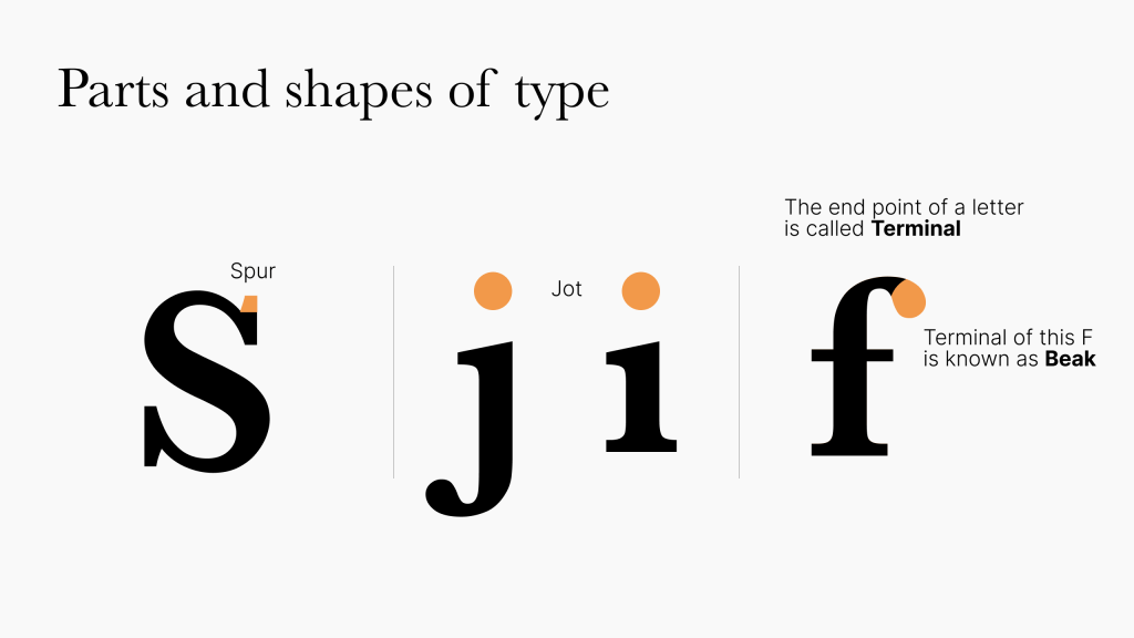
In some previously shared “101” resources, prescription was paramount. In this post, typographical design is framed more as a decision shaped by medium and context, not a fixed set of rules. The guidance is also clear enough for beginners but just smart enough not to bore experts.
I highly suggest keeping it in your bookmarks/personal web archives for future reference and inspiration.
Codepoints
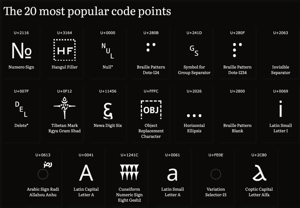
We’ve covered Unicode concepts in previous Typography Tuesday Drops, but — as noted above — we’ve got some new readers (💙), and I recently came across Codepoints.net, so this seems like spiffy opportunity to talk about that resource and the critical role Unicode plays in typography.
Codepoints.net is the Rosetta Stone of the nerd alphabet soup that is Unicode, and a “living atlas” of human writing, emoji, math symbols, and typographic oddities. Every character you’ve ever typed or seen, whether it be an “A”, “㐭”, or 🚀, has a permanent home called a codepoint, a unique number that ensures it looks the same regardless of where in the world it appears.
Before Unicode, text was chaos (one might even say chaotic evil). Hundreds of competing encoding systems meant your résumé might turn into hieroglyphs if emailed to someone in a different locale. Unicode ended that mess by giving every symbol, across all scripts, a single, universal identity. Codepoints.net lets us wander this universe effortlessly. We can search by name (“arrow”, “mahjong”), browse by block (“Dingbats”, “Egyptian Hieroglyphs”), or even draw a mystery character to find it. Each codepoint entry tells where the character comes from, how it behaves, and what makes it special.
While Unicode defines what a character is, typography decides how it looks. A codepoint like U+0041 always means “A”, but in typographic hands it could become A, A, 𝒜, or 𝕬 (trying to get alternative typefaces into a hosted WordPress newsletter is fairly painful, hence the use of Unicode characters vs. font changes for those examples). One of Unicode’s Principles captures the relationship perfectly: it encodes characters, not glyphs. Designers build the visual interpretations, such as ligatures, alternates, swashes, and styles, on top of Unicode’s invisible structure. In that sense, fonts are the interpreters of Unicode: they translate meaning into form.
Type designers consult Unicode to decide which characters to support (maybe a tidy Latin set, or the full 155,000+ range of humanity’s writing). This makes Codepoints.net an indispensable field guide, showing which symbols exist, how they interact, and what mysteries lie in ancient scripts or special spaces (yes, Unicode even defines invisible characters like the zero-width space U+200B).
In the end, Unicode gives text its logic, typography gives it its voice, and Codepoints.net sits at their intersection—an elegant reminder that every letter, emoji, and punctuation mark carries centuries of cultural and technical meaning in just a few bytes.
No Tofu
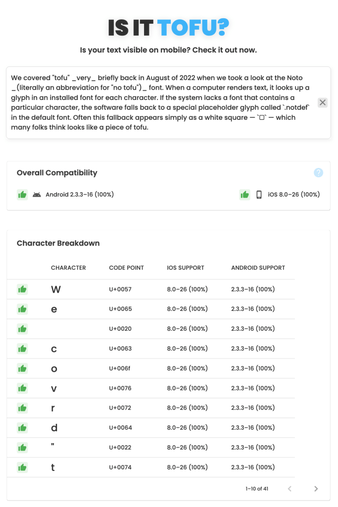
We covered “tofu” very briefly back in August of 2022 when we took a look at the Noto (literally an abbreviation for “no tofu”) font. When a computer renders text, it looks up a glyph in an installed font for each character. If the system lacks a font that contains a particular character, the software falls back to a special placeholder glyph called .notdef in the default font. Often this fallback appears simply as a white square — □ — which many folks think looks like a piece of tofu.
Encountering tofu, today, is generally rare on desktops/laptops, but happens more occasionally on mobile devices. If avoiding tofu specifically in that mobie context is important to you, Is It Tofu? is a fast and helpful tool that provides a statistical overview of the likelihood of readers in different technical contexts encountering tofu from your content (ref. section header image).
Type-X, a resource we covered in 2024, is also super-helpful when striving to eliminate tofu on other devices. It’s also helpful when trying to avoid the tofu effect when a web font doesn’t include every glyph needed for a particular word. In that case the browser fills in the missing characters with glyphs from other fonts, often making the text look like a ransom‑note collage from a 1970’s TV police/detective drama.
If you encounter tofu when browsing the web (which can happen after each new Unicode release if the font being used does not have support for the new codepoints), copy and paste the rectangle into the aforementioned codepoints.net to reveal the mystery character(s).
FIN
Remember, you can follow and interact with the full text of The Daily Drop’s free posts on:
- 🐘 Mastodon via
@dailydrop.hrbrmstr.dev@dailydrop.hrbrmstr.dev - 🦋 Bluesky via
https://bsky.app/profile/dailydrop.hrbrmstr.dev.web.brid.gy
☮️

Leave a comment