FSBH; 🐇; The Surprising History of the @ Symbol
Today, we get a glimpse into a groundbreaking approach to syntax highlighting using OpenType features, a way to speed up font delivery while also having a chance to strip away some of Google’s web domination, and then uncovers the fascinating history of the ‘@’ symbol in communication.
TL;DR
(This is an LLM/GPT-generated summary of today’s Drop using SmolLM3-3B-8bit via MLX and a custom prompt.)
It’s back to mostly doing what I asked, so “yay”? It’s hard to complain, though, since I continue to be amazed at how fast this SmollM3 model is on the M4.
- Heikki Lotvonen’s FSBH blog uses OpenType features for syntax highlighting without JavaScript, with a demo sandbox. Link: https://github.com/hlotvonen/FontWithASyntaxHighlighter
- Bunny Fonts replaces Google Fonts for privacy, with a simple migration by replacing the Google Fonts link. Link: https://fonts.bunny.net/
- The
@symbol’s history traces back to 1739, evolving from a commercial character to its role in email addresses, as detailed in James Mosley’s blog post. Link: https://typefoundry.blogspot.com/#:~:text=06%20OCTOBER%2C%202013-,Commercial%20at,-Note%3A%20this%20post
FSBH
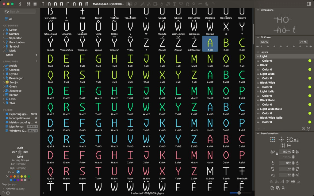
Heikki Lotvonen wanted to hand-craft a blog without dragging in heavy JavaScript libraries.That may sound odd in this modern world of static site generators and content management systems, but many folks (including me) fondly remember typing out HTML back in the day to post thoughts or share ideas. Writing in just HTML has some downsides, especially if you’re sharing code snippets. There were (and are) a few text editors that would let you copy out code as HTML so you could make code blocks more readable with syntax highlighting. Today, most of us use tools like Prism, Shiki, or highlight.js to achieve the same function. But, those tools also do the same thing as that editor-copy idiom and slice up code: wrap every token in HTML, and shove it back into the page. It’s super effective but ends up making very “messy” HTML.
Lotvonen asked a pretty radical question: can syntax highlighting live inside the font itself (GH)? The answer, believe it or not, is “yes,” thanks to a pair of obscure OpenType features.
The first is the COLR table, which lets fonts carry multiple colors. Heikki built an eight-color palette and duplicated every glyph (i.e., letters, numbers, symbols), so there’s not just an “a,” but also a blue “a,” a green “a,” and so on.
The second is contextual alternates, normally used for handwriting fonts where letters morph depending on their neighbors. Here, that same feature detects code patterns and swaps plain characters for their colored counterparts.
For JavaScript keywords, the trick is simple. When the font spots “if,” it replaces both letters with pre-colored versions. He wrote similar rules for dozens of JS keywords, CSS properties, and HTML tags.
Things get clever-er with CSS functions and HTML attributes, where there are far too many to enumerate. Instead, the font looks for any sequence of up to 25 letters followed by a parenthesis — which catches both “rgb(” and “myCustomFunction(” — and colors the whole chunk.
Strings and comments were the toughest challenge. OpenType doesn’t do loops or regex, so Lotvonen built a finite state machine. When the font sees “/”, it keeps coloring characters until it hits “/”.
The result is syntax highlighting with no JavaScript, no preprocessing, and no dependencies, just a font file and two lines of CSS (which is bonkers cool). Even textareas, normally immune to syntax highlighting because they can’t render HTML, suddenly light up like a Christmas tree. Lotvonen’s demo sandbox proves it works: full highlighting, undo/redo, all inside a plain textarea.
Of course, there are trade-offs. Updating the syntax rules requires editing the font itself. The pattern-matching is rough, so keywords can be miscolored if they appear in odd contexts. Multiline comments break if you add manual line breaks. And it only works where OpenType features are supported—which, fortunately, is most modern browsers.
Heikki hints at where this could go: pairing fonts with [harfbuzz-wasm](https://github.com/harfbuzz/harfbuzz/blob/main/docs/wasm-shaper.md) to run real parsers inside typefaces. That could wipe out most of the current limitations while preserving the core highlighting magic.
Instead of treating fonts as static vessels and layering intelligence on top with JavaScript, we can move intelligence into the font itself! Typefaces then don’t just render symbols, they actually interprets them. And that opens a door to many possibilities outside of this highlighting hack.
🐇

Bunny Fonts was launched in 2022 by Bunny as a privacy-first, GDPR-compliant drop-in replacement for Google Fonts. The service was introduced following a court ruling in Munich earlier in 2022 where a company was found guilty of violating user privacy due to using Google Fonts.
The motivation behind creating Bunny Fonts was to address privacy concerns and GDPR compliance issues with Google Fonts, offering a zero-logging policy and ensuring user data stays private while maintaining the same API compatibility as Google Fonts for easy migration. Simply swap “https://fonts.bunny.net/css” in place of “https://fonts.googleapis.com/css” in your website’s source code and let your visitors enjoy better privacy.
Google uses their font CDN to track our movements across the web, which helps fuel their profit-generating machine, which is now being used to shove AI at us wherever possible. Migrating away will help decrease their ability to be evil, albeit in a small way. But every de-Googling gesture chips away at their power, and this is one of the easiest ones to execute on.
The Surprising History of the @ Symbol

We use it constantly in email addresses, but the little @ symbol has a backstory that’s anything but straightforward.
Its modern life began in the 1970s, when we humans needed a neutral divider between usernames and domains in email addresses. The @ was already on every typewriter keyboard but almost never used, so it was deemed perfect for the job. But where did it come from in the first place?
The earliest clear sighting is from 1739, in the papers of London printer William Strahan, where it meant “at a price of.” Over the next century, printers adopted it as one of the “commercial characters,” alongside $ and %.
But its roots may go even deeper. In Spain and Italy, 16th-century merchants scribbled @ in correspondence, sometimes to mark units of measure (like amphorae of wine), sometimes to mean simply “at.” Spanish traders also used it to stand for the “arroba,” a unit of weight tied to the region’s Arabic past. Even today, Spanish speakers still call the symbol arroba.
By the 19th century, @ was firmly part of business shorthand and, as noted above, made its way onto typewriters, which then handed it off to computer keyboards. So when said email needed a separator, @ was just waiting in the wings.
This kind of means @ evolved organically, passed along by merchants, printers, and clerks who needed a quick way to write “at.” Centuries later, it’s become one of the most instantly recognizable marks in global communication.
James Mosley goes into far more detail about @’s journey — complete with a cadre of historical visual artifacts — in this piece.
NOTE: It’s an ancient Blogger site that had no obvious way to just link to this specific post, so I’m relying on the “copy link to highlight” functionality in some browsers to get you straight to it. If that doesn’t work in your browser, just scroll down until you see a giant @ (you cannot miss it).
FIN
Remember, you can follow and interact with the full text of The Daily Drop’s free posts on:
- 🐘 Mastodon via
@dailydrop.hrbrmstr.dev@dailydrop.hrbrmstr.dev - 🦋 Bluesky via
https://bsky.app/profile/dailydrop.hrbrmstr.dev.web.brid.gy
☮️

Leave a comment