Flexflex; Fit; Overshoots
It’s arts-and-crafts day at the typography-centric edition of the Drop as we take a look at two “constructivist”-inspired fonts and dig into a typography term you may not be familiar with.
TL;DR
(This is an LLM/GPT-generated summary of today’s Drop using MLX LLM in OpenAI API server compatibility mode, SmollM3-3B-8bit, and a custom prompt.)
- Flexflex (Flexflex) is a JavaScript library that draws 26 uppercase Latin letters in any rectangular container using only straight lines and circular arcs, allowing infinite continuous transformation while maintaining geometric minimalism and strict boundary logic.
- Fit (Fit) is a variable font by David Jonathan Ross that distills letters into geometric shapes, filling maximum area with perpendicular lines and circular corners, creating dense, graphic capitals that prioritize positive/negative space and resist traditional font constraints.
- Overshoots (The Art of Eyeballing – Part III: Overshooting) explores the optical adjustment in typography where rounded/pointed letters extend slightly above/below baseline heights to ensure visual equality, a concept critical for geometric typography design.
Flexflex
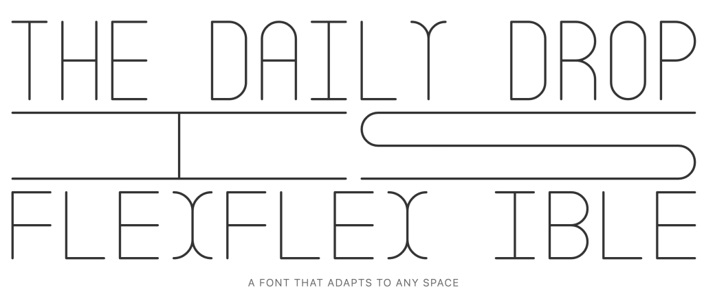
(Head over to the demo and change the window size.)
Flexflex (GH) is a super constrained typographic experiment by Roni Kaufman (Roni’s profile site is 100% worth its own visit) that investigates what happens when a typeface prioritizes adaptability to spatial requirements over dictating them. Rather than being an ordinary digital font file, Flexflex exists as a JavaScript library that programmatically draws each letterform so that it perfectly fits any specified rectangular container. This approach means that each letter – restricted to the 26 uppercase Latin alphabet, for now – can be infinitely and continuously reshaped depending on the ratio and size of its bounding box.
The forms themselves are a study in geometric minimalism and typographic logic. Each glyph is constructed from only non-diagonal, straight lines and circular arcs (quarter, half, or full circles). There are no diagonals, and all components are monolined, which helps ensure consistent stroke thickness. No element of a letter ever leaves its rectangular enclosure: there are no descenders, ascenders, or overshoots (see last section), and nothing pokes beyond its boundary. This boundary logic is important because it guarantees that, regardless of extreme stretching, every glyph remains contained and visually “flexed” to its box.
Flexflex’s modularity goes even deeper. There’s no kerning (individual letters don’t adapt to neighbors), and each glyph is drawn entirely independently. If you change the container’s shape (resizing a browser window, for example), Flexflex instantly redraws each letter to fill its new proportions. This is similar in spirit to some works by Vera van de Seyp, David Jonathan Ross (see middle section), and others, who have explored programmatic or responsive type, but Flexflex’s approach is especially strict about geometric rules and continuous transformation.
The design constraints shape not just the look but the implementation: all source code is public (under a Creative Commons BY-NC-SA 4.0 license), and anyone can explore or extend the system. The rendering happens through a single function in the library:
drawLetter(el, ch, x, y, w, h, col, sw, [skewAngle], [linecap], [linejoin])
This function lets us specify the target drawing surface (SVG or Canvas), the character, its container’s position/size, the color and stroke width, as well as optional parameters for slanting (to create oblique styles) and for setting the shape of stroke ends and joins (square or round). Any of these attributes can be manipulated programmatically, allowing for real-time visual experimentation: stretching, skewing, thickening, or rounding the type. Each change creates a fresh, mathematically aligned version, constructed entirely in code.
The typeface is a nod to both classical constructivist design (as seen in the works of Theo van Doesburg, Herbert Bayer, and others) and contemporary generative type “thinking”. It is also a testament to the new possibilities of typography when fonts are treated not as static code artifacts but as live, performative instructions. The result is a type system that resists the fixité (Kagi FTW for that word) of traditional fonts, instead offering a radically flexible, always-recalculating letterspace.
Fit
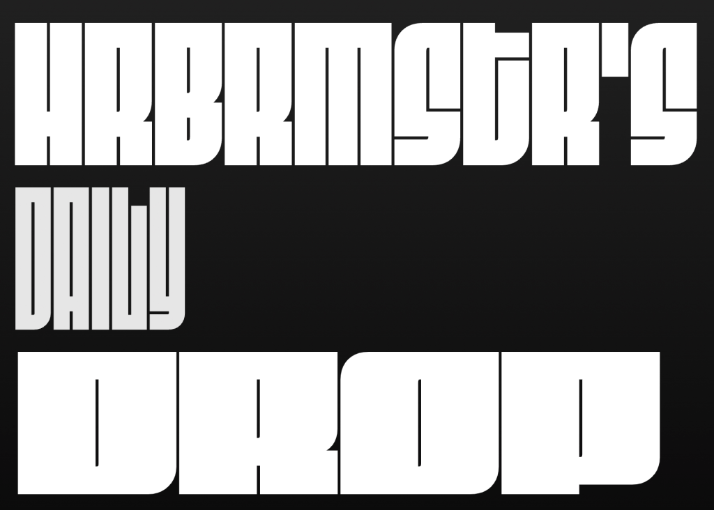
Fit is a font designed by the aforementioned David Jonathan Ross. OK, that’s not exactly true, since it is more than “just” a typeface. Ross created Fit as a visual experiment in pushing typographic boundaries where letters become objects, riddles, and images at the same time. Jonathan’s intent behind Fit was to create a type family in which each letter fills its maximum area, distilling letterforms down to almost pure geometry. This experiment required drawing virtually all capital letters using perpendicular straight lines, juggling sharp and circular corners, and, in some cases letting characters fold into themselves to banish empty space. The effect is a set of dense, graphic capitals that refuse to be lost in the background.
This was one of the first typefaces to take advantage of the (at the time) brand new variable font tech. From the razor-thin “Skyline” variant to the room-filling “Ultra Extended” (3,600%!! width growth between extremes), the forms alter only in their stroke thickness. The internal counters and the gaps between letters are always kept to thin, unchanging white lines. These turn words into mazes of positive and negative space that beg us to linger on the glyphs for a moment or two longer than we might otherwise. This consistency across widths invites unusual ways to combine and juxtapose styles, enabling playful visual effects and seamless blending between extremes on a single line.
You will want to avoid using Fit for prose/longform content. The glyphs are more like decorative artifacts or, in some settings, more like building blocks for “images.” Like Flexflex, Fit gives a nod to constructivism’s angular geometry, and font nerds of a certain age will likely also see a nod to the graphic drama of 1960s jazz album covers.
While not free, Fit may have a place in your fonts folder, and I’d 💙 to see some clever datavis folks experiment with it in some data storytelling context.
Overshoots

Type nerds and anyone who remembers elementary school likely are familiar with the terms “descender” and “ascender”, but I suspect “overshoot” is not something most folks immediately associate with typography. It refers to an optical adjustment where rounded or pointed parts of certain letterforms – like O, C, S, A, M, and V – extend slightly above the cap height or x-height and/or below the baseline. This is necessary because, to the human eye, geometrically identical heights between round/pointed and flat letters do not look visually equal. Strict mathematical alignment makes round or pointed letters appear too small compared to their flat counterparts (like H, L, or X)
Rather than consume more of my blathering, Fábio Duarte Martins’ excellent post: “The Art of Eyeballing – Part III: Overshooting”. There are scads of illustrative examples, and I guarantee you’ll be spotting more overshoots as you consume new dead tree- and glowing rectangle-based content.
FIN
Remember, you can follow and interact with the full text of The Daily Drop’s free posts on:
- 🐘 Mastodon via
@dailydrop.hrbrmstr.dev@dailydrop.hrbrmstr.dev - 🦋 Bluesky via
https://bsky.app/profile/dailydrop.hrbrmstr.dev.web.brid.gy
☮️

Leave a comment