Maximum Proxima Nova; Typography In Atlassian’s Design System; Featured Free Font: [No] King[s] Sans
FYI: I now have two Perplexity Comet gift links for anyone who wants one.
No Monday Drop for a somewhat amazing reason: the normal, daily, long covid sleep disruptions did not happen! As such, I lost the hours I usually spend cranking out a Drop. Said event also happened overnight Monday, but I had planned today’s Drop well in advance. It just took a bit to find a suitable free font to pair with some long prose sections.
TL;DR
(This is an LLM/GPT-generated summary of today’s Drop using Ollama + Qwen 3 and a custom prompt.)
- Proxima Nova turns 20: Proxima Nova, designed by Mark Simonson in 1981, has become one of the most successful modern typefaces, with a journey spanning over four decades and evolving through various iterations and names. (https://www.marksimonson.com/notebook/view/proxima-super-nova/)
- Typography In Atlassian’s Design System: Atlassian uses typography to create clear, consistent experiences that strengthen brand identity across all platforms, prioritizing accessibility principles and systematic scaling. (https://atlassian.design/foundations/typography)
- [No] King[s] Sans: A trendy, modern sans serif font perfect for logos, retro or modern branding, or any other design need, suitable for emphasizing the idea of a single king. (https://factory738.com/fonts/king-minimal-sans/
Maximum Proxima Nova
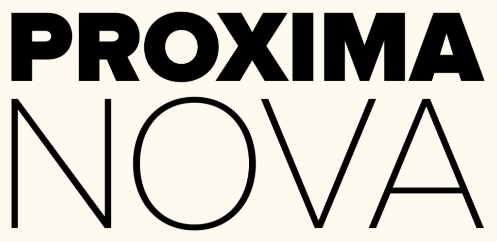
It has been nearly a year since we featured Proxima Super Nova in the Drop. While we did cover the Super incarnation, we didn’t give its progenitor proper justice. The OG typeface recently turned twenty, which is a good opportunity to take a closer look at this popular typeface.
Proxima Nova is, without question, one of the most successful modern typefaces, but its journey from concept to ubiquity spans over four decades and reveals the evolving nature of type design itself.
Mark Simonson first sketched what would become Proxima Nova in 1981, initially calling it “Zanzibar.” His vision was to create a geometric sans-serif that bridged the warmth of classics like Franklin Gothic with the structural clarity of Futura and Helvetica. The project evolved slowly through various iterations and names — Visigothic, then Proxima Sans — reflecting Simonson’s methodical approach to refining letterforms.
The first commercial release came in 1994 through FontHaus as Proxima Sans, featuring just six fonts. Sales were disappointing, and between new parental responsibilities and a full-time job, Simonson shelved the project for nearly a decade. However, Rolling Stone magazine’s adoption of Proxima Sans for a redesign in the early 2000s reignited his interest and convinced him to reimagine the family on a much larger scale.
The 2005 relaunch as Proxima Nova transformed everything, as the expanded family now included 42 fonts with OpenType features. It also arrived at the perfect moment. The explosion of webfont usage in the mid-2000s created massive demand for typefaces that worked well across digital platforms. Unlike older sans-serifs, Proxima Nova struck an ideal balance: geometric but not cold, modern but approachable. This adaptability allowed it to quietly supplant Helvetica as the default choice for a new generation of designers, eventually becoming the most popular paid webfont worldwide by the mid-2010s.
Simonson’s success stemmed from his willingness to revisit and refine his work over decade. This is an unusual occurrence in an industry that often prizes novelty over longevity. He approached type design as a solitary craft, balancing the iterative precision of traditional letterform design with a pragmatic eye for technology and utility. This persistent attention to detail distinguished Proxima Nova from competitors and contributed to its widespread adoption in branding, user interfaces, and editorial design.
However, success brought unexpected challenges. By 2019, managing Proxima Nova’s complex and expanding family had become unsustainable for Simonson as a solo designer. The growing demand for expanded language support required resources and coordination more typical of a small technology company than an individual artist’s practice. The burdens of managing, maintaining, and marketing the library increasingly pulled time away from designing new typefaces.
Recognizing these limitations, Simonson made the difficult decision to transfer ownership and stewardship to The Type Founders, a foundry with the infrastructure necessary to continue developing and maintaining Proxima Nova on a global scale. This allowed him to return his focus exclusively to creating new typefaces while ensuring Proxima Nova could reach its full potential in an international, digital-first marketplace.
Since the transfer, The Type Founders and collaborators have driven further expansions, including the aforementioned Proxima Super Nova, which supports scripts beyond Latin, Greek, and Cyrillic, extending the family into new linguistic territories. Simonson’s decision reflects a broader shift within the type industry: the recognition that enduring, world-class typefaces often require the full infrastructure of an established foundry to thrive in today’s market.
Simonson remains a celebrated designer, while Proxima Nova continues its development under new stewardship, still bearing the hallmarks of its originator’s distinctive blend of utility and charm.
Mark waxes poetic about these creations and evolutions in four recent-ish posts that I highly recommend folks take time to review:
- Proxima Super Nova
- Fonts Similar to Proxima Nova: Our Favorite Picks
- Proxima Nova Font Pairing: Our Favorite Fonts
- Proxima Nova Turns 20
Typography In Atlassian’s Design System
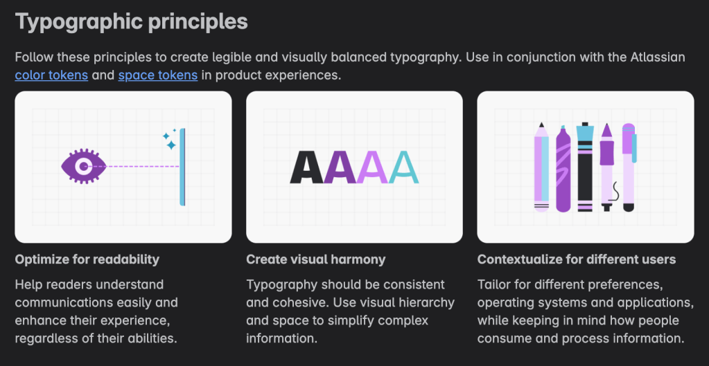
As I’ve noted in many-a-Drop, I’m more of a “user” of existing design systems and elements than a maker of them, and I accumulate links to such resources through regular internet crawls (mostly with the aid of Inoreader). A recent crawl surfaced Atlassian’s Design System (published using Storybook), since it noted there was a typography “refresh”. I’ve tried to distill the core elements of it, below.
The creators at Atlassian use typography to create clear, consistent experiences that strengthen brand identity across all platforms. They prioritize accessibility principles and systematic scaling, and provide their designers and developers with reliable text treatments that work universally.
Atlassian Sans serves as the primary typeface for all product interfaces. This custom variant of Inter Variable optimizes for screen readability with features like a single-story “a”, lowercase “l” with tail, and square punctuation. For displaying code, Atlassian Mono (based on JetBrains Mono) provides clarity with its default slashed zero and disabled ligatures to prevent ambiguity. I will forever be jealous of companies who can devote capital resoures to custom brand typography.
The typography system follows a minor third scale (we discussed typography scales in a previous Drop), where each size increases by a factor of 1.2, rounded to multiples of four pixels. This mathematical approach creates natural visual hierarchy while maintaining consistent spacing relationships. All measurements use rem units (1rem = 16px) to ensure responsive scaling that respects user browser settings and accessibility needs.
Text styles combine font family, size, weight, and spacing into standardized tokens that preserve consistency across design and development. Heading styles range from 32px for “hero” content down to 12px for compact interfaces. The default body text uses 14px for most UI components, with 16px reserved for longer reading experiences and 12px limited to fine print where absolutely necessary.
Line heights follow consistent ratios: headings use 1.2 times the font size while body text uses 1.5 times, both rounded to four-pixel increments. This creates unified vertical rhythm throughout interfaces while optimizing readability.
Font weights remain intentionally limited. Regular (400) handles most text, Medium (500) works alongside icons or in components, and Bold (700) emphasizes headings or critical information. The system avoids semibold to prevent inconsistent fallback behavior across different browsers and operating systems. Yes: “fonts” compatibility is still an issue in 2025. I run into this with designing typography themes for {ggplot2} quite a bit.
Headings establish clear information hierarchy and support screen readers through proper semantic structure. Each page should contain only one H1, with subsequent headings following logical sequence. Marketing content typically uses the largest sizes (32px, 28px), product interfaces favor medium sizes (24px, 20px), and compact UI elements use smaller headings (16px, 14px, 12px) based on available space and content importance.
Metric styles specifically highlight numerical data in dashboards and charts, using larger sizes (28px, 24px, 16px) to draw attention to key performance indicators. However, supporting elements like chart legends and axis labels should use standard body styles to maintain appropriate visual weight.
Code formatting applies consistently across inline snippets and code blocks using the dedicated 12px monospace token. This ensures technical content remains readable while distinguishing it from regular interface text.
Color and contrast follow established accessibility standards, with typography color tokens guaranteeing sufficient contrast ratios. The system supports responsive design by scaling proportionally with user preferences while maintaining minimum readable sizes.
Optimal line length stays between 60-80 characters for comfortable reading, requiring adjustment for mobile viewports. Truncation only appears when expansion options exist, and all-caps text remains limited to acronyms or specific components.
This systematic approach balances design flexibility with implementation consistency, enabling teams to create interfaces that communicate clearly while reinforcing Atlassian’s brand identity across diverse digital experiences.
The site is, at a minimum, worth bookmarking to use as a reference for you and your team if you ever want to level up what you create.
Featured Free Font: [No] King[s] Sans
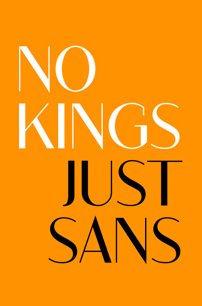
We’re gearing up for another protest and I’ve been scouring the intertubes for a font to use for the next sign. It seems appropriate to use King Sans to emphasize that it is the only king we need (besides Stephen).
As the foundry notes, it is a trendy, modern sans serif font that is perfect for design projects. The casual and minimal style make this typeface well-suited for logos, retro or modern branding, or any other design need you may have.
FIN
Remember, you can follow and interact with the full text of The Daily Drop’s free posts on:
- 🐘 Mastodon via
@dailydrop.hrbrmstr.dev@dailydrop.hrbrmstr.dev - 🦋 Bluesky via
https://bsky.app/profile/dailydrop.hrbrmstr.dev.web.brid.gy
☮️

Leave a comment