How Typefaces Got Their Names; From Boheld to Bodega; So Beta
Some fun, fresh, novel and all fontastic resources in today’s typography-centric edition of the Drop.
TL;DR
(This is an LLM/GPT-generated summary of today’s Drop using Ollama + Qwen 3 and a custom prompt.)
- A graphic explores the etymological origins of typeface names, highlighting their historical and cultural significance (https://www.alphabettes.org/wp-content/uploads/2015/09/perpetua_wardle.pdf)
- Zohran Mamdani’s campaign used bold, hand-drawn typography and culturally resonant colors to create a distinctive political identity (https://www.fastcompany.com/91360641/the-anatomy-of-zohran-mamdanis-winning-campaign-poster)
- Setup Type Lab offers unfinished font families as beta versions, allowing real-world testing and feedback to refine their designs (https://www.setuptype.com/blog/setup-type-lab)
How Typefaces Got Their Names

The “chart” in the section header is a work by @etymology_nerd on X (hence no link). It presents etymological claims about how various typefaces received their names. I knew most of them (and their background), but used Apple’s spiffy local image-to-text models to to extract the annotations for each hex, ran each through a Kagi search, did a quick check to make sure the basic claims were true (they are!).
The graphic serves both as a quick reference and a reminder that fonts are almost “living” entities. A typeface’s “identity” is often tied in deeply with that of their creator, and many have fascinating backstories. Plus, if you never gave much thought to a font’s name, this is a nice reminder to have around, and can be a sneaky quick reference if you want to sound posh at a fancy dinner party.
I’ll leave you with a foray into the history of one of them by Alpbabettes contributor Tiffany Wardle, where she digs into the history of Perpetua and a companion (italics) font Felicity. This typeface was the only one in the list (perhaps, apart from Aharoni) that I was completely unfamiliar with, and it’s a quick but interestring read.
From Boheld to Bodega

(I wrote this section because, as you’ll see, the design choices got so much attention that nearly all the linked articles ended up in my Inoreader search-based “typography” feed folder. So, I felt compelled to dig in.)
When Zohran Mamdani’s bright yellow campaign posters began appearing across New York City, they didn’t just catch attention. In a way, they ended up rewriting the rules of political typography. With virtually every poster and flyer normally being dominated by sterile, traditional (dare I say “safe”) sans-serif fonts and predictable color schemes, Mamdani’s visual identity stood out like a neon beacon in Times Square.
The centerpiece of Mamdani’s visual campaign is his custom wordmark, which began life as Boheld, a decorative typeface more commonly seen on whiskey labels than campaign posters. Designer Aneesh Bhoopathy took this Old English-inspired font and transformed it into something entirely new, hand-tuning the typeface until it perfectly captured Mamdani’s personality.
“It’s funny,” Bhoopathy told The Hollywood Reporter. “I think people would probably be surprised to learn that was the starting point.” The dramatic drop shadows and bold serifs that made Mamdani’s name impossible to ignore were inspired by vintage Bollywood posters—a nod to his South Asian heritage and his mother, acclaimed filmmaker Mira Nair.
While “ZOHRAN” commanded attention in its custom serif treatment, the campaign needed balance. For supporting text like “for New York City,” Bhoopathy chose Union Gothic (though some sources reference it as “Unique Gothic”), a clean sans-serif that provided what he called necessary equilibrium.
“We wanted to balance out the playfulness so the identity doesn’t get too Barnum and Bailey,” Bhoopathy explained. This typographic restraint prevented the design from becoming a circus act while maintaining its joyful energy.
A super interesting aspect of these designs is that much of Mamdani’s typography carried a hand-drawn quality that echoed New York’s disappearing bodega signage. It turns out that this wasn’t accidental. The team made a deliberate choice to evoke the “human touch” that differentiated the campaign from corporate political branding.
The typography worked in concert with the campaign’s signature colors: MetroCard yellow, Mets blue, and fire-engine red. These weren’t just aesthetic choices but cultural references that every New Yorker would recognize—from taxi cabs to subway cards to lottery tickets.
As noted, traditional political campaigns typically rely on safe, corporate-feeling fonts that project stability and authority. Mamdani’s team threw this playbook out the window. As one observer from the AOC campaign noted, his poster “looked more like a concert poster for a singer than a political campaign poster”—which designer Scott Evans took as the ultimate compliment.
The typography’s success wasn’t just aesthetic; it was strategic. For a candidate whose name many voters needed to learn to pronounce, making “ZOHRAN” large, memorable, and phonetically clear was brilliant communication design.
These design choices prove to be as novel and refreshing as Mamdani’s overall campaign and approach to governing. In an era of focus-grouped political messaging and sanitized visual identities, his team created something that felt authentically connected to both his personal story and the city he aimed to represent.
The fonts told a story — of heritage and home, of tradition and innovation, of a candidate who wasn’t afraid to stand out in a crowded field. In the end, perhaps that’s the most important lesson from Mamdani’s typographic revolution: sometimes the most powerful political statement is simply refusing to look like everyone else.
These are some of the aforementioned deluge of articles on this topic:
- Here’s what made Zohran Mamdani’s campaign poster so good – Fast Company
- Font used in Zohan Mamdami campaign : r/identifythisfont
- Zohran’s Campaign Logo Looked Nothing Like a Campaign Logo
So Beta
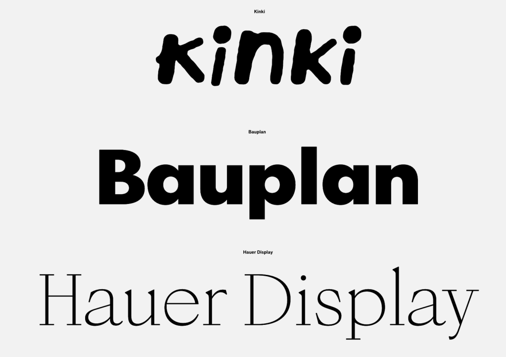
Setup Type Lab is a new initiative from solo type designer Setup Type, releasing 25 unfinished font families as beta versions rather than letting them sit indefinitely on the shelf. These highly usable fonts are priced based on their completion level (version 0.1-0.9) and represent a pragmatic approach to running a one-person foundry. The Lab serves as a space for pre-release typefaces, experiments, and previously client-only custom fonts, inviting real-world testing to help push these designs toward their final versions.
A number of specimens are intriguing (Sonda caught my eye for some reason), and I felt this was a unique enough offering to warrant including a pay-to-use series of glyphs.
FIN
Remember, you can follow and interact with the full text of The Daily Drop’s free posts on:
- 🐘 Mastodon via
@dailydrop.hrbrmstr.dev@dailydrop.hrbrmstr.dev - 🦋 Bluesky via
https://bsky.app/profile/dailydrop.hrbrmstr.dev.web.brid.gy
☮️

Leave a comment