Featured Freemium Font: Wumpus Mono; Featured Free Font: Annotation Mono; Bonus Free Font: 🍁 Mono
I ended up not having time to dig into two stories I wanted to include, today, so it’s going to be a (mostly) free-for-all typography-centric edition of the Drop, today.
TL;DR
(This is an LLM/GPT-generated summary of today’s Drop using Ollama + Qwen 3 and a custom prompt.)
- Wumpus Mono is a modern monospaced freemium font designed for programming, with features like OpenType stylistic sets and programming ligatures, available for free via GitHub with a paid “pro” version (https://vaughantype.com/wumpus-mono-pro/)
- Annotation Mono is a variable monospace font offering extensive customization with two axes (Weight and Slant) and support for 377 languages, available on GitHub (https://qwerasd205.github.io/AnnotationMono/)
- Maple Font is a multilingual monospace font with clean curves, good italics, and ligatures, designed to address shortcomings in existing fonts and available on GitHub (https://font.subf.dev/en/)
Featured Freemium Font: Wumpus Mono
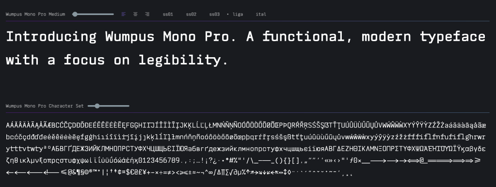
Wumpus Mono (GH) is a modern monospaced freemium typeface, designed specifically for programming environments with influences from IBM Plex and Susan Kare’s Chicago. If you still crank out or edit Perl code, take some comfort that you are not alone, as Wumpus Mono was created with Perl developers particularly in mind, as it reflects the designer’s own coding workflow and priorities.
The font does excel at small-size legibility. While I’m not partial to a “dense” layout for terminals or code, I know many folk are, and this works very well in that context. OpenType stylistic sets allow toggling between single and double-storey variants for characters like ‘a’ and ‘g’, plus alternative forms for ‘l’. Special attention to characters like ‘i’, ‘J’, and ‘j’ reduces common monospace ambiguity issues.
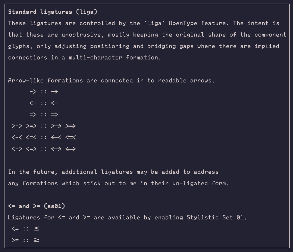
If you are partial to programming ligatures (they’re still fairly contentious), Wumpus has them, and they do help improve visual flow of multi-character operators
The name honors a radio astronomer friend nicknamed “wumpus” and references the classic “Hunt the Wumpus” game, reinforcing its terminal culture roots. This “space” theme continues with a deliberate and distinctive six-lobed asterisk, of which the designer said draws inspiration from the James Webb Space Telescope’s hexagonal mirrors.
Tis free for personal evaluation via GitHub, with a paid (<$100 USD) “pro” version offering additional weights and styles.
Featured Free Font: Annotation Mono
Annotation Mono (GH) is a variable font that bridges the gap between a handwritten feel and the brutalist functionality of monospaced type.
The font’s two variable axes provide extensive customization: Weight (100-1000) spans from Thin to ExtraBlack, while Slant (0° to -15°) offers precise italicization control. It supports a whopping 377 Latin-based languages, making it genuinely multilingual.
It is definitely a thoughtful entry in the monospace landscape that demonstrates how traditional constraints can inspire innovative solutions.
Featured Free Font: 🍁 Mono
Choosing the “perfect” coding/terminal font is an endless pursuit (at least for humans; I wonder when we’ll see opinionated coding assistants make snyde remarks about our IDE typeface choices). Being the perpetual font gadfly, I’m never one to resist the urge to try out a new candidate when it appears. Enter: Maple Font (GH).
Song (the creator) didn’t just build yet-another monospace font; they dissected the existing landscape and found it wanting:
- JetBrains Mono: precise but rigid
- Fira Code: great ligatures, mediocre italics
- Victor Mono: overly stylized cursive
- Sarasa Gothic: Chinese support but cramped English
Fair critiques. Anyone juggling multilingual codebases knows the pain.
The glyphs have clean curves that don’t sacrifice readability for personality. The italics actually look cursive without being pretentious (something I also appreciate about the Recursive family).
It was designed with multilingual support as a paramount feature, and even has a variable font if your environment supports using that over TTF/OTF.
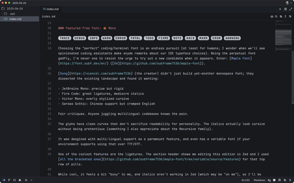
One of the coolest features is the ligatures. The section header shows me editing this edition in Zed and I used all the bracketed ones for that top row of pills.
While it’s a pretty spiffy font, it feels a bit “boxy” to me, and italics aren’t working in Zed (which may be “on me”), so I’ll be sticking with Recursive for a tad longer.
FIN
Remember, you can follow and interact with the full text of The Daily Drop’s free posts on:
- 🐘 Mastodon via
@dailydrop.hrbrmstr.dev@dailydrop.hrbrmstr.dev - 🦋 Bluesky via
https://bsky.app/profile/dailydrop.hrbrmstr.dev.web.brid.gy
☮️

Leave a comment