Death To Kerning!; Henceforth, I Never Will Be Humanist; Feeatured Free Font: Nebula Sans
Typography is more than just picking a font—it’s the craft of shaping how we see, read, and interpret meaning in everything from memorials to marketing.
This week, we look at two flashpoints in the type world: the global uproar over the poorly spaced lettering on Pope Francis’ tombstone; and, the heated debate around Nebula Sans’ claim to “humanist” status. Both stories show how seemingly minor design choices—letter spacing, terminology, or a typeface’s lineage—can trigger strong reactions from both designers and casual observers.
Whether carved in stone or released as open-source, typography isn’t mere decoration. It’s a powerful force that guides our eyes, shapes our emotions, and sometimes ignites controversy.
TL;DR
(This is an LLM/GPT-generated summary of today’s Drop using Ollama + Qwen 3 and a custom prompt.)
- The Pope Francis tombstone’s typography sparked global debate due to poor kerning, making the inscription “Franciscus” appear disjointed (https://archive.ph/SAUW4)
- The misuse of the term “humanist” in describing Nebula Sans led to criticism from typography communities, highlighting the importance of accurate typographic terminology (https://nebula.tv/)
- Nebula Sans is a free, open-source font developed by Nebula as a replacement for their previous commercial font, though it’s not considered a true humanist sans-serif (https://nebulasans.com/)
Death To Kerning!

The recent unveiling of Pope Francis’ tombstone ignited an unexpected global debate. Rather than focusing on the Pope’s legacy or the simplicity of his final resting place, attention centered on the typography etched in marble. The inscription, intended to read “Franciscus,” instead appears to many as “F R A NCISC VS,” a visual hiccup that shattered the minds of many a designer/typographer.
What Went Wrong? Kerning. As we’ve noted more than a few times, kerning is the fine art of adjusting space between individual letters to achieve visual harmony. While the tombstone’s use of Times Roman (a battered workhorse serif font) might seem fitting for Francis’s humble wishes, the execution fell pretty flat. Folks immediately noticed that the spacing between certain letters, especially around the “A” and “N,” was so irregular that it broke the word’s flow and readability. As Charles Nix of Monotype put it, “Woe be unto the person who decided to do it the way that they did it, just because it’s a bad decision that will last for a long time, unless they change it.”
The likely culprit? A mechanical, mathematical approach to spacing, rather than an optical one. Experts suspect the letters were laid out as individual elements, spaced by measuring from edge to edge instead of by eye, which ignores the unique negative spaces each letterform creates. This is a common pitfall in modern stone cutting, where templates are often computer-generated and lack the nuanced kerning adjustments typographers obsess over. As a result, the inscription looks awkward, with the “A” in particular appearing isolated, almost as if it’s a secret button to a hidden chamber.
To the casual observer, the inscription may simply look “off.” But to typographers, this is a textbook example of why kerning matters, even in monumental contexts. Proper kerning is about optical balance, not just mathematical distance. Roman capitals, with their varied shapes and widths, demand hand-tuned adjustments for legibility and beauty. As Paul Shaw, a type historian, noted, “RAN” and “CVS” are letter combinations that have always required special care, care that was clearly absent here.
The irony is sharp: a tomb meant to embody humility and simplicity now draws attention for an avoidable visual misstep. While the Vatican has no plans to alter the inscription, the debate serves as a powerful reminder. Typography is never just decoration. It’s a craft that shapes how we perceive meaning, even in stone.
Henceforth, I Never Will Be Humanist
In Act II, Scene II of Romeo & Juliet, our [in]famous female protagonist drops a profound beat:
What’s in a name? That which we call a rose
By any other name would smell as sweet;
noting that a name is nothing but a name, and it is hence a convention with no meaning behind it.
Many ardent typography aficionados would likely disagree with said assertion, and they certainly did when the folks from the Nebula streaming service released the font we’re showcasing in the last section. They described it thusly:
A versatile, modern, humanist sans-serif with a neutral aesthetic, designed for legibility in both digital and print applications.
In similar fashion to the response to the kerning in the first section, the misuse of “humanist” shattered the minds of typography communities on Lemmy, Reddit, and other hangouts. These critics argued that, since it’s essentially a tweaked Source Sans (itself only debatably “humanist”), the label is more branding than typographic truth. This is especially true when compared to canonical humanist sans-serifs like Gill Sans or Frutiger. Many see the “humanist” claim as generic marketing spin, diluting the term’s meaning, while typographic purists call out the lack of true calligraphic or old-style influence.
To help you avoid stirring a similar controversy, the fine folks at Monotype have a spiffy Typography Style Guide that provides a wealth of information and examples of the core typeface styles. You should 100% keep it bookmarked (and also read it), but you can also keep the cheat sheet (below) handy in a pinch.
- Blackletter (Gothic/Textura)
Dense, angular forms based on medieval manuscripts; narrow proportions, sharp lines, steep pen angle. - Didone (Modern)
Extreme contrast between thick and thin, vertical stress, thin unbracketed serifs; think Bodoni and Didot. - Garalde
Transitional old-style serifs named for Garamond and Aldus Manutius; moderate contrast, refined proportions, horizontal crossbars. - Geometric Sans
Constructed from basic shapes (circles, squares); monolinear strokes, simple forms, single-storey “a” and “g”. - Graphic/Display
Decorative, ornamental, or experimental; designed for impact and display rather than readability. - Grotesque Sans
Early sans serifs; quirky shapes, some stroke contrast, squarish curves, often with spurred “G”. - Humanist Sans
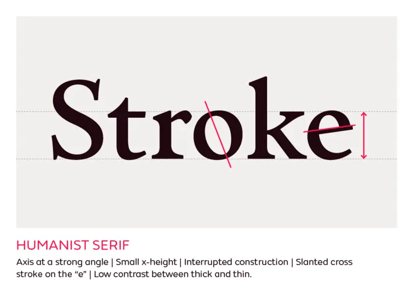
Sans serif with calligraphic influence; open forms, angled stress, double-storey “a” and “g”, designed for readability. - Humanist Serif
Inspired by Renaissance calligraphy; features organic, hand-drawn shapes and low contrast between thick and thin strokes. - Incised (Glyphic)
Inspired by letters carved in stone; flared or minimal serifs, often all-caps, echoing Roman inscriptions. - Neo-grotesque Sans
More regular and neutral than grotesques; minimal contrast, clean lines, even proportions (e.g., Helvetica, Univers). - Script
Based on handwriting; connected, often slanted letters, ranging from formal to casual, mimicking pen or brush strokes. - Slab Serif (Egyptian/Clarendon)
Heavy, block-like serifs-either squared (Egyptian) or bracketed (Clarendon); designed for display, with large x-height and low contrast. - Transitional
Bridge between old-style and modern serifs; higher contrast, nearly vertical stress, flat and refined serifs.
Ultimately, in this time when seemingly “nothing matters”, you can likely use whatever words you want to describe a font style. Just be prepared to ward off the pitchforks and torches of the informed zealots when you do so.
Featured Free Font: Nebula Sans

With the controversy out of the way, head on over and pick up your free copy of Nebula Sans. It’s an open-source sans-serif typeface, developed — as noted — by Nebula as a replacement for their previous commercial font due to licensing costs. The font is based on Source Sans, with adjustments to better fit Nebula’s brand and needs. Just remmeber: none dare call it a humanist.
Protip: If you tap the link to the Nebula streaming service from the Nebula Sans page, you can get a discount on a year streaming from that indie service.
FIN
Remember, you can follow and interact with the full text of The Daily Drop’s free posts on:
- 🐘 Mastodon via
@dailydrop.hrbrmstr.dev@dailydrop.hrbrmstr.dev - 🦋 Bluesky via
https://bsky.app/profile/dailydrop.hrbrmstr.dev.web.brid.gy
☮️

Leave a comment