It Ain’t Easy Being Green; Ending Font Famine; First They Came For The ‘Delve’
Tis font wonk time, again, for the typography-centric edition of the Drop, with one resource that solves a real problem, another that highlights a truly poorly-chosen design trend that needs to die in a fire, and a last one that laments one more thing our AI overlords are trying to take away from us.
TL;DR
(This is an LLM/GPT-generated summary of today’s Drop using Ollama + llama 3.2 and a custom prompt.)
- Microsoft Design introduces Kermit, a typeface specifically designed for children learning to read, addressing reading challenges faced by children with dyslexia (https://microsoft.design/articles/introducing-kermit-a-typeface-for-kids/).
- Thin fonts have become a significant accessibility barrier due to poor legibility and usability issues, particularly on standard monitors, mobile devices, or in suboptimal lighting (https://webdesignerdepot.com/thin-fonts-are-a-usability-nightmare-and-finally-designers-are-waking-up/).
- The em dash has become a suspect mark in the AI arms race, with its overuse by large language models leading to a backlash and concerns about machine-generated writing (https://archive.ph/6qnfx).
It Ain’t Easy Being Green
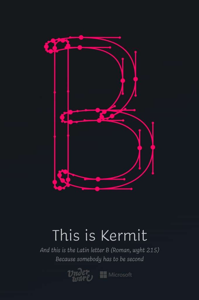
Rob McKaughan of Microsoft Design has a great, recent post that introduces Kermit, a typeface specifically for children learning to read, crafted in a partnership with type design studio Underware.
The font addresses reading challenges, including those faced by children with dyslexia – approximately one in ten people have some form of dyslexia, often undiagnosed, making basic reading tasks challenging. Kermit exemplifies how design can transform learning outcomes through scientific research and creative approaches.
The designers wanted Kermit to feel as welcoming as a handwritten note from a friend. They focused on informal, relatable characteristics: large x-height, thick strokes, generous spacing, and familiar letter shapes. These elements combine the warmth of handwriting with the clarity of classic book typefaces like Garamond or Avenir. Kermit supports over 426 languages across Latin, Greek, and Cyrillic alphabets.
Kermit innovatively represents prosody, a TIL word that relates to the rhythm, pitch, and emphasis of speech that written text typically lacks. Research indicates that typographic representation of vocal inflections improves children’s reading aloud and comprehension. Kermit uses boldness to show volume, width for duration, and vertical shifts to represent pitch. These visual cues help convey spoken language nuances, potentially improving comprehension for children and adults with hearing impairments.
For readers with dyslexia, Kermit explores animation possibilities. As a Variable Font, it transitions smoothly between styles rather than being limited to static styles like Light, Regular, or Bold. The designers implemented Higher Order Interpolation (HOI), allowing letters to draw themselves naturally, similar to handwriting motion. This animated version remains in testing, but might help dyslexic readers by strengthening neural pathways involved in reading, improving word recognition and letter order understanding.
Kermit represents significant progress in making reading more accessible and enjoyable. By merging research-based strategies with approachable design, it aims to build children’s confidence and stimulate their imaginations. The basic styles (Regular, Bold, Italic, Bold Italic) are available in Microsoft Office, with additional styles coming soon. Those interested can experience Kermit through an online demo site.
Ending Font Famine

In “Thin Fonts Are a Usability Nightmare—And Finally, Designers Are Waking Up”, Noah Davis discusses the some very real and present problems with thin fonts.
These barely there typefaces emerged as a design trend symbolizing minimalism and luxury but have become a significant accessibility barrier. Initially lauded for creating clean, sophisticated interfaces, these wispy typefaces create real usability issues that affect millions of humans across various devices and viewing conditions.
The fundamental concern stems from poor legibility. While thin fonts might appear elegant in ideal scenarios (e.g., on high-resolution displays with perfect lighting) they fail in everyday situations when viewed on standard monitors, mobile devices, or in suboptimal lighting. Readers must strain to read content, particularly when designers pair these fonts with trendy low-contrast color schemes. This creates barriers for everyone, especially those with visual impairments, color blindness, or cognitive differences.
The accessibility impact extends beyond inconvenience to legal compliance issues. Many thin typefaces fail to meet Web Content Accessibility Guidelines (WCAG), exposing organizations to potential legal consequences and excluding visitors from accessing content. Even folks without disabilities avoid sites that require squinting to read navigation elements or call-to-action buttons. This frustration leads to abandoned visits, reducing engagement and conversion rates.
Mobile experiences compound these issues. Small screens magnify the weaknesses of thin fonts, rendering text nearly unreadable in common situations involving glare or dim lighting. The problem became so widespread that industry leaders who initially promoted thin typography — including Apple and Google — reversed course by implementing thicker, more readable fonts after complaints and usability testing revealed significant problems.
A positive shift has begun across the industry. Major brands, from technology companies to luxury fashion houses, have abandoned ultra-thin typefaces for more readable alternatives. This transition reflects growing recognition that accessibility and usability constitute fundamental aspects of effective design rather than optional features. More readable typography correlates with improved engagement, higher conversion rates, and more inclusive reader experiences.
The message for any of us who publishes content of any kind remains clear: avoid defaulting to thin fonts merely for aesthetic appeal in static mockups. Effective design requires testing typography under realistic conditions — across device types, lighting situations, and with diverse consumers. Prioritizing contrast and legibility serves everyone better. When clients request ultra-thin fonts to achieve high-end visual appeal, designers should advocate for best practices supported by usability data. Excellence in design means prioritizing clear communication and accessibility over whispered elegance.
The era dominated by thin fonts appears to be ending as the industry embraces typography that prioritizes function alongside form. The most effective typography balances visual appeal with practical functionality, ensuring every person can read, engage with, and participate in digital experiences regardless of ability or circumstance.
First They Came For The ‘Delve’

The em dash—once a mark of typographic sophistication and rhythmic prose — has become collateral damage in the AI arms race. Commercial large language models (LLMs) like ChatGPT have not only flooded the internet with formulaic writing, but have also made certain words and punctuation marks, such as “delve” and the em dash, suspect. What was once a sign of a writer’s stylistic flair is now, in the eyes of many, a “tell” — a red flag that a machine may have done the heavy lifting.
This shift is more than a passing annoyance for those of us who care about typography. The em dash is a beautiful, versatile element — a pause, a pivot, a flourish that gives prose its unique cadence (and one I may be deliberately over-using in this section 🙃). But as LLMs churn out content at scale, their overreliance on the em dash has led to a backlash. The dash’s presence is now met with skepticism, its charm eroded by association with algorithmic mimicry. What was once a subtle typographic choice is now a signpost for “AI-generated,” and writers who use it naturally find themselves unfairly scrutinized.
It’s not just anecdotal. Viral posts and podcasts have dubbed the em dash the “ChatGPT hyphen,” (ugh) and social media is awash with suspicions about any text that uses it with frequency. Some even advise removing em dashes from writing to avoid the taint of machine authorship. The effect is chilling: a typographic tool, beloved by journalists and stylists for centuries, is being pushed to the margins — not because of its misuse by humans, but because of its overuse by machines.
The em dash isn’t the only casualty. Words like “delve,” “particularly,” and “not only” have also become suspect, their frequency in LLM output making them shorthand for “AI wrote this”. This phenomenon isn’t limited to punctuation; it’s a broader flattening of style. LLMs, trained on oceans of internet text, reproduce the most common patterns — sometimes overzealously — until distinctiveness is lost. As one commentator put it, “The machines weren’t aiming for elegance, they were going for efficiency. And, in the process, they turned the sophisticated toolbox of punctuation into a blunt instrument”.
This is a deeper problem for typography lovers. The em dash, the en dash, the subtle interplay of hyphens and spaces — these are the details that give text its visual and rhythmic character. They are the marks of careful design and attentive editing. But as AI-generated writing becomes ubiquitous, these marks are co-opted, stripped of their nuance, and rendered generic. The typographic landscape, once full of variety and intention, risks becoming a monoculture of machine-learned habits.
The irony is that the em dash’s new association with AI is not because it was invented or popularized by machines, but because LLMs learned it from the best human writers. Journalists, essayists, and stylists have long relied on the em dash for its expressive power. Now, their own tools are being weaponized against them, and their writing mistaken for the output of a bot.
What’s lost isn’t just a mark on the page, but a piece of typographic culture — a way of shaping thought and voice in text. As AI continues to shape the way we write and read, the challenge is to reclaim these elements, to remind ourselves that beauty in typography is not a “tell” but a tradition worth defending. If we cede the em dash, the en dash, or the carefully chosen word to the algorithms, we lose not just our tools, but our typographic soul.
So yes, first they came for the “delve.” Now, they’re coming for the em dash. What will be left when every beautiful mark is suspect, every flourish a sign of the machine? For those who love typography, it’s a loss that’s more than aesthetic — it’s existential.
FIN
Remember, you can follow and interact with the full text of The Daily Drop’s free posts on:
- 🐘 Mastodon via
@dailydrop.hrbrmstr.dev@dailydrop.hrbrmstr.dev - 🦋 Bluesky via
https://bsky.app/profile/dailydrop.hrbrmstr.dev.web.brid.gy
☮️

Leave a comment