Putting the ‘I’ In Tensile; The Secret History of the Manicule; Featured Free Font: Ronzino
Today’s Drop was on track to be on-time, but the U.S. Gov decided to upend the entire foundation of my industry by killing off the program that tracks software vulnerabilities (MITRE CVE). Needless to say, the post-noon Tuesday was just a tad bit chaotic.
TL;DR
(This is an LLM/GPT-generated summary of today’s Drop using Ollama + llama 3.2 and a custom prompt.)
- This study questions the traditional I-beam design by testing letter-shaped cross-sections from over 1,000 typefaces using physical testing and computer simulations (http://dx.doi.org/10.13140/RG.2.2.35453.88802)
- The manicule symbol has a history stretching back nearly a thousand years, originating in medieval manuscripts as a personal highlighter and later becoming a common sight in European manuscripts (https://www.messynessychic.com/2025/03/07/the-secret-history-of-the-manicule-little-hand-thats-everywhere/)
- Ronzino is a modern neutral sans serif font designed to serve as a contemporary alternative to Arial, offering advanced OpenType features and a fresher visual personality (https://www.collletttivo.it/typefaces/ronzino)
Putting the ‘I’ In Tensile
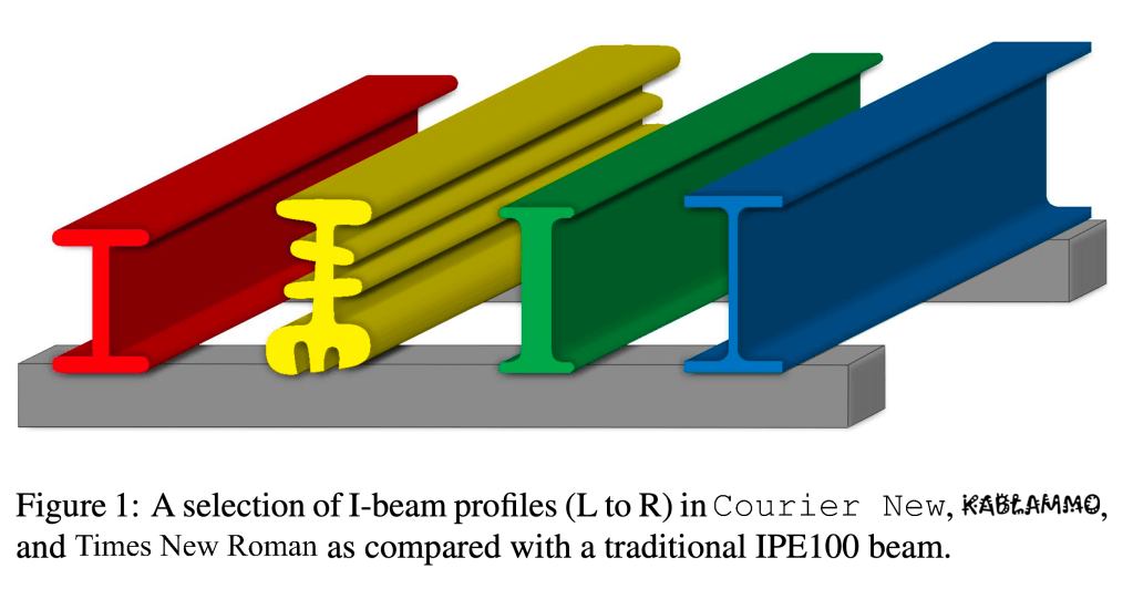
Brought to you by the “Too Much Time And Computational Power On Their Hands” department comes this study (GH) which questions whether the traditional I-beam design is truly optimal by testing letter-shaped cross-sections from over 1,000 typefaces. Researchers used both physical testing with CNC-machined plastic beams and computer simulations to compare performance under different types of stress.
I-beams emerged during the industrial revolution when new steel rolling mills could mass-produce standardized shapes. Their design—with wide flanges connected by a thin web—efficiently places material where bending stresses are highest. But this shape came from manufacturing limitations of the 1800s, not from a comprehensive search for the best possible design.
For fair testing, all letter profiles were scaled to the same dimensions and normalized by mass. Physical tests showed the Courier New “I” performed similarly to standard I-beams, while BioRhyme “I” slightly outperformed them due to its wider flanges and lack of fillets. When testing other letters, researchers found that a rotated “H” performed better in both bending and torsion, while circular “O” shapes resisted buckling best.
Computer simulations tested every letter in every typeface under various loads. The best performers under bending were symmetrical designs with wide flanges and evenly distributed material. Handwritten and script fonts performed poorly, failing early due to their irregular and disconnected shapes. Round letters like “O” and “D” resisted buckling best, while total cross-sectional area determined tension performance regardless of shape. For torsional resistance, profiles with mass distributed away from center performed best.
These findings challenge the idea that the I-beam represents peak structural efficiency. By examining typography, researchers discovered that alternative profiles—already familiar in visual culture—can outperform standard I-beams for specific loads. This suggests a new approach to structural engineering where aesthetic and historical forms might inspire better-performing designs. The research also highlights the importance of simulation and testing, as simple formulas can’t capture the complex interplay of geometry and real-world failure modes.
I remain unconvinced this is not just some elaborate April 1st tomfoolery, but I am so here for it this year, if so.
The Secret History of the Manicule

The manicule, that familiar pointing hand symbol, has a history stretching back nearly a thousand years. Its origins lie in the margins of medieval manuscripts, where readers — often monks or scholars — ould draw little hands to highlight important or provocative passages. These early manicules were deeply personal, each one a unique doodle or miniature artwork, sometimes as simple as a few quick pen strokes, sometimes elaborately decorated with cuffs and exaggerated fingers. The Domesday Book of 1086 is among the earliest surviving works to feature such marginalia, and by the 12th to 15th centuries, the manicule had become a common sight in European manuscripts. For centuries, it was arguably the most prevalent symbol readers added to texts, serving as a medieval highlighter and a silent shout of “Look here!” in the language of pen and parchment.
With the advent of the printing press in the 15th century, one might have expected the handwritten manicule to disappear. Instead, printers quickly recognized its utility and began casting the symbol in metal type. The first printed manicule appeared in a 1479 book of canon law, and soon publishers were using it to draw attention to footnotes, commentary, or important sections of text. The margin, once the reader’s domain, became a space for publishers and authors to guide the reader’s attention. Printed and handwritten manicules coexisted for a time, creating a dialogue between the reader’s personal highlights and the publisher’s preselected points of interest.
By the 1800s, the manicule had escaped the confines of books and entered public life. It became a graphic staple in Victorian advertising, newspapers, posters, and signage. The symbol’s directness and charm made it a favorite for pointing out prices, attractions, or headlines. Its most famous appearance may be on the 1865 wanted poster for John Wilkes Booth, where a bold manicule emphasized the reward for Lincoln’s assassin. Manicules also adorned street signs, gravestones, and even U.S. Postal Service stamps. However, by the late 19th century, the symbol’s ubiquity led to its decline; it became almost comical through overuse, and simpler arrows began to replace it in print and signage.
Despite fading from mass print, the manicule never vanished entirely. It lived on in niche uses, such as in the U.S. Postal Service’s “Return to Sender” stamp, and in the playful marginalia of writers like H. L. Mencken and Kurt Vonnegut. Its true revival, however, came when we started staring at glowing rectangles. The graphical user interfaces of early computers, such as the Xerox Star in 1981, adopted the pointing hand as a cursor, and today the manicule is embedded in the very code of the web. In CSS, the cursor style for clickable links is literally named “pointer,” a direct nod to its typographic ancestor. Manicule emojis — 👉, ☝️, and others — are now part of Unicode, allowing anyone to send a digital version of the symbol with a tap.
In recent years, the manicule has enjoyed a nostalgic resurgence. Vintage-style signage, boutique branding, and graphic design often employ the pointing hand to evoke a sense of retro charm and playful guidance. The symbol endures because its meaning is so intuitively human: to point is to direct, to highlight, to connect. Whether inked in the margin of a medieval manuscript, printed in a Victorian advertisement, or rendered as a cursor on a digital screen, the manicule bridges centuries of communication, always signaling that something is worth noticing.
Featured Free Font: Ronzino
Ronzino is explicitly influenced by Arial but was designed to serve as a more contemporary, neutral sans serif for Collletttivo’s own website and communications.
Arial and Ronzino represent two different approaches to neutral typefaces. While Arial is widely recognized for its neutrality, it’s often criticized as uninspired despite offering an extensive range of mostly standard styles. Though it provides broad character coverage, it doesn’t always address modern typographic needs effectively. Arial offers only basic OpenType feature support and, despite good general readability, can sometimes appear cramped or generic, giving it a functional but “tired” visual personality.
In contrast, Ronzino maintains neutrality while delivering a fresher, more contemporary feel. It comes in a more focused set of weights (Regular, Medium, and Bold, each with Oblique variants) and excels with advanced OpenType features including fractions, scientific inferiors, tabular figures, and stylistic sets. Ronzino’s character set was specifically designed with modern web and communication needs in mind. Its visual personality feels decidedly modern and less overused than Arial, with specific attention paid to clarity and legibility in contemporary contexts.
Ronzino also offers advanced OpenType features such as fractions, scientific inferiors, tabular figures, and stylistic sets — capabilities not natively present in Arial. These features are especially valuable for editorial, scientific, and data-driven content, allowing for more sophisticated and flexible typography. While Arial is neutral, its ubiquity has made it feel stale. Ronzino provides a similar neutrality but with a more up-to-date design, making it feel less generic and more intentional in contemporary design contexts.
Ronzino ships with Regular, Medium, and Bold weights, each with matching Oblique (italic) styles, supporting a wide range of typographic hierarchies and use cases. It was designed specifically for the needs of a modern web and communication environment, ensuring clarity and legibility at various sizes and in digital contexts. While Arial has slightly softer curves and open apertures compared to Helvetica, Ronzino refines these qualities further, offering a more harmonious and readable appearance for both body and display text.
I’m seriously considering adding this font to {hrbrthemes}.
FIN
Remember, you can follow and interact with the full text of The Daily Drop’s free posts on:
- 🐘 Mastodon via
@dailydrop.hrbrmstr.dev@dailydrop.hrbrmstr.dev - 🦋 Bluesky via
https://bsky.app/profile/dailydrop.hrbrmstr.dev.web.brid.gy
☮️

Leave a comment