VTC Garibaldi; VTC Ruby; VTC Tatsuro
I think you get the general idea of where we’re going today without further expository.
Also, not TL;DR, as I think it’s important to digest each section.
VTC Garibaldi

In times when hope seems hard to find, it helps to remember that creativity itself can be an act of resistance. The VTC Garibaldi typeface reminds us of exactly that.
Born from a partnership between Vocal Type founder Tré Seals and Italian designer Michele Patanè, this typeface tells the story of everyday people who stood up against fascism in World War II Italy.
The typeface is named after the Garibaldi Brigades — groups of regular citizens who fought against both German forces and Italian fascists during WWII. These resistance fighters didn’t just use weapons; they used words and images, printing secret materials to spread hope and organize resistance.
VTC Garibaldi captures the spirit of those resistance printers. When those brave folks created their materials, they worked in hiding with whatever they could find — old letterpress machines, typewriters, or whatever printing tools weren’t confiscated. They didn’t have time for perfect design; they had a message that needed to be heard.
Instead of trying to make everything match perfectly, VTC Garibaldi leans into the mix-and-match style that resistance printers had to use. Some letters might look like they came from a newspaper headline, others from a typewriter, and others from hand-carved wooden type.
As the Vocal Type website puts it, the typeface works as “a combination of different styles that work together,” just like the diverse groups of people who joined forces in the resistance.
Since the brutal murder of George Floyd in 2020, Vocal Type’s work has shifted from simply being inspired by movements for change to actively participating in them. VTC Garibaldi carries this mission forward — it’s not just a collection of letters, but a reminder that creative expression can challenge power and inspire change.
In our own challenging times, VTC Garibaldi offers both a useful design tool and a powerful reminder: when faced with darkness, everyday people have always found ways to create, connect, and resist. The imperfect tools available to us might just be precisely what we need.
The section header translates (mostly) to:
Workers, Technicians, Employees, Industrialists, and All Citizens!
The Nazi-fascist hordes, defeated on all fronts, are engaging in the systematic and scientific destruction of the national assets of all peoples, with the sole aim of hindering the reconstruction of the oppressed countries, leaving them in misery and chaos.
The defense of our Workshops from Nazi-fascist outrage is the first step towards the reconstruction of our Country.
INDUSTRIALISTS!
Boycott immediately any orders from the Nazi-fascists aimed at dismantling and removing your machinery.
TECHNICIANS AND EMPLOYEES!
Do not contribute to the destruction of our National heritage.
WORKERS!
In this struggle, where you have already given so much, protect your machines, refuse to dismantle them, prevent them from being stolen.
ALL CITIZENS!
The execution of the Nazi-fascist plan of destruction and plunder means for everyone:
HUNGER! MISERY! EPIDEMICS AND DEATH!
Anyone who does not heed these appeals and collaborates with the enemy will be considered a traitor, and as such, wherever they may try to hide, they will be tracked down and punished by Partisan and Popular Justice.
Li, September 21, 1944
The C.L.N. of the Valleys (Committee of National Liberation of the Valleys)
VTC Ruby

Back in the 1850s, a Boston company took a French typeface, tweaked a couple letters, and called it “Gothic Shade.” Later, when some typography companies merged, this typeface was renamed with a deeply offensive title (ref the link in the previous sentence) tied to racial segregation laws in America’s South.
Enter our pal Tré Seals, again, a designer who — once more — saw potential for change. Instead of letting this typeface remain tainted by its racist history, Seals spent months researching and redesigning it. His most powerful change? Renaming it “VTC Ruby” to honor Ruby Bridges.
You all should remember Ruby Bridges. In 1960, as a six-year-old girl, she walked into an all-white school surrounded by angry protesters and federal marshals. Her simple act of going to school helped break down segregation barriers when many states were fighting against integration.
By renaming this typeface after Ruby Bridges, Seals transformed something with an ugly past into something beautiful and meaningful. VTC Ruby isn’t just a set of letters anymore — it’s a symbol of courage, progress, and the power of small actions to create big change.
This story reminds us that even in challenging times, we can reclaim what’s harmful and transform it into something that honors bravery and moves us forward. Just as Ruby Bridges’ small steps changed America, small creative acts like Seals’ redesign can help us remember our capacity to turn darkness into light.
VTC Tatsuro
As we’ve noted in many-a-Drop, behind every font is a story, but few carry the emotional weight of VTC Tatsuro. This typeface isn’t just about aesthetics—it’s about remembering our (America’s) history and honoring courage in the face of injustice.
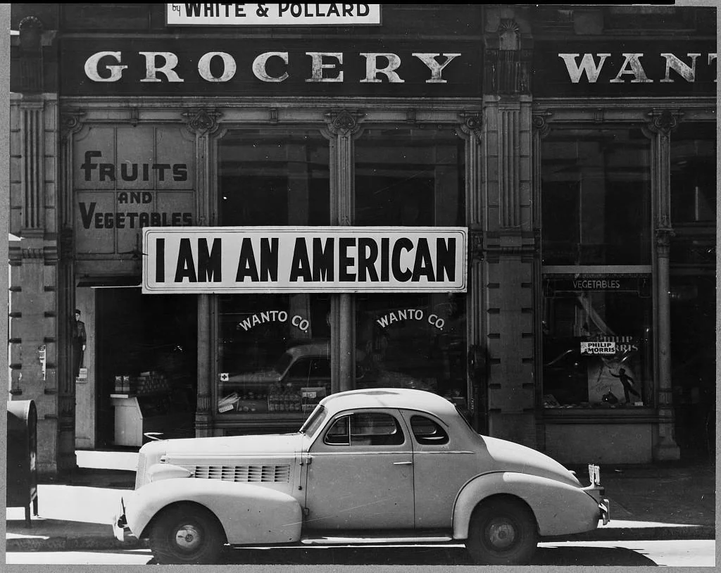
On December 8, 1941—just one day after Pearl Harbor—a Japanese American named Tatsuro Matsuda hung a simple sign on his family’s Oakland grocery store: “I AM AN AMERICAN.”
As a college graduate and business owner, Matsuda hoped this straightforward message might protect his family and livelihood as anti-Japanese sentiment exploded across the country. The sign was both a plea and a statement of truth—these were Americans, regardless of their ancestry.
Despite Matsuda’s efforts, his family’s store was soon shuttered. Like thousands of other Japanese Americans, the Matsudas were forced from their homes and businesses into internment camps. Their citizenship and constitutional rights were stripped away based solely on their heritage.
Famed photographer Dorothea Lange captured the image of Matsuda’s store and its powerful sign. That photo became an iconic reminder of a moment when America betrayed its own ideals.
In December 2022, Vocal Type Co. released VTC Tatsuro, transforming the letterforms from Matsuda’s original sign into a usable typeface. The foundry specializes in creating fonts that honor pivotal civil rights moments in history.
By preserving these letters in a modern, functional typeface, designers ensure that Tatsuro Matsuda’s act of courage isn’t forgotten. Every headline, poster, or message set in VTC Tatsuro carries an echo of his voice asserting “I belong here too.”
Matsuda’s simple declaration—“I AM AN AMERICAN”—resonates with similar statements throughout our history, including the “I AM A MAN” signs carried during Civil Rights marches decades later. And, it is pretty shameful we’re letting history both rhyme and repeat right now.
These statements share a common thread: the need to assert one’s humanity and belonging when others try to deny it. They remind us that citizenship isn’t just about paperwork—it’s about community, contribution, and shared values.
The VTC Tatsuro typeface transforms a painful historical moment into something constructive and forward-looking. It reminds us that even in our darkest chapters, there are voices worth preserving and stories worth telling.
By using this typeface today, designers don’t just choose a style—they continue a conversation about what it means to be American, and who gets to claim that identity. In a time when divisions run deep, VTC Tatsuro reminds us that our diversity and resilience have always been our greatest strengths.
FIN
Remember, you can follow and interact with the full text of The Daily Drop’s free posts on:
- 🐘 Mastodon via
@dailydrop.hrbrmstr.dev@dailydrop.hrbrmstr.dev - 🦋 Bluesky via
https://bsky.app/profile/dailydrop.hrbrmstr.dev.web.brid.gy
Also, refer to:
to see how to access a regularly updated database of all the Drops with extracted links, and full-text search capability. ☮️

Leave a comment