You Literally Cannot Judge ‘Book’ By It’s Name; OH NO!; Berkeley Mono 2.0
A bit of history, insight into the design process, and and update to a fav font of the Drop are all in store for readers, today.
TL;DR
(This is an AI-generated summary of today’s Drop using Ollama + llama 3.2 and a custom prompt.)
- The term ‘Book’ weight in typography has German origins and became widely used but problematic during the ITC era (1970-1989), with inconsistent usage across the industry making its meaning ambiguous (https://www.alphabettes.org/dear-alphabettes-what-defines-a-book-weight/)
- Ohno Type Co., founded by James Edmondson in 2015, developed Degular and Degular Mono typefaces as versatile options for designers seeking reliable fonts that can “fade into the background” (https://ohnotype.co/fonts/degular)
- Berkeley Mono 2.0 continues to evolve with detailed changelog documentation, offering a fresh option for IDEs and terminals in 2025 (https://usgraphics.com/products/berkeley-mono/releases)
You Literally Cannot Judge ‘Book’ By It’s Name
A post/poll by Typographica over the weekend, led me to find this post by Alphabettes, which led me to dig a bit more to see that the question of “WTHeck is ‘Book’?” has been “a thing” for at least a few decades.
I’ve always been confused by this font weight term, and have always assumed it was just an odd term for “thicker” than “normal”. Oddly enough, despite having a pretty active curiosity gene, I never bothered to explore it until now.
The ‘Book’ concept and terminology has German roots, where “buch” (book weight) was part of the traditional German typographic nomenclature alongside terms like “mager” (thin), “leicht” (light), “normal” (normal), and various gradations of “fett” (bold).
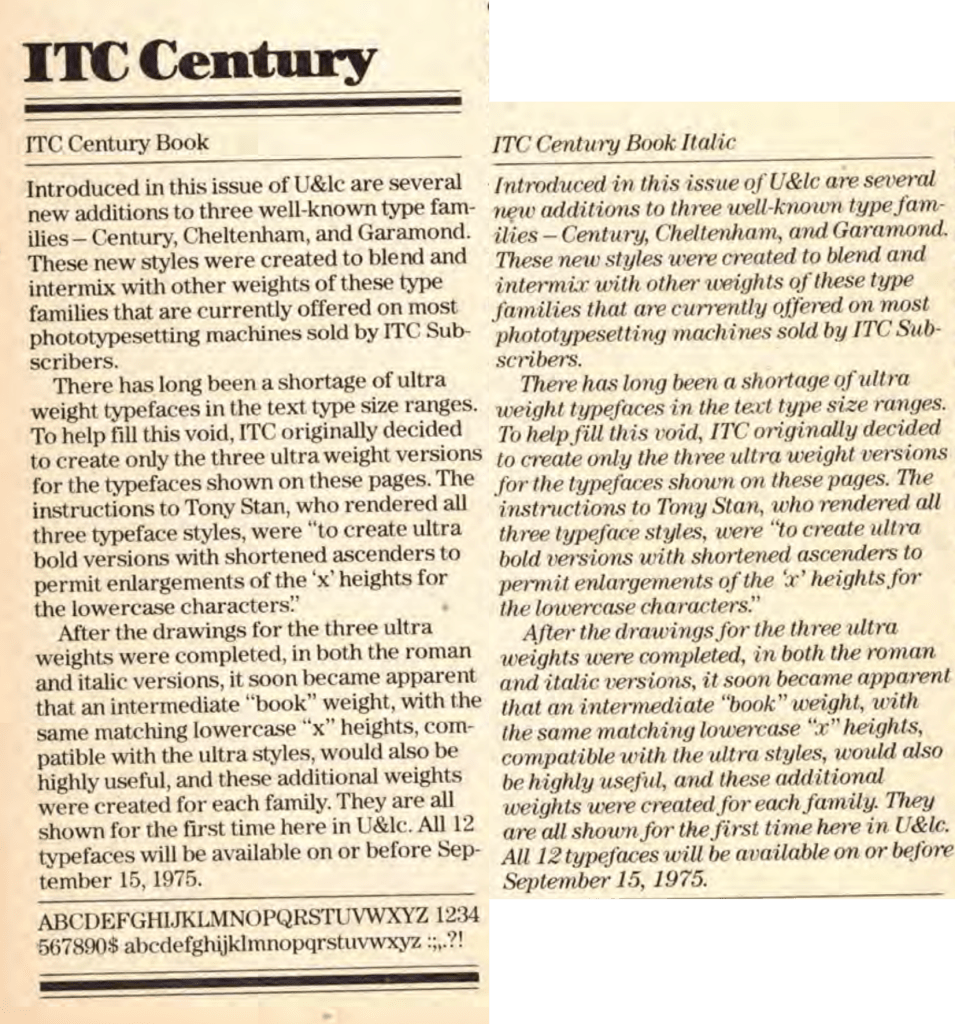
One of earliest “documented” use of “Book” weight appears to be from ITC (International Typeface Corporation) in 1975 with the release of ITC Garamond, ITC Century, and ITC Cheltenham, all designed by Tony Stan.
So, the term “Book” became more widely used but also became problematic during this ITC era (~1970—1989).
ITC’s approach was particularly notable because they would squeeze at least four weights from every typeface release for revenue purposes (this is a more readable version of the section header):
Introduced in this issue of U&lc are several new additions to three well-known type families – Century, Cheltenham, and Garamond. These new styles were created to blend and intermix with other weights of these type families that are currently offered on most phototypesetting machines sold by ITC Subscribers.
There has long been a shortage of ultra weight typefaces in the text type size ranges. To help fill this void, ITC originally decided to create only the three ultra weight versions for the typefaces shown on these pages. The instructions to Tony Stan, who rendered all three typeface styles, were “to create ultra bold versions with shortened ascenders to permit enlargements of the ‘x’ heights for the lowercase characters”.
After the drawings for the three ultra weights were completed, in both the roman and italic versions, it soon became apparent that an intermediate “book” weight, with the same matching lowercase “x” heights, compatible with the ultra styles, would also be highly useful, and these additional weights were created for each family. They are all shown for the first time here in U&lc.
ITC’s Book weights were often too light for actual book text, while their medium weights were typically too heavy. This ended up creating confusion about what “Book” weight actually meant.
This inconsistent application of the term “Book” has led to ongoing ambiguity in the type industry, where:
- Sometimes Book is lighter than Regular
- Sometimes Book is the same as Regular
- Sometimes Book is heavier than Regular
The term remains somewhat fluid in modern typography, with different type designers and foundries using it differently, though it consistently signals that the font weight is intended to be optimized for extended reading in printed books.
Unfortunately, I — and likely you — are still confused as to what ‘Book’ really is.
OH NO!
Ohno Type Co., founded by James Edmondson in 2015, is a San Francisco-based independent type foundry known for its expressive and unconventional typefaces. Edmondson, a graduate of the TypeMedia program at the Royal Academy of Art in The Hague, established the foundry to create fonts that emphasize organic forms over geometric precision, aiming for lively designs with excellent spacing. The foundry’s philosophy centers on making fonts not merely to generate revenue but to fuel the creation of more innovative typefaces. 
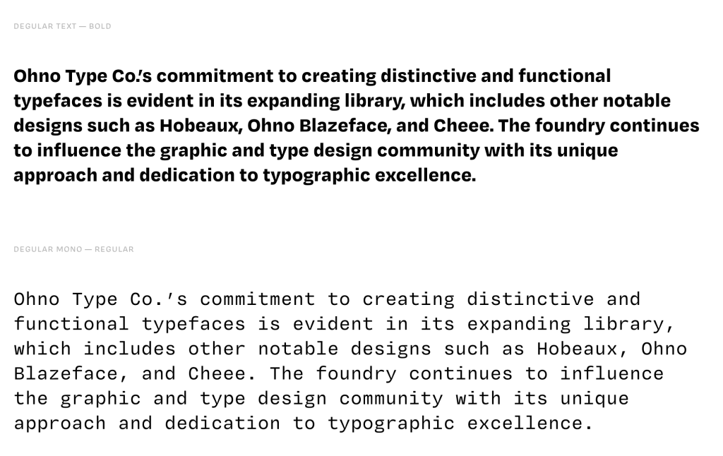
Among Ohno’s diverse catalog, Degular is a unique, versatile sans-serif typeface designed to “fade into the background,” providing designers with a reliable choice for various applications. The development of Degular was driven by feedback from users who desired a typeface from Ohno that could be utilized more frequently across different projects. This led to the creation of a family that includes seven weights and three optical sizes—Text, Degular, and Display—each available in both roman and italic styles. 
Building upon the success of Degular, Ohno introduced Degular Mono, a monospaced companion to the original family. The design process for Degular Mono involved adapting the proportional forms of Degular Text to a fixed-width format, ensuring that each glyph occupied the same horizontal space. This transformation required meticulous adjustments to maintain visual harmony and legibility, especially given the constraints of monospaced design. The result is a typeface that retains the approachable character of Degular while offering the technical feel inherent to monospaced fonts.
Both posts about the design process are fun reads, and you can hit up the foundry itself for test versions of the fonts.

(The true closing paragraph for this section is — ironically — in the section header.)
Berkeley Mono 2.0
We’ve covered Berkeley Mono before, so we’ll make this brief.
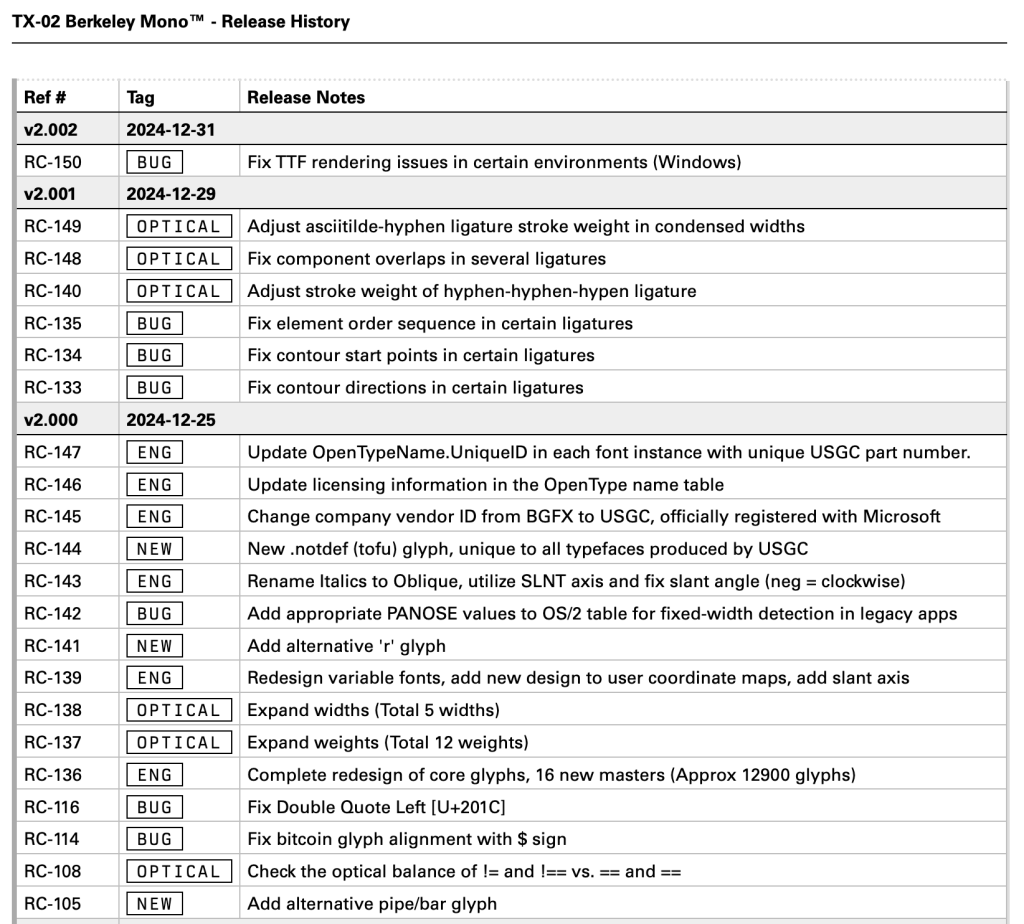
So, remember: fonts are software! Not only that, but even the old-school cut letterforms had “versions” as the designers refined their creations over time.
I’ll bet none of them has as spiffy of a CHANGELOG as The U.S. Graphics Company does.
If you’re looking to change things up in 2025 and have not yet sat with Berkeley Mono for a spell, it’s not a bad font to try in your IDEs and terminals.
FIN
Remember, you can follow and interact with the full text of The Daily Drop’s free posts on:
- 🐘 Mastodon via
@dailydrop.hrbrmstr.dev@dailydrop.hrbrmstr.dev - 🦋 Bluesky via
https://bsky.app/profile/dailydrop.hrbrmstr.dev.web.brid.gy
Also, refer to:
to see how to access a regularly updated database of all the Drops with extracted links, and full-text search capability. ☮️

Leave a comment