Fontra; Typography And Automation From The Linotype To A.I.; You Need Your Eyes Checked (Featured Free Font)
Today’s typography-centric edition of the Drop takes another peek into the world of font creation, explores the historical intersection of typography and automation, and showcases a unique (free) display font that challenges our visual perception.
TL;DR
(This is an AI-generated summary of today’s Drop using Ollama + llama 3.1b and a custom prompt.)
- Fontra is an open-source, browser-based font editor supporting various font formats and tasks, with plans for advanced features and collaborative tools (https://fontra.xyz/)
- J. Dakota Brown’s talk at Typographics 2023 explored the history of typography automation, from manual typesetting to AI, highlighting the impact on labor and union struggles (https://2024.typographics.com/)
- “You Need Your Eyes Checked” is a free display font by Kostas Bartsokas, inspired by optotypes and featuring variable width and weight axes (https://www.myfonts.com/collections/you-need-your-eyes-checked-font-kostas-bartsokas)
Fontra
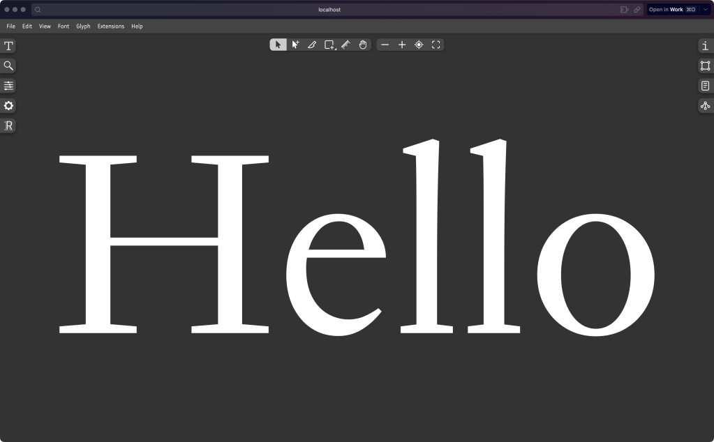
Fontra (GH) is an open-source, local-first, browser-based font editor that’s fit for both typography professionals and enthusiasts. It’s also “variable-first”, meaning it fully groks variable fonts.
The core Fontra editor client runs directly in the browser and is written in JavaScript, while the Fontra server operates locally (or, remotely) and is developed in Python. It does require Node to run, but there are pre-built “paks” (for macOS and Windows) to make installation painless.
The tool supports a wide array of font-related tasks. It can read and write various font formats, including .designspace, .ufo, .ttf, and .otf files. It has robust glyph editing tools such as outline editing, pen tools, and component manipulation. At the font level, it allows editing of metadata, variation axes, and more. The editor also supports multi-window workflows with real-time propagation of change.
Current features include basic outline editing, variable component support, and undo/redo functionality. The roadmap outlines plans to introduce advanced editing features, kerning support, OpenType feature editing, and collaborative tools, which will further expand its capabilities.
Looking ahead, Fontra has some fancy plans, including peer-to-peer collaboration (like co-editing in Zed or gDocs) and integration with tried-and-true font compilation tools.
This could be the excuse you’ve needed to add yet-another item to your already overflowing hobby project list!
Typography And Automation From The Linotype To A.I.
Typographics is a design festival for people who use type. The annual event series, now in its 10th year, is focused on contemporary typography and where its future may lie. This year, the U.S. installment was held between June 10–18, 2024, in New York City and online. But, we’re not here to talk about the 2024 conference (though we will in some future Drop).
We’re going back to Typographics 2023, where J. Dakota Brown — a quarter-century typography veteran — did a talk on “Typography and Automation from the Linotype to A.I.”. I like to think of it as “the hidden labor history of typography”, since most folks likely do not ponder that as we tap the font name menu in any given app.
While we typically think of printers as machines today, for centuries printers were skilled workers who played a crucial role in disseminating information and shaping public discourse. Brown’s talk traced how technological changes in printing — from manual typesetting to linotype machines to computers — repeatedly disrupted and reshaped the printing workforce. Each new technology promised increased efficiency, but often at the cost of jobs and worker autonomy.
A key player in this history was the International Typographical Union (ITU), which fought to maintain control over typesetting work as it evolved. The ITU’s efforts to adapt to changing technologies offer lessons for workers facing automation today.
Importantly, many printing innovations were explicitly developed to undermine unions and worker power (boy does that sound familiar). This reveals how new technologies, even those that seem to simply make work easier, are often shaped by struggles between workers and employers.
Brown argues that we should view today’s design software as an accumulation of typographical knowledge developed by generations of workers — knowledge that has been encoded into machines that have largely erased those workers from design history.
His focus on this perspective encourages us to look beyond the hype around AI and other new technologies, and instead examine how they may be used to discipline and devalue labor. By uncovering the labor history embedded in our tools, we can better understand and shape the future of design work.
I cleaned up a transcript of the talk for folks who want to read vs watch/listen: https://rud.is/dl/brown-ai-automation.txt.
You Need Your Eyes Checked (Featured Free Font)
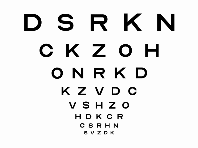
Optician Sans (GH) is a free typeface inspired by the historical eye chart letters used by optometrists and ophthalmologists worldwide. Created by ANTI Hamar and typographer Fábio Duarte Martins for the Norwegian optician Optiker-K, the font draws from two significant eye chart systems. The first is the Snellen chart from 1862, renowned for its 5×5 unit grid, and the second is the Sloan letters from 1959, which removed serifs from Snellen’s original design. By expanding beyond the original ten letters used in these charts, Optician Sans offers a complete alphabet that includes numbers and special characters.
The font is constructed on the same 5×5 grid as the original eye chart letters and has three distinct styles. The default style is the clearest and most legible. Stylistic Set 1 presents a squarish design reminiscent of traditional eye charts, while Stylistic Set 2 adds long serifs to certain letters, creating a more varied rhythm. The font has a geometric and clean appearance with a technical, somewhat clunky feel. However, it only supports the basic Latin script and some special characters, lacking accents or currency symbols.
It’s released under the SIL Open Font License, is primarily designed as a display typeface, and is NOT intended for body text. Don’t get me wrong: it’s a cool font! But, it is also important to note that it’s not designed to enhance legibility in everyday use. Since the glyphs are designed based on eye chart principles, they intentionally create some ambiguity between letters; and, the last thing you likely want is to confuse your readers.
FIN
Remember, you can follow and interact with the full text of The Daily Drop’s free posts on Mastodon via @dailydrop.hrbrmstr.dev@dailydrop.hrbrmstr.dev ☮️

Leave a comment