SACAM/SAPC-APCA; Evaluating Fonts; San Francisco’s 🎂
(100% forgot to hit second “schedule” button, again, yesterday. You have no idea how bad the WP UX is. Plus, they constantly move stuff around.)
We’re focusing a bit on “accessibility” today, as well as celebrating tomorrow’s (well it was “tomorrow”, yesterday) birthday of Apple’s fav font.
Rather than make Wednesday a two-fer, I’ll just add an extra section to the Thursday and Friday editions.
TL;DR
(This is an AI-generated summary of today’s Drop using Ollama + llama 3.1b and a custom prompt.)
The model suddenly switched to using “•” vs markdown dashes and I kind of like it, so left it in.
• The SACAM/SAPC-APCA section introduces the Accessible Perceptual Contrast Algorithm (APCA), a new method for calculating and predicting readability contrast, designed to improve upon the limitations of the Web Content Accessibility Guidelines (WCAG) 2.x contrast guidelines. It provides guidelines for achieving different levels of contrast (Lc) for various font sizes and types to ensure readability.
• The Evaluating Fonts section discusses the importance of font selection for accessibility and display readability, focusing on factors such as font size, weight, tracking, leading, and lightness contrast. It references Andrew Somers’ resource on Font Family Selection for Accessibility & Display Readability for detailed guidance.
• The San Francisco’s 🎂 section explores the evolution of Apple’s San Francisco font since its introduction in 2014, highlighting its optimizations for readability on small screens, the development of various variants (e.g., San Francisco Text, San Francisco Display, San Francisco Compact, SF Mono, SF Pro, SF Compact, and SF Rounded), and its continued refinement for accessibility and adaptability across Apple devices.
SACAM/SAPC-APCA
No, neither our cat, nor #2.1 attacked my keyboard witht the caps lock on. “Experts” in various industries just likes them they acronyms.
- SACAM == S-Luv Accessible Color Appearance Model
- SAPC == S-Luv Advanced Predictive Color
- APCA == Accessible Perceptual Contrast Algorithm
I drop “accessibility” resources every-so-often since we exist in a very diverse world, and we should care that our creations are consumable by as many humans as possible. I sometimes fail at that, but practice makes progress, and one can’t practice “a thing” if they don’t know about said thing.
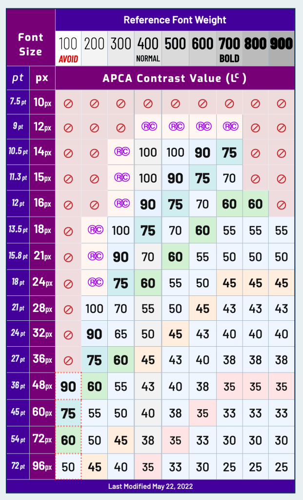
The APCA is a new method for calculating and predicting readability contrast, designed to improve upon the limitations of the Web Content Accessibility Guidelines (WCAG) 2.x contrast guidelines (I link to those quite a bit, so I’m going to assume folks know what that is). APCA is part of the larger SACAM and is specifically optimized for accessible color appearance on self-illuminated RGB computer displays and devices (i.e., those “glowing rectangles” I regularly mention), focusing on visual readability.
This is a great starting point for all things APCA.
“I thought this was the typography edition of The Drop?”
It is!
Contrast plays a big part in readability, and that includes the readability of text on those glowing rectangles.
The APCA calculates a contrast value (“Lc” or “lightness contrast) between light and dark colors based on a given font size and color combination, ensuring that this value aligns with our human perception. This means that, regardless of the color’s brightness or darkness, an Lc 60 value will always represent the same level of perceived readability. This standard contrasts with WCAG 2.x, which has many contextual limitations (especially with dark colors, often exaggerating contrast). e.g., a 4.5:1 ratio can still result in poor readability if one color is nearly black, making WCAG 2.x less suitable for designing in “dark mode.”
APCA’s contrast values are perceptually consistent and adjust according to contrast constancy, especially around where the contrast sensitivity curve levels out. A doubling or halving of the APCA value directly reflects a similar change in perceived contrast. Additionally, it applies nuanced adjustments, such as increasing contrast for smaller, thinner fonts and slightly boosting contrast for very dark colors.
There are rules/tests one can apply to help identify whether you’re creations are up to snuff, and I highly suggest aiming for silver or gold. But, you don’t need tests, or a lookup table (like in the section header), as there is some general guidance you can follow:
Here’s a more concise version of the text:
- Lc 90 – Ideal for body text in fonts no smaller than 18px/300 weight or 14px/400 weight. Also suitable for non-body text with a minimum of 12px/400. Thin fonts (24px/200 weight) and large/bold fonts (36px bold) should max out at Lc 90. No maximum for small fonts.
- Lc 75 – Minimum for body text: 24px/300, 18px/400, 16px/500, 14px/700. Non-body text minimum: 15px/400. Use Lc 75 for larger text where readability matters.
- Lc 60 – Minimum for content text, excluding body, column, or block text. Minimums: 48px/200, 36px/300, 24px/400, 21px/500, 18px/600, 16px/700. For body text, add Lc 15.
- Lc 45 – Minimum for large, heavy text like headlines (36px/400, 24px bold). Also applies to detailed pictograms or smaller icons.
- Lc 30 – Minimum for “spot readable” text like placeholders, disabled elements, or copyright bugs. Also for large icons/pictograms. Minimum of 5.5px in the smallest dimension.
- Lc 15 – Minimum for non-semantic, non-text elements (e.g., dividers, thick focus outlines) no smaller than 5px. Should be avoided for important interactive elements.
Caveats for 👆:
- font “size” assumes an x-height ratio of ~0.52.
- weights are normalized to Helvetica
pxis CSSpx
See next section for some more guidance on accessible font selection.
I will admit to being partial to 100-weight fonts on super hires displays until digging into accessibility a few years ago.
Evaluating Fonts

If you aren’t prepared to “APCA All The Things!”, Andrew Somers has a great resource on Font Family Selection for Accessibility & Display Readability, that’ll do in a pinch.
To borrow from the paper’s intro:
What makes a font easy to read? The full answer could take a book to describe, but this is just a pamplet so we’ll stick to the bare essentials. Font size, weight, tracking (i.e. letter spacing) leading (i.e. line spacing) and lightness contrast vs. the background are key factors. For this guide, we’ll focus most on the design of the individual letters (called glyphs). We’ll use black letters on white, and an 18pt size for the examples.
It’s a short PDF with plenty of examples that should help grok weights to use for a give typeface.
San Francisco’s 🎂
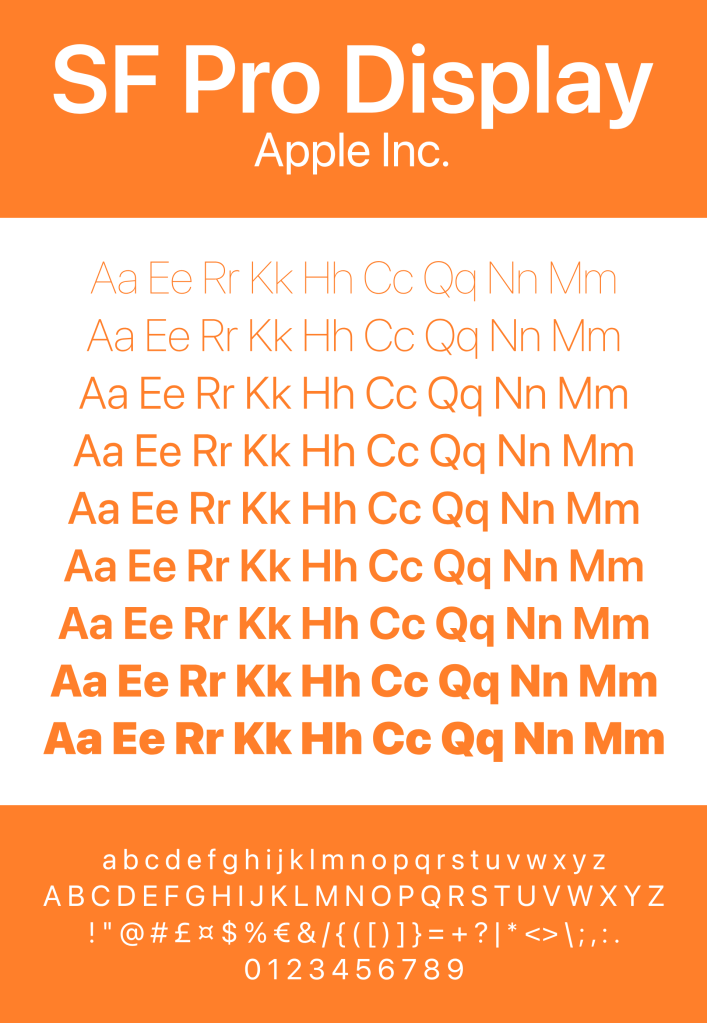
Apple’s San Francisco font has evolved significantly since its introduction in 2014, as part of iOS 9 and OS X El Capitan releases. Initially designed for the Apple Watch, San Francisco was created to optimize readability on small screens and soon replaced Helvetica Neue as the system font across all Apple platforms. Two key variants emerged: San Francisco Text, optimized for larger font sizes above 20 points, and San Francisco Display, which adjusted spacing for a more polished appearance on larger screens.
Between 2016 and 2018, the font saw wider adoption across macOS and iOS. A specialized version called San Francisco Compact was introduced for the Apple Watch, catering to the constrained space by offering a rounder appearance for better readability. During this period, Apple continued to refine the font’s features and optimize it for a broader range of devices.
From 2018 to 2020, San Francisco expanded further with the introduction of SF Mono, a monospaced variant designed for coding and terminal applications. Apple also began supporting variable fonts, giving developers more control over font weight, width, and size. This made San Francisco more versatile and adaptable to different applications and screen sizes across the Apple ecosystem.
In the years from 2020 to 2023, Apple focused on improving the font’s consistency and readability, particularly on higher-resolution displays, as part of its transition to custom ARM-based chips (M1 and M2). Specialized variants such as SF Pro, SF Compact, and SF Rounded were fine-tuned. SF Rounded, in particular, introduced a softer, more approachable look, which is often seen in Apple Pay and system settings interfaces.
In recent years, San Francisco has continued to evolve, with improvements aimed at accessibility, particularly in dynamic type and low-vision modes. The font has also been adapted for new Apple devices, including the Vision Pro mixed reality headset, where legibility and user interface design are paramount. Overall, the evolution of San Francisco reflects Apple’s focus on creating a highly readable, adaptable, and aesthetically consistent font system across its entire device ecosystem.
I am pretty partial to this font, and it makes working around Apple’s constantly degrading app and OS UI/UX a bit less painful.
You can grab them all here: https://developer.apple.com/fonts/.
FIN
Remember, you can follow and interact with the full text of The Daily Drop’s free posts on Mastodon via @dailydrop.hrbrmstr.dev@dailydrop.hrbrmstr.dev ☮️
 hrbrmstr's Daily Drop
Leave a comment