Departure Mono; Karsa Mono; Font Size Is Useless
I’m on a monospace kick (again), so we’ve got two free and fun mono fonts for your terminal/editor pleasure. There’s also a link to a fun piece to help reassure you that you’re not crazy if you think your editor/terminal is lying to you about font size/line height/etc.
Programming note: I changed up the AI overlord used in the “TL;DR” section. I’m finding llama 3.1 to be a very capable, general purpose, local model, so I used it for today’s summary.
This is the “Collection” prompt I have in Perplexity:
“The content file provided by the user contains a blog post in Markdown format with three main sections of content. I would like a very concise three bullet summary of it. Each bullet should succinctly describe a section and include the link to the primary resource being covered. Please try to recreate the URLs as exactly as possible.”
I made that the system prompt for a chat with Ollama in Ollamac, and it did a bang-up job from the pasted content:

I’ll be switching to this updated prompt for future Drops, as it has turned out to be far more deterministic (in pplx) after experimenting over the past few weeks:
The user has provided a Markdown file containing a blog post with three main content sections. Please generate a highly concise three-bullet summary of this content, adhering to the following guidelines:

1. Each bullet point should correspond to one of the three main sections.
2. Summarize the key points of each section in a single, concise sentence.
3. Include the primary resource link for each section, ensuring the URL is reproduced as accurately as possible.
4. Avoid any introductory text or additional explanations.
5. Use consistent formatting for all bullet points.
6. Ensure the summary is clear and informative without sacrificing brevity.

Example format:
• [Section 1 summary] (http://example.com/resource1)
• [Section 2 summary] (http://example.com/resource2)
• [Section 3 summary] (http://example.com/resource3)
TL;DR
(This is an AI-generated summary of today’s Drop using Ollama + llama 3.1b and a custom prompt.)
- Departure Mono: A free, pixelated monospace font inspired by early CLIs & GUIs, created by Helena Zhang, with a lo-fi technical vibe and highly readable characters. Read more.
- Karsa Mono: A debut font from Gha Arizal / Wacana Foundry, featuring a structured appearance with smooth corners and diagonal lines, ideal for those seeking a “pay what you want” monospaced font. Check it out.
- Font Size Is Useless: A blog post by Nikita Prokopov discussing the challenges of setting font sizes and line heights in digital typography, particularly in code editors and user interfaces, offering insight into why font settings don’t always yield consistent results. Read the full article.
Departure Mono
(This made the socmed/list rounds, yesterday, so you may have already seen it; but this is “no assumptions 2024” at the Drop.)
Departure Mono is a “monospaced pixel font with a lo-fi technical vibe”. It was inspired by the constraints of early CLIs & GUIs, the tiny pixel fonts of the yore, and sci-fi concepts from film and television. It is the creation of Helena Zhang, a brilliant designer, who you may remember from our coverage of Phosphor Icons.
While it can be used in your fav editor or terminal program, it’s also pretty handy in a design context, as evidenced by the site the creators built to showcase it.
Speaking of design, the font was engineered to be highly readable, even at small sizes, with easily distinguishable characters, particularly for commonly confused pairs like “1” (one) and “l” (lowercase L), or “0” (zero) and “O” (uppercase O).
I’m just going to let you bask in the brilliance that is their site. Make sure to scroll all the way down — past the flight simulator — so you can goof off a bit at work and play some old school breakout.
Karsa Mono

Karsa Mono (gallery) is the debut font from Gha Arizal / Wacana Foundry. It draws its name from the Javanese language, where it resonates with themes of desire, intention, and the determination to fulfill them.
This monospace typeface features characters with a uniform width, resulting in a structured appearance that is balanced by smooth, rounded corners and 45° diagonal lines. Many of the characters, such as “E,” “M,” and “N,” have a boxy, rectangular form, reinforcing the retro, digital feel. The curves in characters like “O” and “C” are somewhat squared off, adding to the mechanical and technical aesthetic.
The glyphs have a relatively tall and narrow appearance, which is a common characteristic of fonts designed for early computer displays and certain types of monospaced fonts. It reminds me of the glyphs on (IIRC) VT-520 workstations.
It’s a bit tall/thin for my liking, but if you’re in the market for a “pay what you want” monospaced font, you may want to give this a go.
Font Size Is Useless
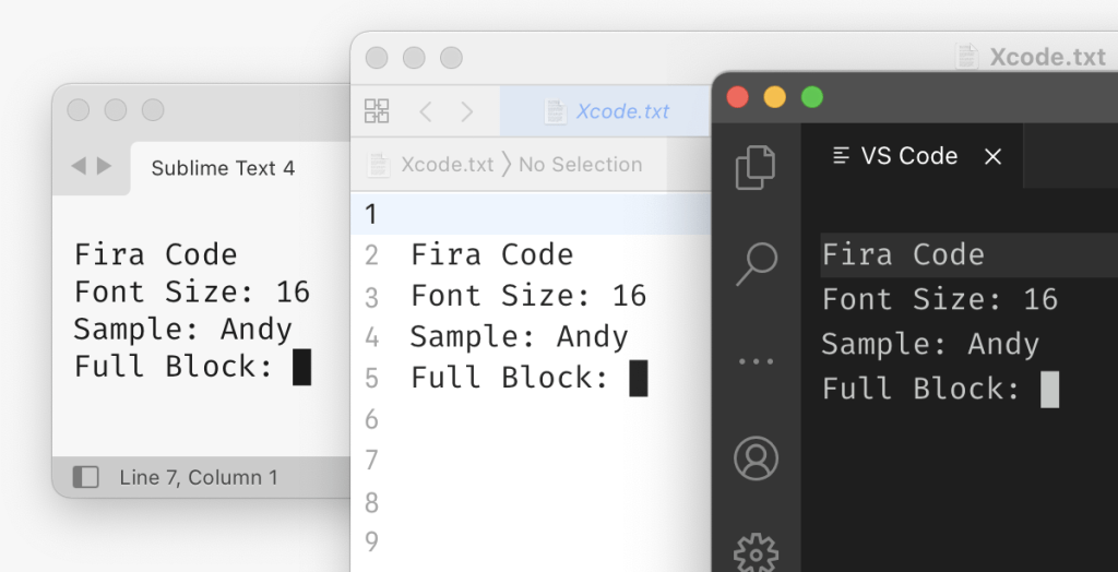
In “Font size is useless”, Nikita Prokopov (yes, that Nikita Prokopov) discusses the challenges and quirks of setting font sizes and line heights in digital typography, particularly in code editors and user interfaces.
Reading it felt like the typography version of Gary Bernhardt’s “WAT” talk.
If you’ve ever been “confused” about why the same editor (et al.) font settings do not end up with the same results across different programs or different operating systems, this is the post for you.
FIN
Remember, you can follow and interact with the full text of The Daily Drop’s free posts on Mastodon via @dailydrop.hrbrmstr.dev@dailydrop.hrbrmstr.dev ☮️

Leave a comment