Berkeley Mono; MonoLisa; Fancy Font Generator
If you only knew how bad the UX is on the “Publish/Schedule” button workflow in WordPress, you’d totally understand why this non-late Drop is late. Sigh.
It’s “Monospace Day” at the Drop! Well, mostly. Two super cool mono-a-mono typefaces, and a third section I know I’ll regret sharing.
TL;DR
(This is an AI-generated summary of today’s Drop using Sonnet via Perplexity.)
Here’s a concise three-bullet summary of the blog post:
- Berkeley Mono: A monospaced typeface designed for coding and technical applications, inspired by vintage computing aesthetics while maintaining high functionality. It offers four cuts, variable fonts, and over 150 programming ligatures. Try it for free at https://berkeleygraphics.com/typefaces/berkeley-mono/
- MonoLisa: A premium monospaced font tailored for coders, featuring increased character width, custom-designed italics, and over 120 coding ligatures. It supports 200+ languages and offers variable fonts for web use. A 14-day free trial is available at https://www.monolisa.dev/
- Font Generator: A clean, clutter-free website that allows users to generate stylized text using Unicode characters for social media platforms. While cautioning about potential accessibility issues, it offers a simple way to customize text appearance. Try it at https://www.fontgenerator.dev/
Berkeley Mono

This one is filed under the “I could have sworn we covered this already”. I was reminded of it due this minimalist website that focuses on using monospace fonts and a grid-based layout for web design (GH). In it, the author references The U.S. Graphics Company, which used to be called Berkeley Graphics, the foundry for Berkeley Mono. Both a web search and local ripgrep tell me I have failed you, dear readers, and must immediately make amends.
I’m keeping this short-ish since the font showcase site does a way better job showing than telling.
Berkeley Mono is a monospaced typeface specifically designed for coding and technical applications. It draws inspiration from the “golden era of computing,” aiming to evoke a sense of vintage technology while maintaining high functionality. This typeface is engineered for the purpose of reading and writing code, offering excellent legibility, distinct glyphs, and a comfortable line height. The aesthetics of Berkeley Mono strike a balance between the objectivity of machine-readable fonts from the 1970s and the humanist qualities of sans-serif fonts.
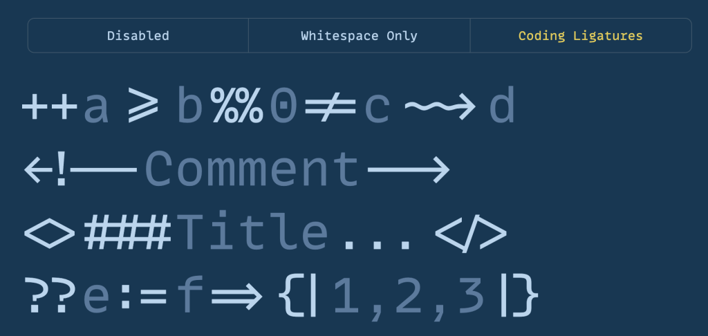
This typeface is fully monospaced and is currently available in four cuts, with more planned for future releases. It includes variable fonts and over 150 ligatures tailored for programming languages (R is supported, but it’s kind of “meh” ligature-wise tbh). Additionally, it supports a wide range of good ol’ human languages, making it versatile for various applications beyond code, such as user manuals, movie scripts, and control panel designs.
Berkeley Mono offers both personal developer licenses and commercial licenses, and youy can try it for free! The typeface has received positive feedback from notable figures in the tech industry, including the founder of Serenity OS and a co-founder of Stack Overflow. However, opinions on its readability and beauty vary, with some users noting that its wider-than-usual characters may require an adjustment period.
The development of Berkeley Mono is ongoing, with new glyphs, cuts, and features being added over time. It represents a thoughtful approach to typeface design for coding, balancing functionality with a distinct aesthetic inspired by computing history.
MonoLisa

Pay for a font?!?! In THIS economy?! Well…yes! If you can afford it. I know we’ve come to expect fonts to be free (they are bits of software, after all), but typographers gotta eat, too; and, I usually only Drop premium fonts that at least have a “local use only” or trial version, as this one does.
MonoLisa (GH) is a premium monospaced font designed specifically for coders/terminal denizens. It offers a range of features tailored to enhance the coding experience, including increased character width for more natural, open forms that help reduce eye strain. The font is carefully crafted to distinguish between similar characters, minimizing ambiguity and reducing the likelihood of mistakes. Its unique letter shapes balance dark and light space, while open forms and terminals improve the reading flow. Additionally, MonoLisa includes custom-designed italics, rather than just slanted versions of regular characters, and over 120 coding ligatures to reduce visual noise. The font also features symbols for use in command line interfaces, including PowerLine.
On the technical side, MonoLisa supports over 200 languages and alphabets, including Latin, Cyrillic, Greek, and Vietnamese. It ships as a variable font for web use, allowing access to all weights without the burden of large file sizes. The font includes many OpenType features, offering a high level of customization.
The font was/is designed to improve productivity and reduce fatigue during long coding/terminal sessions. The font is highly legible and visually pleasant, making it an excellent choice if you find it impossible to not stare at a glowing rectangle all day. Its customizable features let anyone tailor the font to their individual preferences, and it has received positive reviews from users who praise its readability and aesthetics.
As noted, MonoLisa is a paid font, with pricing ranging from 69𝑡𝑜69to299 depending on the license. A 14-day free trial is available, and both personal and commercial licenses can be purchased.
Fancy Font Generator

Before Dropping the resource on ya, I need to stand on a soapbox for a sec.
In general, I’m not a fan of stylized alphanumeric-esque Unicode characters. They can cause major problems for screen readers and users with visual impairments. Screen readers may read out the full Unicode character names (like “CIRCLED LATIN CAPITAL LETTER H” for 🄷) instead of just the letter, making text extremely difficult or impossible to understand. They also enable homoglyph attacks, where visually similar characters are used to spoof legitimate URLs or code. This is a real security concern that attackers can exploit, though some browsers and security control are getting better at flagging them.
Many of these characters were originally added to Unicode for specific, limited use cases — like mathematical notation, phonetic transcription, or representing characters in other writing systems. They weren’t necessarily intended for stylistic use in regular text, but we humans are really good at repurposing things when we “want to get stuff done”.
But, some very popular screen readers have gotten way better at recognizing them in context; and, we’re all still typing content into tiny boxes on social media sites for some reason; so, we might as well have some fun along the way, and make up for most socmed platform failings when it comes to enabling basic typography.
That’s a whole lotta words to introduce Font Generator (GH) a very clean site that lets you “easily generate stylish text for Facebook, X (formerly Twitter), and other social media platforms. Customize fonts with bold, italic, fancy, and cool styles to make your posts stand out.”.
Unlike more than a few other sites that let you perform the same task, this one just does what it says on the tin, in a well-honed, clutter-free design.
If you, like me, are sad to see those “TWITTER” buttons, have a go at hosting your own version of it sans encouragement to use a site run by a small, angry man who wants to rule the world. Also, pls stop using X if you still are.
FIN
Remember, you can follow and interact with the full text of The Daily Drop’s free posts on Mastodon via @dailydrop.hrbrmstr.dev@dailydrop.hrbrmstr.dev ☮️
Leave a comment