Inter Typus Enim GNOME Defectu; Recursive; nanofont3x4
Two (well, technically, four) fonts featured in today’s typography-centric edition of the Drop!
TL;DR
(This is an AI-generated summary of today’s Drop using Sonnet via Perplexity.)
- GNOME project is switching its default font from Cantarell to Inter Variable 11, citing Inter’s modernity, active maintenance, and improved readability. The change is expected to be implemented in GNOME 47 around mid-September 2024. (https://gitlab.gnome.org/GNOME/gsettings-desktop-schemas/-/issues/52)
- Recursive, a variable font family designed by Stephen Nixon, offers both sans-serif and monospace versions with five axes for flexibility. It features true cursive italics and code ligatures, making it suitable for both UI design and coding. (https://www.recursive.design/)
- Nanofont3x4, created by Michael Pohoreski, is the “world’s smallest readable 3×4 font with lowercase” that includes all ASCII symbols. It’s designed for use in tiny displays and for rendering miniature but legible text in various applications. (https://github.com/Michaelangel007/nanofont3x4)
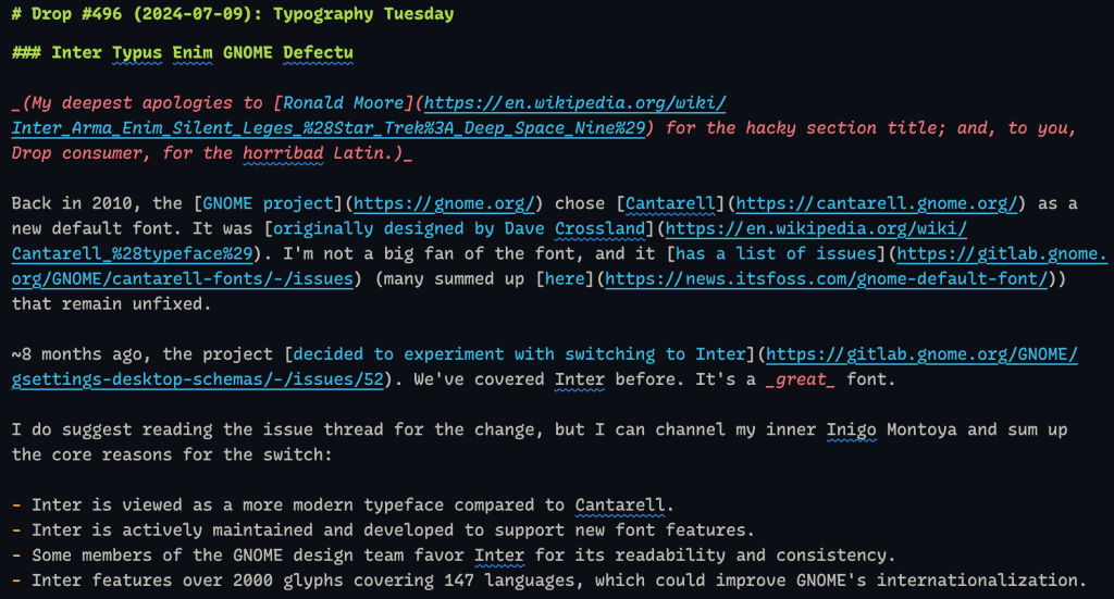
Inter Typus Enim GNOME Defectu

(My deepest apologies to Ronald Moore for the hacky section title; and, to you, Drop consumer, for the horribad Latin.)
Back in 2010, the GNOME project chose Cantarell as a new default font. It was originally designed by Dave Crossland. I’m not a big fan of the font, and it has a list of issues (many summed up here) that remain unfixed.
~8 months ago, the project decided to experiment with switching to Inter. We’ve covered Inter before. It’s a great font.
I do suggest reading the issue thread for the change, but I can channel my inner Inigo Montoya and sum up the core reasons for the switch:
- Inter is viewed as a more modern typeface compared to Cantarell.
- Inter is actively maintained and developed to support new font features.
- Some members of the GNOME design team favor Inter for its readability and consistency.
- Inter features over 2000 glyphs covering 147 languages, which could improve GNOME’s internationalization.
To refresh your memory, Inter’s tall x-height does improve readability, especially in mixed-case and lower-case text. It also has a full weight range from 100 to 900, so it’s also more versatile. And, it has dope support for OpenType features, so GNOME apps can take advantage of advanced typography options.
The change has been merged in the GNOME repository, setting Inter Variable 11 as the default font, and GNOME users can possibly see it as the default as soon as GNOME 47 (~mid-September 2024).
It’ll be interesting to see the reaction from the humans who use GNOME as their desktops (Fedora, Ubuntu, and Debian all use GNOME by default on the desktop).
Recursive
If you did read through the “should we switch to Inter?” issue thread (as advised in the previous section), you may have noticed a question about possibly switching the default monospace font from the aging Source Code Pro to something else. Following that discussion led me to discover Recursive.
Recursive (Sans and Mono) is a variable font family designed by Stephen Nixon (the site is neat; def check it out), a graduate of the TypeMedia program at the Royal Academy of Art in The Hague. The project began as Nixon’s thesis work in 2018 and has since evolved into a flexible typeface system for both code and user interfaces. His experience with typographic clarity and microinteractions in digital products inspired him to create a font family that could address common limitations in animated transitions and variable design.
One reason Recursive is visually appealing comes from a novel drawing method that Nixon developed. In it, he treats each contour as a separate “brush stroke.” While this approach helped shape Recursive’s unique design, it also led to rendering issues on non-HD screens that required later refinement.
Under the hood of this variable font (💙), Recursive incorporates five axes: Casual, Monospace, Weight, Slant, and Italic. This required 24 total source font files for each character.
As noted, there are both sans-serif and monospace versions of the typeface. Recursive Sans was built as a “superplexed” family, meaning all 32 instances share the same glyph width, kerning, and overall letterforms. This makes for super smooth, animated transitions between different font styles without affecting line length.
Recursive Mono also has some cool features, such as the inclusion of true cursive italics as an option (which is great — IMO — for comments and other contextual information in code). It, too, is “superplexed”, and it also sports OpenType features like code ligatures and alternate characters (though not for R’s spiffy new pipe symbol).
Since these families are intricate/complex, Nixon also developed a Chrome extension called Type-X to efficiently test Recursive on live websites, allowing him to override fonts and assess performance in real-world context.
I subbed it out for Monaspace Radon Var in all my editors and terminals. The experience, so far, has been great! And, it does pair very nicely with Inter.
The section header is a screenshot of a portion of this edition with Radon Mono in VS Codium.
nanofont3x4
One of my teammades convinced a bunch of us to grab one of these M5Stack cubes. One of its many features is that it sports a 2.6 inch 320×240 TFT LCD module with a capacitive touch panel. While that’s cool, it’s also tiny!
It’s a good thing we all have access to the “world’s smallest readable 3×4 font with lowercase; includes all ASCII symbol” — nanofont3x4!
Michael Pohoreski‘s motivation for developing this font was to push the boundaries of what’s possible in typography and to explore the essence of glyph design. Pohoreski wanted to answer questions such as “What makes a tiny glyph readable?” and “What is the minimal leading?”.
Pohoreski has suggested this font would be great for rendering in-game book pages that don’t look like gibberish and creating accurate print previews with scaled-down but legible text. But, it’s also perfect for this tiny screen (and other contexts).
FIN
Remember, you can follow and interact with the full text of The Daily Drop’s free posts on Mastodon via @dailydrop.hrbrmstr.dev@dailydrop.hrbrmstr.dev ☮️

Leave a comment