llama.ttf; Roadside Rumble; Featured “Foundry”: Pixel Fonts
Some AI; some longform blathering; and, some fun fonts await y’all in today’s typography-centric edition of the Drop.
TL;DR
(This is an AI-generated summary of today’s Drop using Perplexity with the Claude 3.5 sonnet model.)
A collection of 33 modern TTF Pixel Fonts created by somepx offers nostalgic pixel-based typography for various uses [https://somepx.itch.io/].
Researchers developed “llama.ttf”, a project that embeds a complete LLM and inference engine within a TrueType font file, allowing AI interactions through font rendering [https://fuglede.github.io/llama.ttf/].
The ongoing debate between Highway Gothic and Clearview typefaces for road signs in America highlights the importance of typography in traffic safety and legibility [http://www.meekerdesigns.com/typography-and-legibility/].
llama.ttf
I came across an unexpected (and, mebbe, “unholy”) convergence of typography and artificial intelligence and debated whether this sections belonged in a TT Drop or a ThursdAI Drop. It, obviously landed here.
Researchers have developed an, er, “novel” way to package large language models (LLMs) — as fonts O_O. The project, dubbed “llama.ttf” (GH), embeds a complete LLM and inference engine within a standard TrueType font file, allowing text-based AI interactions through ordinary font rendering.
llama.ttf was developed by Søren Fuglede Jørgensen and exploits the extensibility — via WASM — of modern font shaping engines like Harfbuzz. These engines allow arbitrary code execution during text layout, ostensibly for complex typographic operations. Jørgensen repurposed this capability to run a complete LLM inference pipeline.
The font itself contains a compressed 15-million parameter language model based on the TinyStories dataset, along with a WASM runtime to execute the model. When the font is used to render specific sequences of characters, it triggers the embedded LLM to generate text responses.
Essentially, this experiment allows LLM-“powered” text generation in any application that supports modern font rendering, without requiring explicit AI integration. So, now we can chat with our fonts. O_O While currently a proof-of-concept, the approach demonstrates an interesting potential for embedding AI capabilities into unexpected places.
The 60-megabyte font file is remarkably compact for a full LLM implementation. However, it currently only supports inference, not fine-tuning or learning. The developers are exploring ways to expand the model’s capabilities within the constraints of font file formats.
It also makes me want to explore what other folks may have WASM-embedded into typefaces they have released.
Roadside Rumble

We’ve all likely experienced “road rage” in some fashion, but I doubt many readers have experienced road font rage, or even knew there has been a long-standing battle for typeface supremacy on America’s (and, some other regions’) road signs.
Highway Gothic (FIU Ref) (also something we mentioned back in November), is the venerable incumbent, and has been featured on American highways since ~1948. Developed by Theodore Forbes at the Illinois State Highway Department, this sans-serif typeface was engineered to be legible at high velocities and in adverse weather conditions. It has a fairly stark and utilitarian design.
However, as the driving population aged and reflective sign materials evolved, concerns arose about Highway Gothic’s performance, particularly in low-light conditions. Thus begat Clearview, a typeface crafted by Donald Meeker and James Montalbano in collaboration with the Pennsylvania Transportation Institute. Clearview has larger counter spaces and a higher x-height, which — in theory — enhances legibility and reducing halation effects — the effect that occurs when the bright areas of an image appear to softly bleed around the edges of dark areas — under nighttime illumination.
Initial studies suggested Clearview offered a 2-8% improvement in legibility over its predecessor, with older drivers benefiting most significantly. These findings prompted the Federal Highway Administration (FHWA) to grant interim approval for Clearview’s use on positive-contrast signs in 2004, igniting a typographic revamp across American roadways.
However, subsequent research cast some doubts on Clearview’s so-called advantages, with some studies attributing improved legibility to the replacement of weathered signs rather than inherent typeface superiority. The FHWA’s stance oscillated, rescinding Clearview’s approval in 2016, only to reinstate it in 2018 following congressional intervention (because our lawmakers have nothing better to do).
This typographic “tug-of-war” has not been confined to the Colonies. EU nations have adopted diverse approaches to signage typography. The UK embraces Transport, while Germany adheres to DIN 1451. Switzerland and Austria have opted for ASTRA-Frutiger and TERN, respectively. The wide array of choices is a result ofof cultural, linguistic, engineering, and political considerations in each region.
The debate over the “best roadside font” has not ceased! Factors such as letter spacing, stroke width, and counter size must be carefully balanced against practical considerations like sign dimensions and manufacturing costs. The emergence of computer vision systems for autonomous vehicles adds another layer of complexity to the equation, as typography must now cater to both human and machine readers.
Since this is “road trip” season in many parts of the globe, perhaps take a moment — especially if driving across ‘Murica — to see if you can distinguish one font from another. If nothing else, it may help the miles/hours pass a tad quicker.
Featured “Foundry”: Pixel Fonts
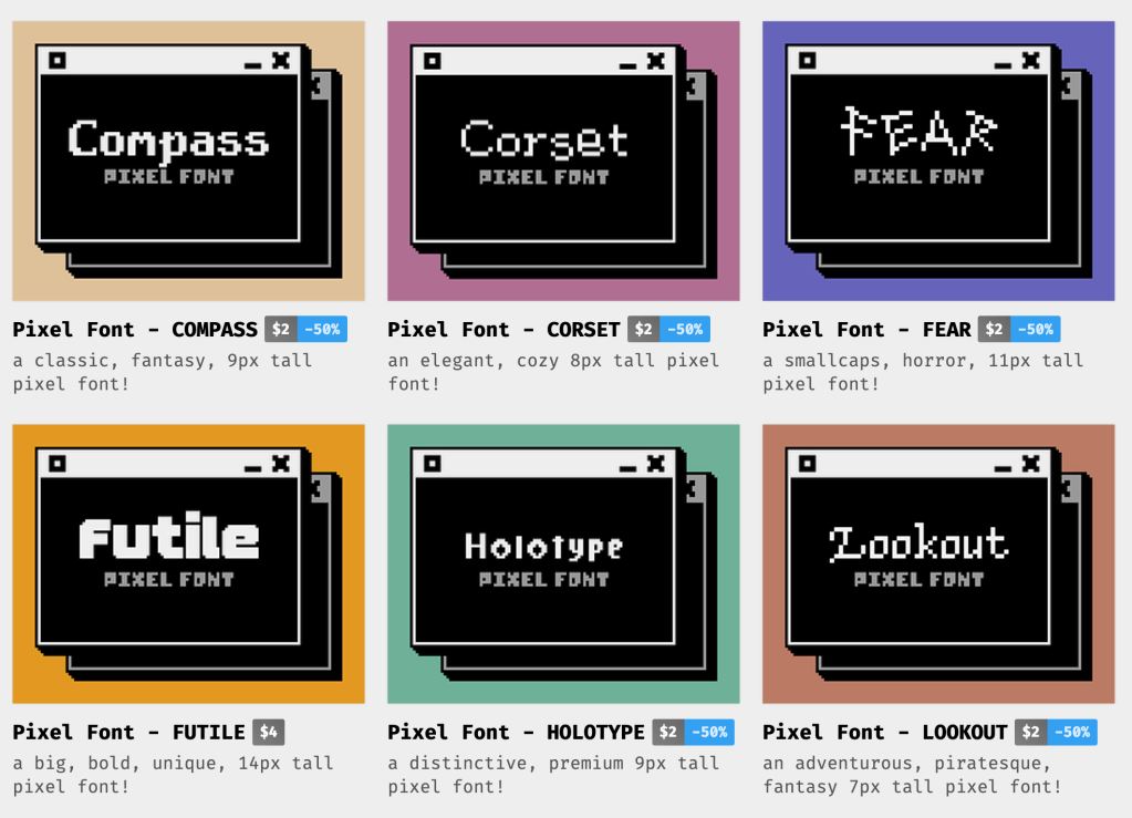
Flowing bezier forms definitely have their place in typography. But, sometimes, one craves for simpler times when pixel fonts ruled the CRTs.
We can reflect on that nostalgia with a collection of 33 modern TTF Pixel Fonts created by somepx. Each typeface also comes in PNG and SpriteFont formats.
While most of the offerings are not free, they’re very reasonably priced (~$2.00-5.00 USD), and I’m pretty sure there’s at least one member of the collection that will bring back a (hopefully) fond memory or two.
FIN
Remember, you can follow and interact with the full text of The Daily Drop’s free posts on Mastodon via @dailydrop.hrbrmstr.dev@dailydrop.hrbrmstr.dev ☮️

Leave a comment