Why Do We Need More Typefaces?; Legibility; What’s Your Type?
I’ve managed to burn down a bit of the backlog of font resources I’ve had in queue to post about, so next time ’round I’ll drop some links Lynn (of TITAA) shot my way a bit ago (she always finds such cool things).
TL;DR
(This is an AI-generated summary of today’s Drop.)
(Perplexity failed to include any links, again.)
- The section discusses the importance and diversity of typefaces, highlighting that new typefaces are essential for cultural expression and adaptability in communication. Kris Sowersby and Veronika Burian argue that typefaces, like ingredients in cooking, offer endless possibilities for creativity and expression, emphasizing the need for new typefaces to reflect societal changes and multilingual requirements. The post also touches on the potential of variable typefaces in offering more control over design.
- Mary C. Dyson’s book “Legibility” is recommended for those interested in typography and text legibility. The book, available for free online under a CC BY-NC-ND 4.0 license, covers various aspects of legibility research and its application in typography, offering a comprehensive resource for students, teachers, and practitioners.
- The Washington Post’s interactive piece invites readers to explore how different fonts affect reading experience, challenging the notion of a “best” font. It suggests that font choice can significantly impact how text is perceived, with no one font being universally superior for all readers.
Why Do We Need More Typefaces?
I was staring at the nigh never-ending scrolling list of fonts in my Adobe font catalog, and it got me thinking that, perhaps, we have all the fonts we “need”. The thought did not end there, and I poked around a bit to see what true experts have said on this.
Kris Sowersby’s take is that “typefaces are the ingredients and typographers are the cooks”. Great cooks can take some simple ingredients and make a an amazing dish; whereas, a horrible cook may perform the equivalent of torture with the same ingredients to produce something inedible. Just like food, we don’t eat the same thing every day, nor make a dish the exact same way each time we prepare it. And, we let influences of other cuisines shape how we make new versions of old favorites.
And, as Kris notes, we haven’t even settled on a “canon” version of some of the most quintessential typefaces. If we had, there would be no Adobe Garamond, Linotype Garamond, Stempel Garamond, Monotype Garamond, or any other of the many Garamond typefaces.
The most profound argument by Sowersby (to me, anyway) is “the alphabet is not defined by a single typeface but expressed through all of them”. The wannabe artist in me does like that perspetive.
Veronika Burian, in a post on ALPHABETTES repeats some answers to this perennial question, such as “do we have enough music, or clothes, or art?”. She goes on to note that type design is highlighted as a carrier of culture that adapts to societal developments and trends, especially in a world where communication channels and self-expression are rapidly evolving. Modern computing and the diversity of rectangles designs show up in has transformed typeface design.The internet has truly shrunk the planet, so multilingual requirements also add complexity to the profession. Despite a flood of digital typefaces, many of which may be flawed (which is one reason the “do we need” question came to my mind), Burian sees their creation as a harmless expression of digital culture.
She also notes how the non-type-nerds amongst the general population just “consumes” information/designs and likely (rarely) pays direct attention to the nuances of the fonts. But, the entire composition — which includes the details of the letterforms and the way the designers have orchestrated them — has a profound impact because of those “unseen” details.
The last item I’ll note from my own ponderings is that we have only truly begun to see what is possible in our brave new world of variable typefaces. You, me, and all the rest of the folks who get to play in this space have far more control over the shapes we place, which kind of makes each tweak yet-another-new-typeface, too.
Legibility
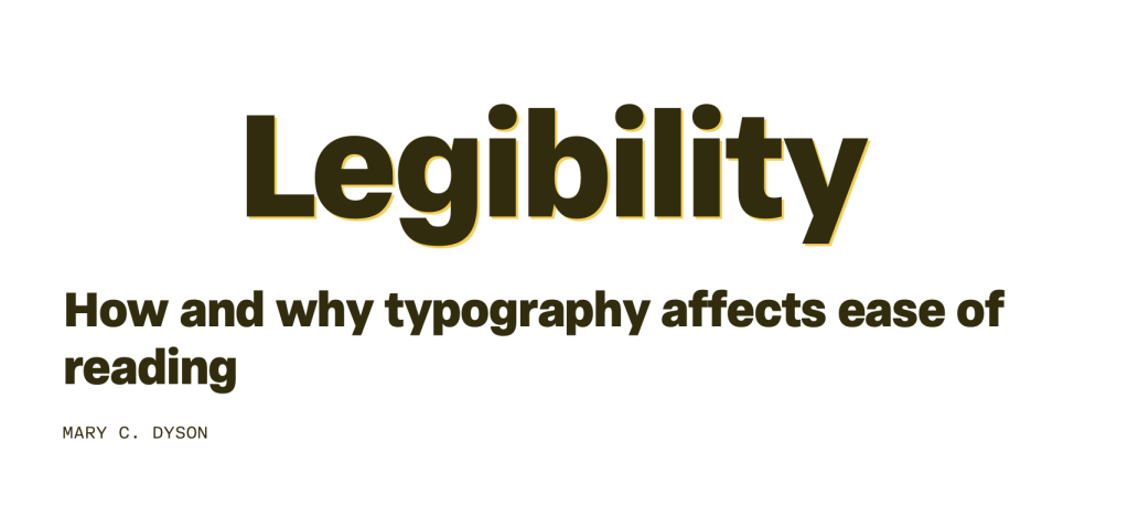
Do you like learning more about how to communicate effectively through typography and free resources? If so, the book “Legibility” by Mary C. Dyson is a comprehensive resource on the topic of text legibility, designed to be accessible for those studying, teaching, or practicing typography. It is available online in English and Spanish under a CC BY-NC-ND 4.0 license. It’s very textbook-like, which was a deliberate choice by the author to help encourage critical reading. The book is structured into seven chapters, each addressing different aspects of legibility research and its application in typography.
- “What Do We Mean by Legibility?” provides a broad definition of legibility, distinguishing it from readability and discussing its importance. It covers the functionality versus aesthetics debate and provides evidence for legibility, summarizing the key points at the end.
- “How We Read” burrows into the rationale behind reading, eye movements, and the recognition of words. It re-examines the word shape theory, discusses parallel letter recognition, word context, and identification of letter features. It also compares reading different typefaces and handwriting, summarizing the findings.
- “Perspectives on Legibility” offers historical perspectives on legibility, outlines research directions, and provides a design perspective. It emphasizes the importance of combining resources across disciplines and summarizes the main points.
- “What is Measured and How” discusses different types of testing and research, the challenges involved, key criteria, reading conditions, and the material used in studies. It also covers methods for comparing typefaces and the importance of illustrating test material, summarizing the chapter at the end.
- “Overview of Research: Type” provides an overview of research on type, discussing screen versus paper legibility, serif versus sans serif typefaces, individual letters, letter features, and type variants like bold and italic. It also touches on typeface semantics and summarizes the research outcomes.
- “Overview of Research: Typography” adopts the same approach as the previous one but focuses on typography. It covers letter spacing, word spacing, alignment, line length, columns, line spacing, paragraph denotation, headings, and overall layout. It identifies dimensions, constructs, or variables that affect good and poor layout, summarizing the research findings.
- “Beyond Legibility Research” broadens the scope of legibility research, revisiting familiarity, examining brief glances at text, and exploring navigation through different menu styles. It discusses aesthetics and the case against legibility disfluency, concluding with a summary of the insights provided throughout the book.
I grabbed the PDF and encourage others to do so as well.
What’s Your Type?

Since you’ve likely tired of my longish blatherings in today’s Drop, I’ll leave you with a fun and informative piece by The Washington Post that encourages you to read the article in multiple fonts to see how it changes the way you read. They do make some assertions as to what the “best” font is for this purpose, but feel free to ignore them if you have a different preference.
FIN
Remember, you can follow and interact with the full text of The Daily Drop’s free posts on Mastodon via @dailydrop.hrbrmstr.dev@dailydrop.hrbrmstr.dev ☮️

Leave a comment