Open [Variable] Source; Typographica; Font ID
Wow, it sure was one of those “Tuesdays” I noted a few weeks ago. I should be able to get a second post out today, tho, to make up for the tardiness of this one.
TL;DR
(This is an AI-generated summary of today’s Drop.)
- Open [Variable] Source: The blog post discusses the release of Ubuntu Sans, a variable font designed by Dalton Maag for the Ubuntu operating system, highlighting its humanist style and flexibility for different mediums. The font’s variable nature allows for resource conservation, especially in areas with slower internet speeds. More details on the history of Ubuntu fonts can be found at Ubuntu’s wiki.
- Typographica: Typographica is a website that provides in-depth reviews and scholarly insights into typefaces and typography literature. Founded by Stephen Coles in 2002, it is a valuable resource for detailed critiques and discussions on the design and emotional impact of typefaces. The site also features an annual list of favorite typefaces and can be followed on Mastodon at @typographica@typo.social.
- FontID: FontID is a community-driven platform for identifying typefaces, where users can post images of fonts and receive identification from human experts. It is likened to a typography version of StackOverflow and is recommended for those seeking font identification over automated machine learning models. Visit FontID for assistance with typeface identification.
Open [Variable] Source
(To keep this section short-ish, we shall take it for granted that every reader knows what Ubuntu is. Drop me a note if not.)
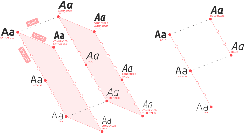
Ubuntu Sans (GH) is variable font commissioned by Ubuntu to complement their seminal monospace typeface. Crafted by the London-based type foundry Dalton Maag, this sans-serif typeface was designed to enhance the Ubuntu OS’s user interface, but you will also find it used in many other places (and, outside of Ubuntu-proper).
It’s a a humanist-style typeface, which means it was designed with an emphasis on clarity and readability, mirroring the qualities of traditional calligraphy. This design principle ensures that the font is both aesthetically pleasing and highly legible across different mediums, from desktop and mobile screens to print. The font’s open curves and friendly appearance contribute to a sense of warmth and approachability, which (in theory) should help ensure things made with it are both inviting and easier to navigate.
The introduction of a variable font version of Ubuntu Sans increases its utility and flexibility. As we’ve covered more than a few times, variable fonts allow for adjustable weight, width, and other typographic features within a single font file. This lets crafters fine-tune the appearance of text dynamically. It’s not mentioned often in typography posts across the internets, but variable fonts, such as the revamped Ubuntu Sans, can actually help conserve resources by reducing the need for multiple font files. Not every location on this globe of ours has speedy internet, so this can be more important than you might first think.
A great deal of time, thought, and effort went into making something most Ubuntu wielders likely take for granted (those who use the Desktop versions, anyway). You can read more about this history of Ubuntu fonts at their wiki
Typographica

Your first thought after glancing at the section title may have been “hrbrmstr made another spelling mistake”, but that is definitely not the case.
Typographica is a site that offers a unique blend of critique, appreciation, and scholarly insight into typefaces and type books. It was founded in 2002 by Stephen Coles, and offers in-depth reviews of typefaces and type-related literature, along with occasional (and, often, quite insightful) commentary on fonts and typographic design.
If you want detailed (and, I mean detailed)/comprehensive reviews of typefaces, you need to peruse Typographica’s back catalog. There are scads of deep dives into the design, utility, and “emotional resonance” of typefaces. Each review is penned by expert contributors with well-informed perspectives who regularly blend technical acumen with aesthetic sensitivity (it doesn’t matter how “techincally cool” a font is if it’s never going to get used).
The site covers both the latest releases by independent foundries, along with pieces looking at historical fonts with significant typographic merit. If you do stop by, make sure to poke at their annual “Our Favorite Typefaces“, which highlights the best in type design from various genres and styles.
They’re also on Mastodon! (@typographica@typo.social).
FontID

The site’s tagline — “Need to identify a typeface? Post an image. Get answers from humans. That’s it. Font ID.” — does kind of say it all. But, I’ll add a bit of extra blathering for good measure.
Think of FontID as the StackOverflow (well, when SO was good) of typography, at least when it comes to identifying fonts.
Sure, there are more than a few sites which use various trained models to automagically guess what an image of a font sample is. But, humans are way cooler than ML/AI models, and we typography nerds can be an obsessive bunch, times.
Next time you’re looking to identify a font, perhaps give these folks a go before giving in to our impending AI overlords.
FIN
Remember, you can follow and interact with the full text of The Daily Drop’s free posts on Mastodon via @dailydrop.hrbrmstr.dev@dailydrop.hrbrmstr.dev ☮️

Leave a comment