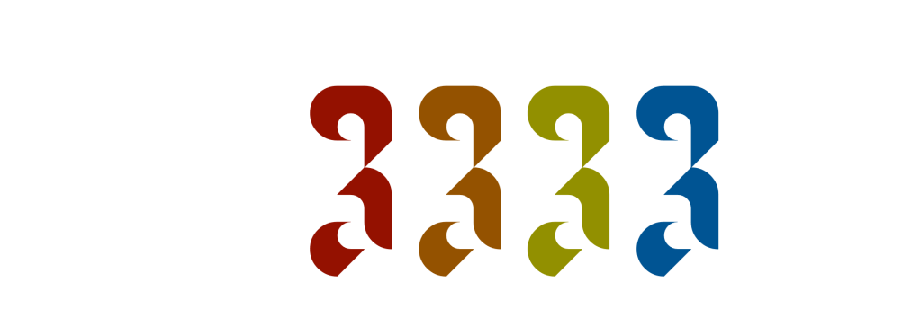
Typodarium; K.73r; Featured Foundry: Jonas Type
We take a slightly different turn in our weekly peek at the world of typefaces with some truly clever resources both in meatspace and screenspace.
TL;DR
(This is an AI-generated summary of today’s Drop)
- Typodarium offers a unique typeface-a-day calendar that has been around since 2008, featuring 366 new typefaces from 292 designers across 34 countries, mixing Latin and non-Latin alphabets to celebrate linguistic and artistic diversity. The 2024 edition is currently out of stock, but interest can be tracked for future availability Typodarium.
- K.73r is a geometric sans typeface designed by Lauren Graycar, inspired by modernist traditions and Mozart’s canons, with over 10,500 glyphs and up to 100 alternatives per character, blending technical precision with handcrafted warmth K.73r.
- Jonas Type, founded by Jonas Pelzer, offers three free-to-try fonts including Scope, Fictional, and Indicate Mono, each with unique characteristics suitable for various design needs Jonas Type.
Typodarium

Our glowing rectangles provide a digital canvas on which we can see and use a nigh infinite number of typefaces and fonts. Yet, there is something truly special about seeing the flowing lines, curves, and shapes of letterforms on printed on physical medium. This may be due to the different design choices creative minds make knowing the permanence of items produced in meatspace. Or, it could be that we just tend to slow down a bit when interacting with items we can physically interact with.
It’s been a minute since I’ve used a traditional, physical calendar (though we’ve covered one very untraditional calendar that I do look forward to every year). And, it has been even longer since I’ve used one of those tear-off “calendar a day” novelties. I think that’s partially due to wanting to read all the clever/interesting entries, vs. be patient enough to consume them at a slower pace.
Typodarium gives us an opportunity to combine both the consumption of physical type and the experience of a slow, daily “surprise”. This typeface-a-day calendar has been around since 2008, and features hundreds of typefaces by individual designers. This isn’t just a “vanilla” product with just a month and day printed in a single font. Each page is crafted by artisans to showcase the unique features in each font, which brings both visual delight, and can help inspire us in our own creations.
This year’s calendar features 366 new typefaces created by 292 type designers from 34 countries, and deliberately uses a mix of Latin and non-Latin alphabets in order to celebrate the “diversity of languages, concepts, and artistic forms”.

Sadly, this year’s edition is still out of stock (I think places like Amazon may still have it, but we’ve stopped buying from there, and I try not to give that site any more clicks), but if this item piques your interest, have your digital assistant set a reminder to check in on it now and again, or tap back to it later in the year to see what’s in store for 2025.
K.73r

Lynn sent K.73r my way the other day and, for whatever reason, I cannot stop obsessing over this number from this incredibly notable typeface:

This creation by Lauren Graycar‘s is both unique and elegant, created by layering squares, circles, and triangles. The typeface is inspired by modernist traditions and crafted with a meticulous process that involves designing each letter using these basic geometric shapes at uniform widths. The name “K.73r” is derived from one of Mozart’s canons, reflecting the musical inspiration behind the design process. The typeface boasts over 10,500 glyphs with up to 100 alternatives per character, showcasing a blend of technical precision and handcrafted warmth. Through the use of practical guidelines and simple shapes, Lauren has developed a visually striking yet restrained typeface that pays homage to both modernist techniques and traditional craftsmanship.
(If you haven’t subscribed to Lynn’s “Things I Think Are Awesome”, you really should. She’s curates and exposits some amazing resources, most of which I’d never discover on my own.)
Featured Foundry: Jonas Type

The K.73r discovery led me down a rabbit hole of links that eventually dropped me at Jonas Type. This foundry was established by Jonas Pelzer, a designer and developer mainly based in Berlin.
Jonas features three free-to-try fonts in standard and variable formats.
Scope is a monolinear (that’s when a letterform’s stroke exhibits a consistent thickness) typeface, whose letters are constructed to function as mechanical variations and follow a strict set of rules: Closed forms are rounded and open forms are angular.
Jonas describes Fictional as a _”lively and playful typeface with a cartoonesque character, crafted to bring warmth and quirkiness to your designs”.
And, Indicate Mono (a work in progress) “preserves the strict order of a monospace typeface, but also moves away from the typical technical aesthetics of fixed-width typefaces.” If I ever get tired of the Monaspace family, I may give this one a go at the terminal and IDE.
FIN
Remember, you can follow and interact with the full text of The Daily Drop’s free posts on Mastodon via @dailydrop.hrbrmstr.dev@dailydrop.hrbrmstr.dev ☮️
Leave a comment