Unmistakably Human; Featured Free Font: Television Sans; Featured Free Font: Television Sans
You get two freebies for having to up with me slightly soapboxing at the end of the first section.
TL;DR
(This is an LLM/GPT-generated summary of today’s Drop. Ollama and MiniMax M2.1.)
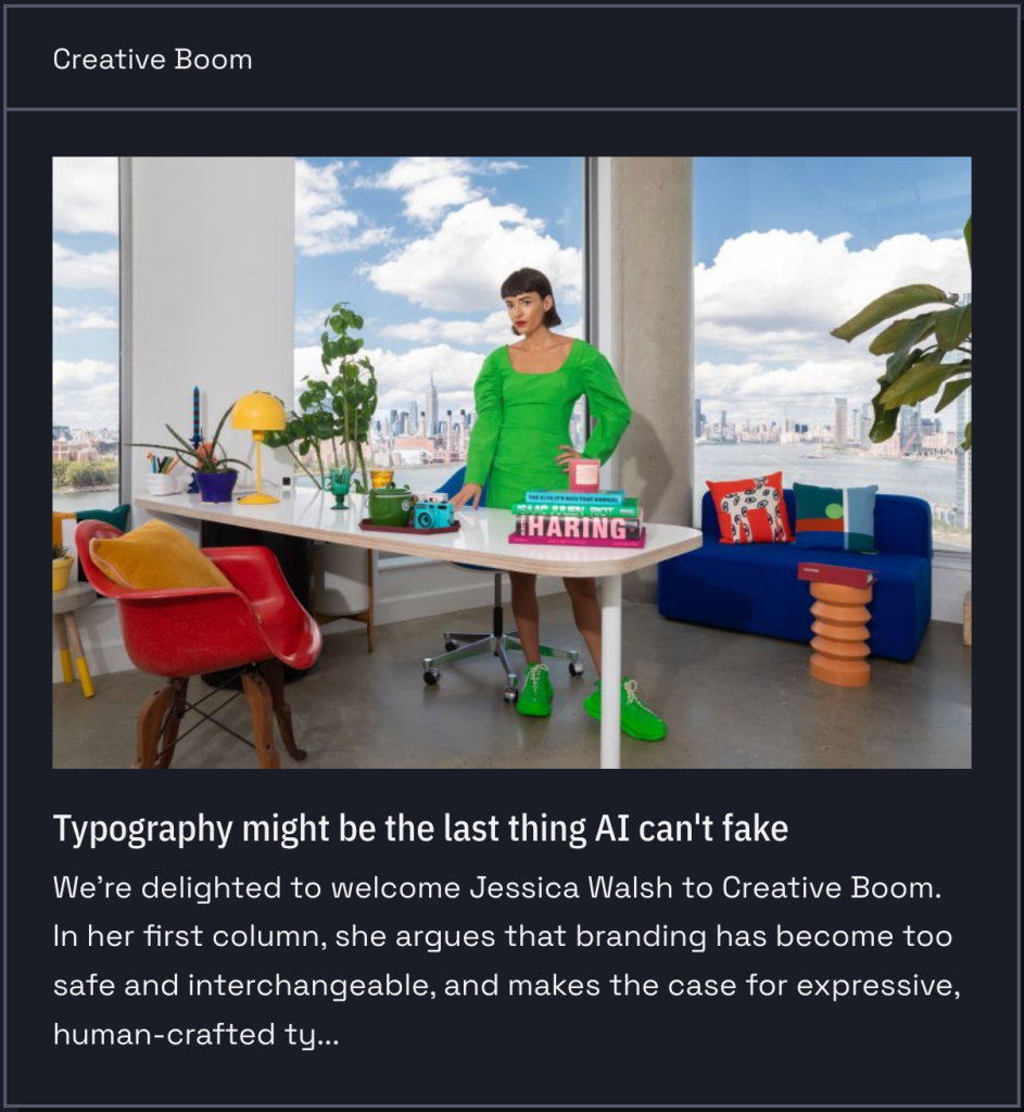
- Typography remains distinctively human in an AI-driven design landscape because it requires optical judgment, cultural fluency, and rhythmic understanding that current AI tools cannot replicate at production scale, with human-crafted type becoming a premium authenticity signal (https://www.creativeboom.com/insight/typography-might-be-the-last-thing-ai-cant-fake/).
- Television Sans is a free geometric sans-serif font inspired by 1980s newsprint advertising that balances circular letterforms and consistent geometry with optical corrections for organic warmth (https://github.com/sammularczyk/television-sans).
- Sobremesa is a freemium contemporary humanist-geometric sans-serif from Anagram Foundry featuring 18 styles, 515 glyphs, and a Weight/Slant variable axis, designed to convey warmth and comfort through subtle human details while maintaining geometric foundations (https://anagramfoundry.gumroad.com/l/afsobremesa).
Unmistakably Human
The visual trust signals that used to distinguish human-made content from generated content are eroding at a frightening pace. Whether it be “AI” created images, video, or layouts, the gap between machine output and human craft is closing rapidly in most areas of visual design. Typography is [still] the notable exception, and probably not for the reasons you’d expect: it’s not that “AI” can’t generate letterforms; it can, and we’ve explored how it can in many-a-Tuesday Drop. But building a typeface that actually functions across a full design system requires optical judgment, cultural fluency, and an understanding of rhythm that current “AI” font tools (or models in general) cannot deliver at production scale. What they produce is draft material, not finished type.
Sadly, we’ve been ushering in this takeover of design on our own for quite some time, so (lacking a better word) “branding” has already been trending toward homogenization independent of “AI.” The commercially available font market is mostly ultra-neutral sans-serifs, with the outliers being either too stylized to survive real-world use or expensive enough to price them out of more widespread adoption. The result is a landscape where everything starts to feel like a variation on the same handful of choices. Genuinely distinctive type identities of corporations, products, magazines, studios, etc., were built over decades; the question is where up-and-comers will find that kind of differentiation now.
Jessica Walsh’s answer, developed over at Creative Boom, is that human-crafted typography is becoming a premium authenticity signal precisely because “AI” can’t fake it convincingly (yet); and that the artists and craftsfolk who are “the market” still haven’t figured out how to democratize that authenticity so it’s accessible to everyone (not just folks with big bundles of cash). It’s a sharper argument than the headline suggests, and I especially like this quote from Jessica: “The brands that win in the next few years won’t be the ones with the slickest images, photos, or videos. They’ll be the ones that feel unmistakably human.”
I’ll take a brief ending aside publisher’s privilege to submit we humans have been trending towards “slop” for a while. It’s nice to cast aspersions on the clankers, but we have all (yes, “all”) been accepting gravitation towards the mediocre for quite some time, barely taking any effort to reward novelty or cleverness in any design space. Heck, even I eventually relented to D3’s ubiquitous and maddeningly generic “steelblue” after a time (a habit I’m breaking this year). So, while we’re using the resource in this section to celebrate our human dominance over the clankers (when it comes to typography), perhaps we should consider all the other places we’ve consigned ourselves to accept the human mediocrity and seek/encourage the authentic. Then, perhaps, we can legitimately complain about “AI.”
Featured Free Font: Television Sans
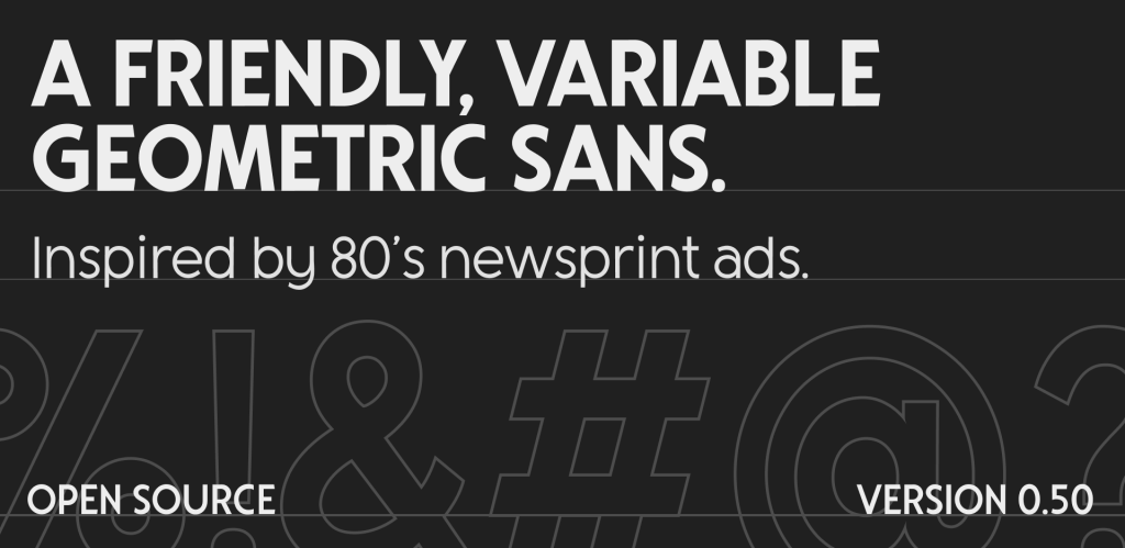
We have another geometric sans in this section, “inspired by newsprint ads from the 1980s.” If you weren’t around back then, AdRetro can give you a small taste of what you, er, “missed.” But you can also go grab Television Sans by Sam Mularczyk and give it a go yourself.
The geometric foundation is, again, evident in the circular “o” forms and the consistent stroke geometry, but it’s tempered with enough optical correction to avoid the cold precision that plagues pure geometric designs. The “S” in the hero specimen (see more of it at the link) has a nice organic quality to it rather than feeling mechanically constructed.
The “a” is single-story, which is, again, consistent with the geometric tradition. The letter spacing looks well-tuned across the weight range, so the Extralight isn’t swimming in space and the Bold isn’t cramped.
Geometric sans fonts dominated newspaper advertising in that era. 80s newspaper ad type needed to be legible on cheap newsprint at speed, so it favored clarity over elegance. Television Sans has that same pragmatic quality. It’s the polar opposite of the flashy neon/chrome/Memphis aesthetic folks typically associate with “the 80s.” You’d see a font like this used in local newspaper ads for electronics stores, car dealerships, and department stores. Think Radio Shack (kids can kagi that) circulars, Sears catalog ((again, kids can kagi that) headers, and regional telco ads.
I’d argue that it Television Sans is a modernized version of its 80s counterparts, but that doesn’t take away from its utility. And, it’s only at version 0.5.0 so keep an eye out for additions/tweaks/improvements.
Featured Freemium Font: Sobremesa
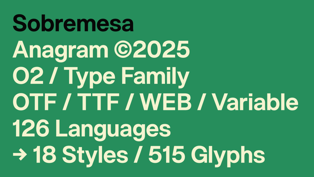
“Sobremesa” is a Spanish/Portuguese word meaning the time spent lingering at the table after a meal, conjuring up images of unhurried conversation with friends or family. This matches the typeface’s intent of creating a feeling of warmth, comfort, and hospitality; not urgeny, and definitely not anywhere near the clinical nature of the typefaces alluded to in the first section.
This contemporary sans-serif comes from Anagram Foundry, which describes it as “balancing geometric construction with subtle human details.” This places it squarely in the contemporary humanist-geometric hybrid territory that’s become increasingly popular. It’s the same space occupied by typefaces like Inter, General Sans, or Pangram Pangram’s Neue Montreal, where strict geometry gets softened by optical corrections and warmth in the curves.
The family ships as 18 styles with 515 glyphs, supporting 126 languages. Formats include OTF, TTF, web fonts, and a variable font cut. The variable font exposes two axes: Weight and Slant. This confirms the 18 styles are 9 upright weights plus 9 corresponding slanted (italic) variants, which is the standard pairing for a family this size.
The ‘O’ is nearly circular, the ‘a’ is double-story, the ‘g’ is single-story. If you take a moment to linger on well-crafted sites or meatspace posters/signs, that double-story ‘a’ / single-story ‘g’ combo is everywhere right now as it splits the difference between readability and clean modern look.
The terminals are flat, not rounded or angled. Apertures are moderately open and wider than Helvetica but narrower than, say, Fira Sans. So this font is likely good enough for body text at small sizes without issues.
The x-height is tall relative to cap height, which is standard for anything designed with screens in mind, as it helps legibility at small sizes, and reduces uppercase/lowercase contrast at large sizes.
The Slant axis means the italics are obliques (a nod back to a recent Tuesday Drop), with letterforms tilted, not redrawn with cursive structures.
If you do choose to use it, one thing to watch is that the lowercase ‘l’ looks like a straight vertical stroke, so depending on the weight you’re using, it could be hard to distinguish from uppercase ‘I’ or the numeral ‘1’. If you need that disambiguation for data-heavy or code-adjacent work, definitely test it first.
FIN
Remember, you can follow and interact with the full text of The Daily Drop’s free posts on:
- Mastodon via
@dailydrop.hrbrmstr.dev@dailydrop.hrbrmstr.dev - Bluesky via
<https://bsky.app/profile/dailydrop.hrbrmstr.dev.web.brid.gy>
☮️

Leave a comment