FontBob; Featured Free Font: Geomini
Just two sections today due to the sleep demons creeping back in again.
TL;DR
(This is an LLM/GPT-generated summary of today’s Drop. Ollama and MiniMax M2.1.)
- FontBob is a browser-based font editor by Carl’s Type in Stockholm that offers a simplified, accessible alternative to expensive professional tools like Glyphs and FontLab, with a free tier including all editor features and a Pro tier at $7/month for private fonts and support (https://fontbob.com).
- Geomini is a compact geometric font available on FontBob that features monolinear strokes, generous x-height, and tight vertical metrics optimized for UI design (https://fontbob.com/geomini).
FontBob
Font design has long been one of those disciplines where the tools assume you already know what you’re doing. Glyphs costs around ~$300.00 USD. FontLab is in the same neighborhood, while the venerable FontForge is free and open source, but its interface was designed by people who think “intuitive” means “you’ll figure it out eventually” (like the Gimp brigade). So, it’s hard for us casual creators, just-scraping-by students, and the merely curious to gain an entry point into this super-cool world.
FontBob takes a different approach. It’s a browser-based font editor built by Carl’s Type in Stockholm, and it’s aimed squarely at the gap between “I want to make a font” and “I hold a degree in type design.”
The editor runs entirely in the browser, so no installs and no platform lock-in (save for FontBob itself). It works on desktop and mobile (try running FontForge on your phone), and when you open the app, you’re immediately in a dark-themed workspace with a live text preview at the top and individual glyph editing canvases below. Each glyph gets its own editing area with Bezier control points, and there’s a toolbar at the bottom with the expected vector drawing tools: select, move, freeform draw, pen, rectangle, ellipse, and a layers panel.
The workspace is organized into four tabs (Sketches, Glyphs, Text, and Fonts), which maps well to how you’d actually work: sketch out some ideas, refine individual glyphs, preview them as text, then manage and export your font files. The key differentiator from the other/aforementioned tools is simplicity. Where professional tools expose hundreds of options for kerning tables, OpenType features, hinting, and glyph metrics, FontBob strips the experience down to drawing letterforms and assembling them into a usable font. Just draw on a canvas, and it handles the rest. That’s 100% a big trade-off, and the right one for the audience they’re targeting.
The free tier gives you all editor features, the ability to share your work, and public fonts (with no credit card required!). The Pro tier at $7/month adds private fonts and priority support. There’s a Studio tier for teams and educational institutions that requires contacting them directly. The fact that the free tier includes all editor features is the right call. It means anyone can evaluate the tool without hitting artificial walls, and the upgrade path is about privacy and support rather than gated functionality.
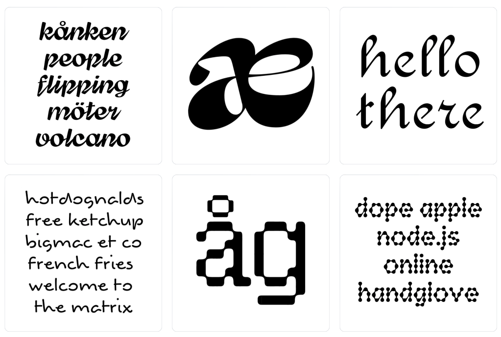
FontBob also has a “Discover” gallery where designers share their creations. Each font card shows the typeface name, creator, a glyph preview, and the license (SIL Open Font License, CC0, CC BY-SA). Fonts can be downloaded directly or forked via an “Editable” button, which opens them in the editor for remixing.
The gallery shows real variety, with everything from pixel fonts to calligraphic scripts to heavy display faces and geometric sans-serifs (and even some experimental ligature work). It’s a small community at this point, but the range suggests the tool is flexible enough to support different styles.
FontBob is not going to replace Glyphs or FontLab for professional type designers. It doesn’t appear to have fine-grained kerning controls, OpenType feature editing, variable font axes, or the deep metrics tools that production fonts require. If you’re designing the next Inter or Fira Code, this isn’t the tool. I might have missed some of these more advanced tools while playing around in the interface, so if you catch some that I haven’t’ drop a note!
Trying to use FontBob to make a new font (or remix an existing one) sure sounds a lot better than doomscrolling.
Featured Free Font: Geomini

I found Geomini via FontBob’s remixable interface. It’s a “compact geometric font for text, titles and interfaces” and a faithful sibling of Inter and Outfit, but it definitely did its required geometry homework a bit more than they did. And, while many (many) other fonts just fiddle with tracking for a “compact” version, they kept doing math and adjusted the metrics of each glyph.
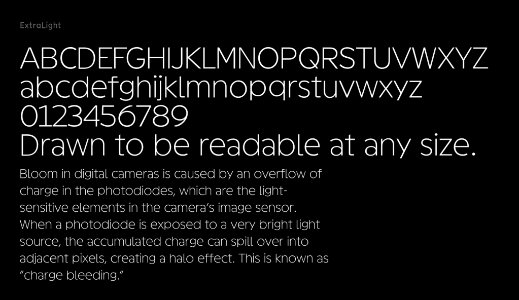
I used a medium weight for the section header ExtraLight weight, and even there you can see that the strokes are monolinear throughout, the round characters sit on near-perfect circles, and there’s just enough optical correction at the baseline to keep things from going wonky. It also has super-generous x-height, ascenders that don’t overshoot the cap line, and short descenders (hit the reference site to see all this). These tight vertical metrics work well in UIs where you’re fighting for line-height space. The single-story ‘a’ (which does have a somewhat odd shape, to me) and ‘g,’ plus the flat-topped ‘t’ and tabular lining numerals, all live up to the “geometric” classification.
Since I mentioned them (and was a bit mean), Geomini is a bit less warm than Inter and more tightly wound than Outfit. It has a similar vibe to Satoshi but is way more strict with the proportionality.
I have to try this in some plots soon.
FIN
Remember, you can follow and interact with the full text of The Daily Drop’s free posts on:
- Mastodon via
@dailydrop.hrbrmstr.dev@dailydrop.hrbrmstr.dev - Bluesky via
<https://bsky.app/profile/dailydrop.hrbrmstr.dev.web.brid.gy>
☮️

Leave a comment