Atlas Of Type; Beyond Bézier; Featured Font: Neue DIN
Removing 20” of ❄️ ate into the free time I normally use for Drops yesterday 😕
The featured font section has a new typography term that I learned from checking out that font.
TL;DR
(This is an LLM/GPT-generated summary of today’s Drop. Ollama and MiniMax M2.1.)
- Atlas Of Type is a curated one-person directory of 12K+ typefaces from 650+ independent foundries, filtered by activity since 2015 and ethical distribution channels, offering an alternative to algorithmic font discovery platforms (https://type-atlas.xyz/).
- Beyond Bézier is ECAL’s 18-month research project exploring alternative type design methodologies beyond Bézier curves through five research axes, documented in video lectures with annotated transcripts (https://beyondbezier.ch/).
- Featured Font: Neue DIN introduces “retalic” (reversed italic) as a design technique, explaining its unconventional psychological impact and the technical challenges of designing left-leaning typography compared to standard italics (https://fontwerk.com/en/fonts/neue-din).
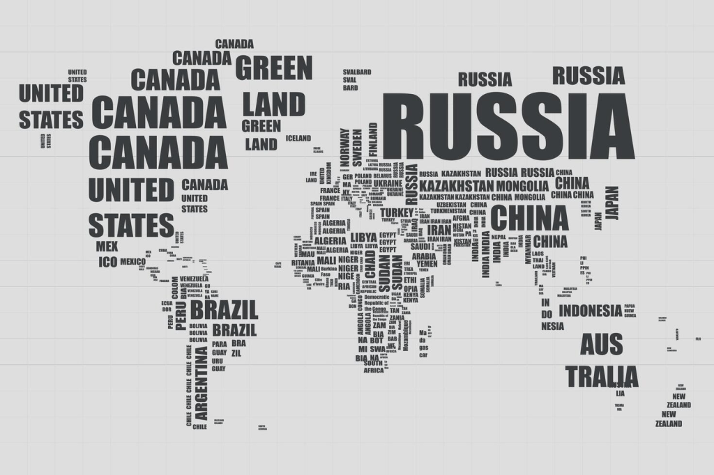
Atlas Of Type

Finding a typeface that isn’t Helvetica, Inter, or whatever Google Fonts is pushing this week shouldn’t require a graduate degree in font archeology (or waiting for the next Typography Tuesday to Drop). The big aggregators bury us all in quantity, listing thousands of faces, most of them from foundries we’ve never heard of, with no clear sense of what’s actively maintained or who actually made it.
Dan Cătălin Burzo’s Atlas of Type takes the opposite approach. It’s a one-person directory of 12K+ typefaces from 650+ foundries, and the inclusion criteria are refreshingly specific: active (released or updated something since 2015), independent (not owned by the usual monopolistic suspects), and distributed through their sites or a short list of reputable partners like Future Fonts, Type Network, and Fontstand.
That last part oddly matters more than one might expect. The type industry has its version of the platform consolidation problem, and knowing a foundry distributes through channels that actually pay designers fairly is useful signal. Burzo’s methodology page lays all this out transparently, so we know where the data comes from, how he verifies it, and what counts as “reputable.” I wish more “awesome” lists both had acceptance criteria and were maintained as well as this is.
If you’re tired of the algorithmic slop that passes for font discovery on the major platforms, Atlas of Type is worth bookmarking.
Beyond Bézier

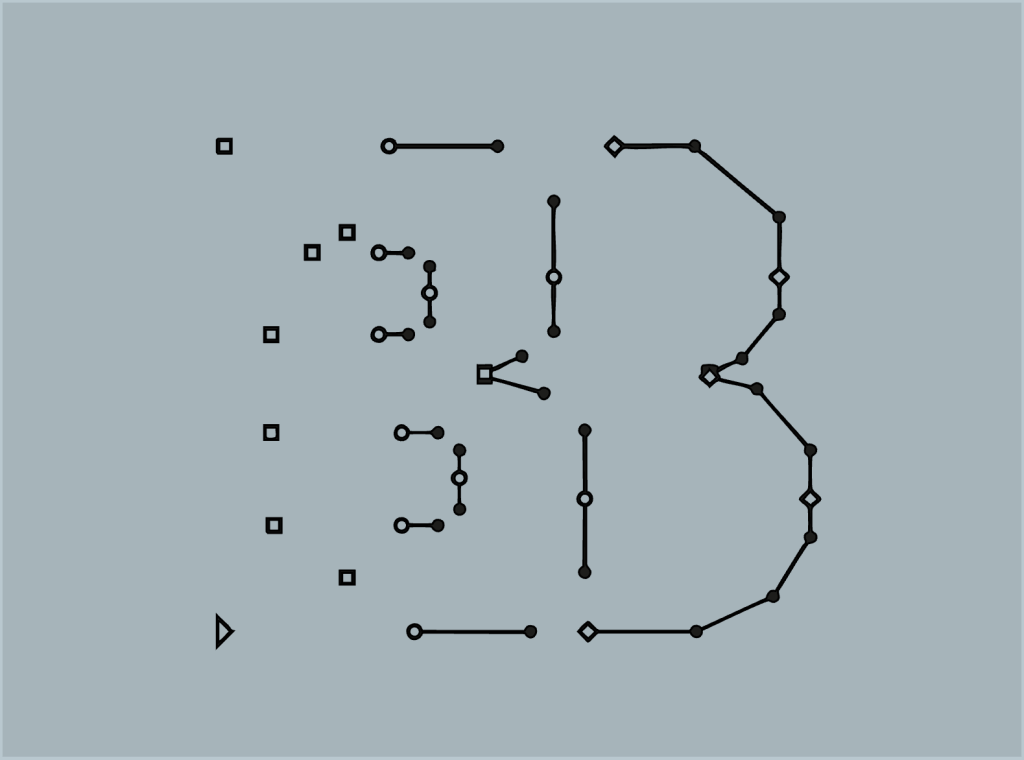
Every digital typeface you’ve used in the past forty years was probably drawn with Bézier curves. We’ve talked about them before, but the TL;DR is that they’re a curve-calculation technology borrowed from car and aircraft design where streamlined shapes matter. The three dominant type design tools (Glyphs, Robofont, FontLab) all rely on it, and that’s led to something worth questioning: when everyone draws with the same paradigm, do the results start looking the same?
ECAL’s Master Type Design program in Lausanne spent eighteen months investigating that question through a research project called Beyond Bézier. The premise isn’t that Bézier curves are bad…they’re not! They’re efficient, and they work well! But, when vector drawing becomes automatic (either through the designer’s muscle memory or through software that “helpfully” smooths out quirks), a whole area of creative possibility disappears.
The project split into five research axes, each exploring different methodologies: The Mathematics, The Stroke, The Surface, The Collective, and The Robot. The first two question traditional tools and instruments. The middle two examine who designs and in what collaborative contexts. The last cuts across all of them. One nugget that stuck with me from it is their acknowledgment of the paradox: everyone’s trying to work outside Bézier-based approaches, but you still need to produce a font file at the end. The researchers landed on a vocabulary of “cultivating” rather than “creating”, accepting that the results would stay experimental rather than becoming polished font families.
The website collects video recordings of five lectures from December 2024, each axis presenting their findings. The recordings come with edited, richly annotated transcripts—you can watch, listen, or read selectively, and the annotations link out to resources for continuing any thread that grabs you. The speakers reference each other throughout, so what started as five separate investigations reads more like one evolving conversation.
If you’re interested in type design, design tools, or just the broader question of how constraints shape creative output (I mean, you’re reading this Drop, so that’s likely an “aye”), it’s worth an ~hour of your time.
Featured Font: Neue DIN

I’m featuring Neue DIN for a few reasons. Sure, it’s a spiffy font, but I do try to avoid including fonts that cost ~$1K USD.
The first reason it’s here is that “TIL” DIN doesn’t stand for Deutsche Industrie Norm anymore. The acronym now refers to Deutsches Institut für Normung (which, in English, is the German Institute for Standardization). That new knowledge came from Neue DIN’s “about page”.
The second reason is for the new term I mentioned at the top of the post: retalic. It means (and is a portmanteau of) “reversed italic”, and Neue DIN has a well-executed version of it, which you can see in the section header. Some designers also call them backslanted, contra-italic, or reclined. There is an almost psychological effect from looking at retalic text since right-leaning generally text feels natural to a large percentage of us humans (matching right-handed handwriting). At least when I look at some samples from around the internets, these left-leaning cousins felt (for lack of better quantification) ’counter-intuitive”, or deliberately “wrong.” If italics say “pay attention,” retalics seem to say (yell?) “stop everything and look at this.”
The history is, well, weird. German mapmakers used retalics to label rivers, 19th-century headstone carvers treated them as decorative flair, and there’s been at least one failed movement to make them the official font of sarcasm (explaining the joke ruined it, apparently). Designing a good retalic isn’t trivial since one cannnot just flip a slant slider and be done with it. Diagonal stems get fat and distorted, the letter “C” looks daftly stubby, and ovals collapse unless you manually adjust the weight and stress.
We’ll make up for this hefty premium font next time with some more fiscally responsible fonts.
FIN
Remember, you can follow and interact with the full text of The Daily Drop’s free posts on:
- Mastodon via
@dailydrop.hrbrmstr.dev@dailydrop.hrbrmstr.dev - Bluesky via
<https://bsky.app/profile/dailydrop.hrbrmstr.dev.web.brid.gy>
☮️
Leave a comment