Areal; One Person’s Rubbish; Featured Free 🇺🇦 Font: Myra 4F
We have a remake, a resurrection, and a really cool display font on tap for today.
TL;DR
(This is an LLM/GPT-generated summary of today’s Drop using SmolLM3-3B-8bit via MLX and a custom prompt.)
I had to run the sections through twice (I guess I should tweak some model parameters), and it still didn’t fully obey the custom prompt.
- Areal (https://www.are.na/editorial/introducing-areal-are-nas-new-typeface) – Johannes Breyer, Charles Broskoski, and Meg Miller explain the creation of Areal, a remade version of Arial optimized for modern web use, including dark mode and variable weights.
- One Person’s Rubbish (https://www.kreativekorp.com/software/fonts/trs80/anothermans Treasure.zip) – The TRS-80’s limited character sets are recreated in Another Man’s Treasure, a TrueType font collection honoring the original while supporting ISO-Latin-1 and Cyrillic characters.
- Myra 4F (http://fonts.4thfebruary.com.ua/myra-4f/) is a Ukrainian-designed all-uppercase display sans font family, offering Light, Regular, and Bold styles with decorative uppercase and sans curls in lower case.
Areal
Johannes Breyer, Charles Broskoski, and Meg Miller did a phenom job explaining the mindset, mission, and process behind the creation of Areal. So, I’m just going to lightly sum it up here and encourage folks to head over there for the deets (further imploring you to “tap/click-in” to the images on the site for a nice surprise).
First, a bit about Are.na.
It’s a unique online platform designed for creative thinking, collaborative research, and knowledge organization. Think of it as a place you can save content, create collections over time, and connect ideas (privately or with other folks). They say it’s been described as “playlists, but for ideas” and a “toolkit for assembling new worlds.”
The platform organizes content into “blocks” and “channels.” A block is an individual piece of content. Blocks can be images, text, links, attachments, or embeds. Folks can save and organize any kind of content into collections and arrange links, videos, images, and texts in a clean, distraction-free space.
The minimalist interface and focus on meaningful connections rather than engagement metrics make the choice of typeface a rather “big deal.”
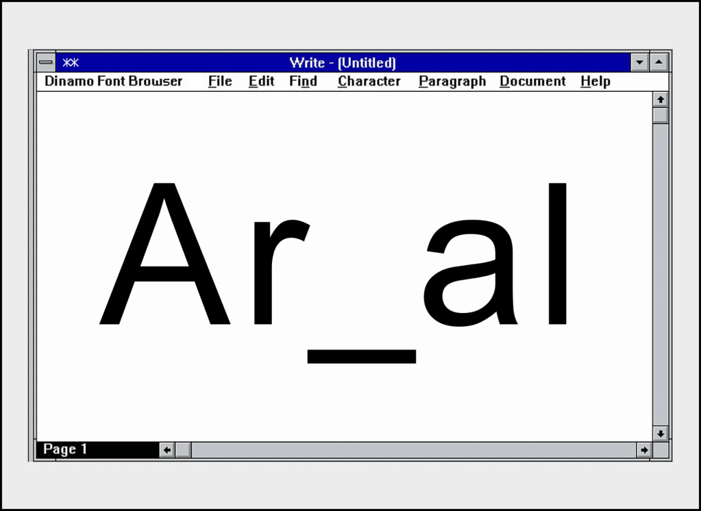
Good ol’ “Arial” is “fine”, in the same way Helvetica is “fine”. But, that doesn’t mean there isn’t room for improvement.
The team didn’t just tweak Arial — they traced it from digital screenshots of the original 1996 web version and redrew every character from scratch. Arial was chosen because it “doesn’t have much of a look” — letting content shine. The remake honors the original while optimizing for 2025 web use (dark mode support, variable weights, custom ligatures). As noted in the article, “looking at Arial and Areal should feel like refreshing a browser page. It’s the same, but it isn’t.”
One Person’s Rubbish
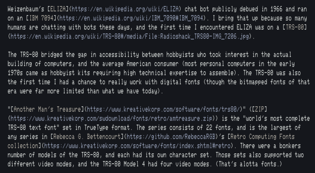
Weizenbaum’s ELIZA chat bot publicly debuted in 1966 and ran on an IBM 7094. I bring that up because so many humans are chatting with bots these days, and the first time I encountered ELIZA was on a TRS-80.
The TRS-80 bridged the gap in accessibility between hobbyists who took interest in the actual building of computers and the average American consumer (most personal computers in the early 1970s came as hobbyist kits requiring high technical expertise to assemble). The TRS-80 was also the first time I had a chance to really work with digital fonts (though the bitmapped fonts of that era were far more limited than what we have today).
“Another Man’s Treasure” (ZIP) is the “world’s most complete TRS-80 text font” set in TrueType format. The series consists of 22 fonts and is the largest of any series in Rebecca G. Bettencourt’s Retro Computing Fonts collection. There were a bonkers number of models of the TRS-80, and each had its own character set. Those sets also supported two different video modes, and the TRS-80 Model 4 had four video modes. (That’s alotta fonts.)
As noted, the OG TRS-80 fonts were very limited. But these TrueType homages to them have added glyphs to support all of ISO-Latin-1, Windows ANSI, and MacRoman, as well as block element characters and other miscellaneous Unicode characters. These additional characters have been modeled after the existing characters whenever possible.
Rebecca has documented the differences in exacting detail that I will not even attempt to summarize here.
The font collection is named after the “one man’s trash is another man’s treasure” proverb.
The section header image is part of this section in Zed, set in Another Mans Treasure MIII 64C.
Featured Free 🇺🇦 Font: Myra 4F
Given the critical and perilous point we’re at in Russia’s war on Ukraine, I felt compelled to find an offering from a Ukrainian designer for today’s edition.
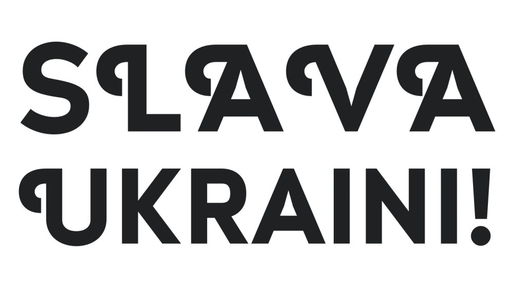
Sergiy S. Tkachenko is an independent type designer from Ukraine. He’s been a practicing software programmer and designer since 1993, and his main priority in font development is the creation of multi-language typefaces that must contain the Cyrillic character set.
Myra 4F is an all-uppercase display sans font family and comes in Light, Regular, and Bold styles. The uppercase glyphs are decorated with curls, and the lowercase glyphs have the same core design but are sans curls.
Sergiy has many more fonts on the 4th February foundry site. Many of the “purchase” links are defunct, but if you do fancy any of those, please reach out as I did some spelunking for many of them and can likely direct you to a new storefront.
FIN
Remember, you can follow and interact with the full text of The Daily Drop’s free posts on:
- 🐘 Mastodon via
@dailydrop.hrbrmstr.dev@dailydrop.hrbrmstr.dev - 🦋 Bluesky via
https://bsky.app/profile/dailydrop.hrbrmstr.dev.web.brid.gy
☮️

Leave a comment