Google Sans Code; Spline Sans Mono; Danfo
The week has been off to a rough start in the U.S., so y’all deserve some free fonts to distract you for a bit.
TL;DR
(This is an LLM/GPT-generated summary of today’s Drop using SmolLM3-3B-8bit via MLX and a custom prompt.)
(And, without modifying the prompt or setup, we’re back to URLs vs links, but they’re supposed to be at the end, not after the resource name, and there’s a deliberate instruction to not include the word “summary,” but here we have it in all three bullets. Can we please kill off “AI” already?)
- Google Sans Code summary (https://github.com/googlefonts/googlesans-code): A monospaced font designed for Google’s products like Gemini and Android Studio, optimized for syntax highlighting and character distinction at small sizes, with a tribute to Chris Simpkins, the creator of Hack font.
- Spline Sans Mono summary (https://github.com/SorkinType/SplineSansMono): A monospaced font for UI and programming environments, designed by Spline and type designers Eben Sorkin and Mirko Velimirovic, featuring thorn traps that subtly alter letterforms to reflect historical and typographic nuances.
- Danfo summary (https://www.afrotype.com/danfo): An African-inspired display font capturing the vibrant energy of Nigerian public transport culture, with bold, geometric letterforms and a design that reflects West African visual heritage and urban aesthetics.
Google Sans Code
This is a “Google thing,” and I’m including it primarily so you can reap the benefits of it, but it’s difficult to get excited about anything they make anymore.
Google Sans Code was built for Google’s own products like Gemini and Android Studio. The designers were especially attentive to character distinction at small sizes and optimized everything for syntax highlighting.
The project uses Google’s modern fontc compiler and includes a dedication to Chris Simpkins, the creator of Hack font who passed away this year.
It is a very nice monospaced font, but I won’t be using it any time soon, save for the section header demo showing it in Zed, given its creator.
Spline Sans Mono

Spline Sans Mono is a monospaced typeface specifically designed for glowing rectangles, UI work, and programming environments. The font was created as a collaboration between the Spline design team and type designers Eben Sorkin and Mirko Velimirovic. The design achieves space efficiency by condensing traditional grotesque proportions while maintaining readability across different contexts.
The typeface has a sleek feel and includes an intersting design element called “thorn” traps that add subtle character to the font. These traps are a deliberate design feature where the letter “þ” (thorn; an Old English/Icelandic character representing the “th” sound) is visually similar to other letters in the typeface, particularly “p” or “b”.
This creates a typographic “trap” where the thorn character can be easily mistaken for these more common letters, especially at small sizes or in poor printing conditions. The similarity is usually in the basic letterform structure—both thorn and “p” have a vertical stem with a closed counter (enclosed space) on the right side.
Historically, this led to confusion in early printing, where typesetters might substitute “p” for thorn when the proper character wasn’t available, contributing to spellings like “ye” (originally “þe” meaning “the”) in phrases like “Ye Olde Shoppe.”
In modern type design, when thorn is included in a character set, designers must carefully balance maintaining the historical character of the letter while ensuring it’s sufficiently distinct from “p” and “b” to avoid misreading. Some typefaces intentionally preserve this ambiguity for historical authenticity, while others modify the thorn to be more clearly distinguishable. It is a rare element in a monospaced font, which does make Spline Sans Mono fairly unique.
The project takes a thoughtful approach to monospaced type design, balancing the technical requirements of programming and interface work with enough typographic personality to make extended reading comfortable. The condensed proportions help maximize screen real estate while the refined details ensure the font remains pleasant to look at during long coding sessions or when reviewing interface layouts.
The section header is, again, a font use preview in Zed
Danfo
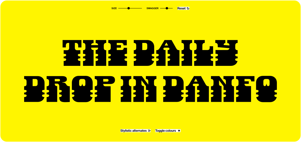
Danfo is a pretty spiffy typeface. It’s an African-inspired display font created by Afrotype that draws from the visual culture of West Africa, particularly Nigeria. The name “Danfo” refers to the iconic yellow minibuses that serve as public transportation in Lagos and other Nigerian cities.
The typeface captures the vibrant, energetic spirit of African street culture and urban life. It features bold, geometric letterforms with distinctive angular cuts and dynamic shapes that reflect the bustling energy of African cities. The design incorporates elements that echo traditional African art and contemporary urban aesthetics.
Danfo is part of a broader movement of African designers creating typography that represents their cultural heritage and visual identity, moving beyond Western-centric design traditions. It’s particularly well-suited for headlines, branding, and display purposes where you want to convey energy, authenticity, and cultural pride.
FIN
Remember, you can follow and interact with the full text of The Daily Drop’s free posts on:
- 🐘 Mastodon via
@dailydrop.hrbrmstr.dev@dailydrop.hrbrmstr.dev - 🦋 Bluesky via
https://bsky.app/profile/dailydrop.hrbrmstr.dev.web.brid.gy
☮️

Leave a comment