Badkeming; Featured Free Font: Alpha Lyrae; Why Comic Lettering Is Storytelling
Something fun (with a bit of typography terminology expository); something usually overlooked; and, something free awaits Drop readers in this weekly typography-centric edition of the Drop.
TL;DR
(This is an AI-generated summary of today’s Drop using Ollama + llama 3.2 and a custom prompt + VSCodium extension.)
- Badkeming.com showcases typographical failures and kerning mistakes, explaining how kerning adjusts spacing between characters for visual harmony using font units and OpenType’s Glyph Positioning Table (https://badkeming.com)
- Alpha Lyrae is a unique typeface with distinctive terminal cuts and OpenType stylistic sets that create pixelated variations and glitch effects (https://vegaprotocol.github.io/alpha-lyrae)
- Comic lettering serves as a crucial narrative tool, demonstrated through examples like Marvel’s Angela series and Barbarella: Woman Untamed where font choices and bubble styles enhance storytelling (https://www.comicbookyeti.com/post/why-comic-lettering-is-storytelling)
Badkeming
The tagline for Badkeming is “Where kerning’s so bad it’s keming, plus other typographical and font failures.” It’s a Tumblr site for “all those font disasters and other typographical amusement”.
It is unlikely the term “kerning” is foreign to folks reading the Drop. But, in the spirit of 2024 being the year of “no assumptions”…
Kerning is the art (yes, art) of adjusting the spacing between individual characters to achieve visual harmony/symmetry and readability. Unlike tracking, which is used to uniformly adjust spacing across entire words, kerning focuses on specific character pairs to create perceived equal spaces between letters.
The process operates using font units (a fraction of the em or current font size) — typically 1,000 or 2,048 units per em — where adjustments can be positive or negative to increase or decrease spacing. Modern fonts employ kerning tables, with OpenType fonts using the Glyph Positioning Table (GPOS) for more sophisticated control.
Essentially — with kerning — we’re trying to create equal perceived space between letters, not “mathematical” equality. Different letter combinations require distinct approaches:
- straight-to-straight letter pairs serve as a baseline unit
- straight-to-round pairs need slightly less space
- round-to-round pairs require even less space
Diagonal letters like A, V, and Y present particular kerning challenges due to their creation of larger negative spaces. The quintessential/seminal “keming” problem/example occurs when ‘r’ and ‘n’ are placed too closely together, creating what appears to be an ‘m’. But, it’s just one of many examples.
Fair warning: some of the “kerning failures” end up being a tad offensive if you have similar sensitive sensibilities as I do.
Featured Free Font: Alpha Lyrae
Alpha Lyrae (GH) is a fun typeface developed by Vega Protocol to showcase their work. Unlike traditional sans-serif or even monospace fonts, Alpha Lyrae introduces unique terminal cuts (the end of any stroke that doesn’t include a serif) that follow the natural stroke of letters.
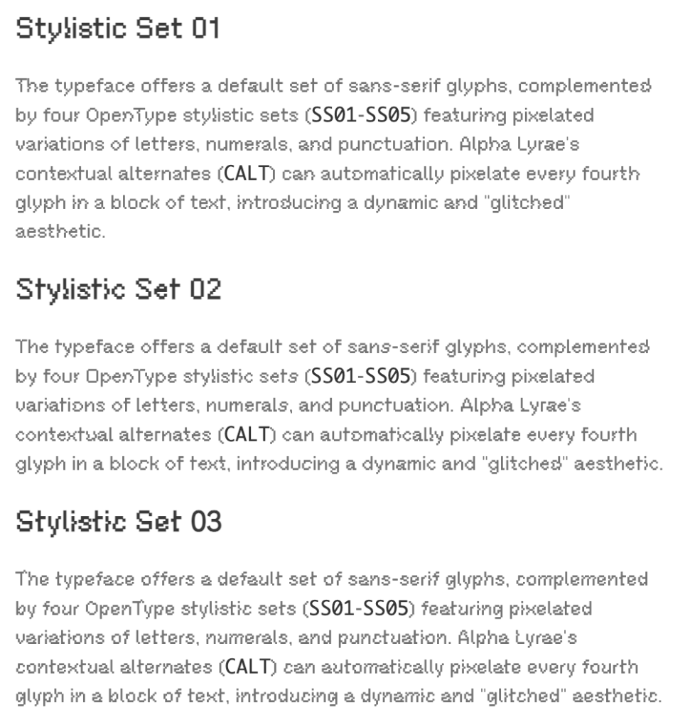
The typeface offers a default set of sans-serif glyphs, complemented by four OpenType stylistic sets (SS01–SS05) featuring pixelated variations of letters, numerals, and punctuation. Alpha Lyrae’s contextual alternates (CALT) can automatically pixelate every fourth glyph in a block of text, introducing a dynamic and “glitched” aesthetic.
For those interested in experimenting with Alpha Lyrae, you can use the online playground at the main link and interact with the various stylistic sets and observe the progressive glitch effects.
It’s a fun, kitchy font to play with over the break.
Why Comic Lettering Is Storytelling
It should be no surprise that I’m still an avid book reader. I’ve been reading comics since I was a wee lad, and I continue to find the medium a captivating way to tell stories. Much emphasis on comic lettering is placed on the visual aspect, but the written word is just as important.
Comic lettering is often called “the invisible art”. It plays a major role in comic book storytelling, though you may not overtly think so. In “Why Comic Lettering Is Storytelling“, Luke Henderson asserts that lettering “transcends” mere text placement to become an integral narrative tool through three key examples.
In Marvel’s Angela series, letterer Clayton Cowles uses distinct fonts to highlight character origins and internal conflicts. Angela’s dialogue uses clean, straight fonts while her Asgardian siblings use flourished text, subtly emphasizing her outsider status and complex identity as an Angel raised apart from Asgard.
Barbarella: Woman Untamed showcases how lettering can plant narrative seeds. Carlos Mangual’s distinctive blue-stroked speech bubbles for the AI character Taln cleverly foreshadow a major plot twist when similar bubbles appear later through another character.
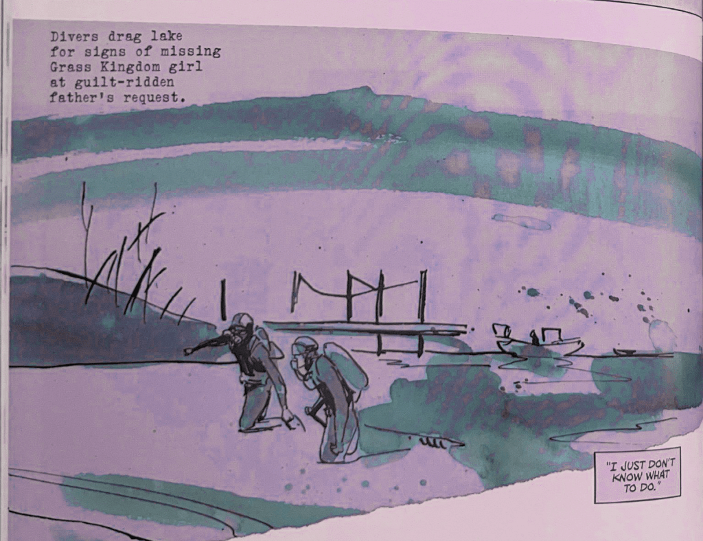
And, in Grass Kings, Jim Campbell’s lettering techniques visualize the protagonist’s fractured psyche by using blank speech bubbles overlaid with monologue text for forgotten conversations and newspaper-style typography for memory fragments, effectively conveying the character’s psychological state.
Henderson argues that comic lettering deserves recognition as a narrative art form rather than mere technical craft, as it actively contributes to storytelling through subtle visual cues that enrich character development and plot progression.
It’s a short read that will hopefully have you noticing the lettering details a bit more the next time you page through a comic book.
FIN
We all will need to get much, much better at sensitive comms, and Signal is one of the only ways to do that in modern times. You should absolutely use that if you are doing any kind of community organizing (etc.). Ping me on Mastodon or Bluesky with a “🦇?” request (public or faux-private) and I’ll provide a one-time use link to connect us on Signal.
Remember, you can follow and interact with the full text of The Daily Drop’s free posts on:
- 🐘 Mastodon via
@dailydrop.hrbrmstr.dev@dailydrop.hrbrmstr.dev - 🦋 Bluesky via
https://bsky.app/profile/dailydrop.hrbrmstr.dev.web.brid.gy
Also, refer to:
to see how to access a regularly updated database of all the Drops with extracted links, and full-text search capability. ☮️

Leave a comment