HTTP Archive Web Almanac 2025 Fonts Chapter; fontdata.com Name Check Tool; Featured Freemium Font: POI Aeronaut
How is it February already?
TL;DR
(This is an LLM/GPT-generated summary of today’s Drop. Ollama and MiniMax M2.1.)
- Roughly 88% of websites now use web fonts, with self-hosting (72%) overtaking third-party CDNs as the dominant delivery method, WOFF2 dominating format usage at 65%, and variable fonts reaching 40% adoption, according to the 2025 Web Almanac fonts chapter (https://almanac.httparchive.org/en/2025/fonts)
- Font designers can check if a proposed font name is already taken across major platforms, historical catalogs dating back to 1926, and trademark records using the fontdata.com name check tool, which has been operated by Lars Schwarz since 2014 and includes an API for workflow integration (https://namecheck.fontdata.com/)
- POI Aeronaut is a geometric sans-serif typeface from POI Type that features stylistic alternates allowing users to swap in cursive, script-like letterforms for more organic visual movement (https://poitype.gumroad.com/l/aeronaut)
HTTP Archive Web Almanac 2025 Fonts Chapter
The Web Almanac (an annual state-of-the-web report based on crawling millions of sites and analyzing what’s actually being served) is out and has a dedicated fonts chapter that specifically examines web typography patterns across the entire observable web. It’s been running since 2019, so there’s good longitudinal data on how font usage has evolved.
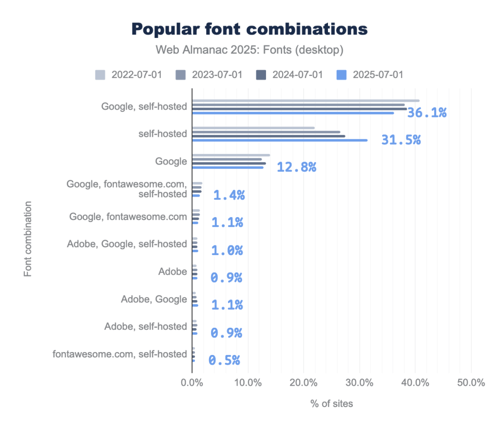
The 2025 edition reveals that roughly 88% of sites now use web fonts, self-hosting has overtaken third-party CDNs as the dominant delivery method (about 72% of sites self-host at least some fonts), and Google Fonts still appears on roughly half of all sites, but its share is slowly declining. WOFF2 has basically won the format war at 65% of font files. Variable fonts hit 40% adoption this year, though most sites just use them for weight variations rather than anything fancy like animation. The chapter also pokes a bit at OpenType feature usage, color fonts (still barely registering), hyphenation and text-wrap CSS properties, and global script support beyond Latin.
The authors of the almanac do a great job providing key facts without “filler” content, so I’m very comfortable shunting you there for the deets.
fontdata.com Name Check Tool
While it is unlikely any of us will need to use this resource, it’s a glimpse into one of the headaches of font design: the name. Sure, you can pick any name for your font, but there are a gazillion ones out there, and the odds are good that any initial name one picks will already be taken.
So, fontdata.com is a very practical utility for type designers who need to check if a font name is already taken before committing to it. Lars Schwarz has been running it since 2014, aggregating font name data from multiple sources: the major digital platforms like MyFonts, Adobe Fonts, and Google Fonts, plus historical type catalogs going back to 1926, and USPTO trademark records.
Just type in a proposed font name, and it tells you if something already exists with that name or something close. It handles foundry prefixes intelligently, so searching “Meta” will find “FF Meta” and similar variations. It won’t catch everything (plenty of fonts exist that aren’t in any database), but it’s a reasonable due diligence step before you finalize naming. There’s also an API for developers who want to integrate name checking into their workflows.
The site notes which font it uses (Lab Grotesque Mono Regular) and links to the foundry’s page, and I cannot close out this section without suggesting you head over to Letters from Sweden as their showcase page is absolutely gorgeous. I sp want all those fonts.
Featured Freemium Font: POI Aeronaut
POI Aeronaut is a geometric sans-serif typeface from POI Type (Philipp Neumeyer’s foundry) that has an interesting twist: it includes stylistic alternates that give letterforms cursive, script-like characteristics. So you can use it as a clean geometric sans, or selectively swap in the script alternates via OpenType stylistic sets to add more organic movement to specific words or passages.
We’ve had a spate of new signups of late. So for those new to Typography Tuesdays, a geometric sans-serif is a style of typeface where the letterforms are constructed from basic geometric shapes: circles, squares, triangles, and straight lines. The “sans” part just means no serifs (those little feet/flourishes at the ends of strokes in fonts like Times New Roman).
The section header of the mid-section is set in POI Aeronaut.
FIN
Remember, you can follow and interact with the full text of The Daily Drop’s free posts on:
- Mastodon via
@dailydrop.hrbrmstr.dev@dailydrop.hrbrmstr.dev - Bluesky via
<https://bsky.app/profile/dailydrop.hrbrmstr.dev.web.brid.gy>
☮️

Leave a comment