Fran Sans; Typocalypse Now; Featured Free Font: Ductile Display
Squeaked it out before midnight ET!
After a quick review of both drafts from earlier in the day, what was going to be the Friday Drop was just horrible, and due to an extended work day (and the need to make pizzas for my son’s D&D group), I ended up priorizing polishing this one vs. give you two garbage Drops. We’ll make up for it this weekend.
TL;DR
(This is an LLM/GPT-generated summary of today’s Drop. Ollama and MiniMax M2.1.)
- Emily Sneddon’s essay documents the origins and design process of the Fran Sans typeface derived from SFMTA LCD destination displays (https://emilysneddon.com/fran-sans-essay)
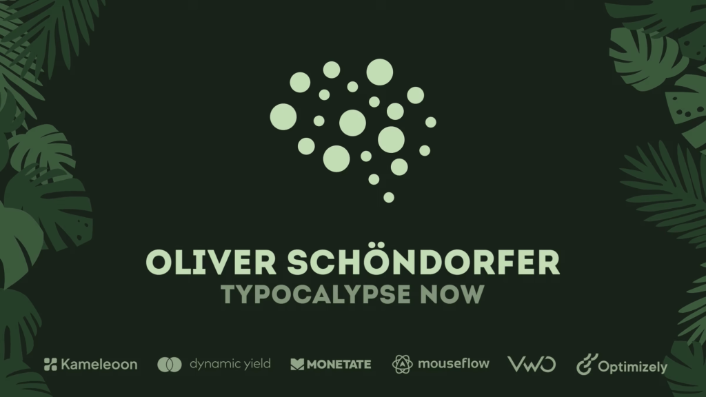
- Oliver Schöndorfer’s “Typocalypse Now” talk on Vimeo examines how bad typography harms usability and proposes a data‑driven framework for testing typographic changes in CRO (https://vimeo.com/114221976)
- The free Ductile Display font by Titus Homei, showcased on Behance, offers a modular, industrial‑style typeface suited for futuristic headlines and display use (https://www.behance.net/asset/703085/Ductile-Display)
Fran Sans
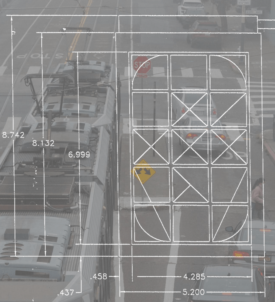
Emily Sneddon’s recent (2025-11-06) essay takes us inside the San Francisco Municipal Transportation Agency’s (SFMTA) old Breda LCD destination displays, the quirky 3×5‑grid panels that still flash “N‑Judah” and “Church & Duboce” on the city’s historic streetcars. By meeting technician Armando Lumbad, hunting down the original Trans‑Lite engineering drawings, and tracing the signs’ imminent retirement, Sneddon reveals how a stripped‑down, utilitarian alphabet—crafted for efficiency, not elegance—became the seed for Fran Sans, a three‑style font (Solid, Tile, Panel) that captures the raw, analogue charm of those fading signs.
The essay walks us through the design journey, starting with a printed matrix code that lit the LCD’s segments, through modular “Lego‑like” letterforms, to a fully functional digital typeface built in the Glyphs app. Sneddon’s research also nods to San Francisco’s typographic heritage, including Joan Trochut’s Tipo Veloz, Zuzana Licko’s Lo‑Res, and the Bell Shakespeare brand’s Hotspur. They demonstrate how a simple transit panel can spark a broader conversation about utility, imperfection, and visual storytelling.
If you are curious to see the font (besides the small sample in the section header) and the story behind it, you should 100% consume the full essay, view the original display photos, and reach out to Emily to get a copy of the typeface. It was pretty cool being able to experience a piece of San Francisco’s disappearing visual voice before the next generation of LED screens takes over, and let the odd angles and thin diagonals of Fran Sans remind me that design’s greatest character often lives in the imperfect details.
Typocalypse Now
As we’ve noted many time, better typography is pretty obvious when one sees it. The content comes across as cleaner, more guided, and far less chaotic. Unfortunately we live in an age where — despite most folks seemingly willing to accept “good enough” slop — we are almost forced to double check whether what we put out there for others to consume has any impact at all.
Oliver Schöndorfer brought that question to Conversion Hotel, which is a conferences for “Conversion Rate Optimization” (CRO) — O_O — held on a Dutch island with 200+ folks involved in “experimentation” (which is my kind way of “folks obsessed with”a/b” testing). His talk, “Typocalypse Now,” covered how bad typography can absolutely destroy usability. But the real conversation happened in an unconference session: how do you actually measure this stuff? People tossed out ideas like “paragraph blindness” (walls of text that get skipped like banner ads) and debated metrics, such as form completion, click-through rates, and time on page.
What I found interesting: these are two groups who almost never talk to each other. Type people operate on intuition. CRO people want data. Schöndorfer’s piece is an attempt to get them in the same room. By doing so, he ended up walking away with a framework for testing typography in production.
It’s an unusual situation, but it gives us a look into an area of typography we’ve had little coverage of in these weekly tomes.
Featured Free Font: Ductile Display
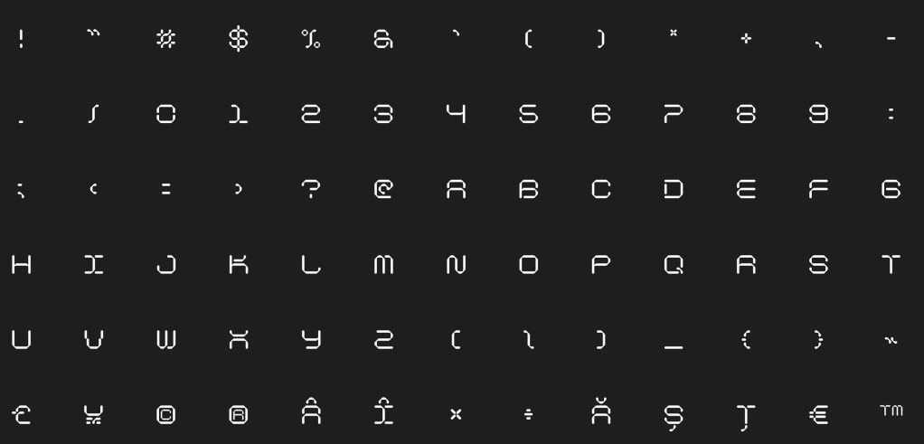
Ductile Display takes its name from a material science concept: ductility, which is the ability to deform under stress without fracturing. Designer Titus Homei turned that idea into a typeface, and the result is a font that feels both rigid and alive. The letters are modular and geometric, built from segments that suggest industrial precision. But there’s tension in the design. These forms look like they could stretch or shift at any given moment.
At a purely technical level, it’s a display font with 82 glyphs, so we are absolutely working with this in headlines and statement pieces. Do not even remotely consider using it for long reads. The high-tech vibe makes it especially useful for sci-fi branding, digital interfaces, or any project that wants to feel future-forward without going into full robot mode.
It’s free for both personal and commercial work
FIN
Remember, you can follow and interact with the full text of The Daily Drop’s free posts on:
- Mastodon via
@dailydrop.hrbrmstr.dev@dailydrop.hrbrmstr.dev - Bluesky via
<https://bsky.app/profile/dailydrop.hrbrmstr.dev.web.brid.gy>

Leave a comment